
There’s a very useful tool that can automatically box in the high and low points of the Asian session, the London session, and the New York session—so you don’t have to spend every day staring at the clock to find the right positions and then manually draw lines segment by segment.
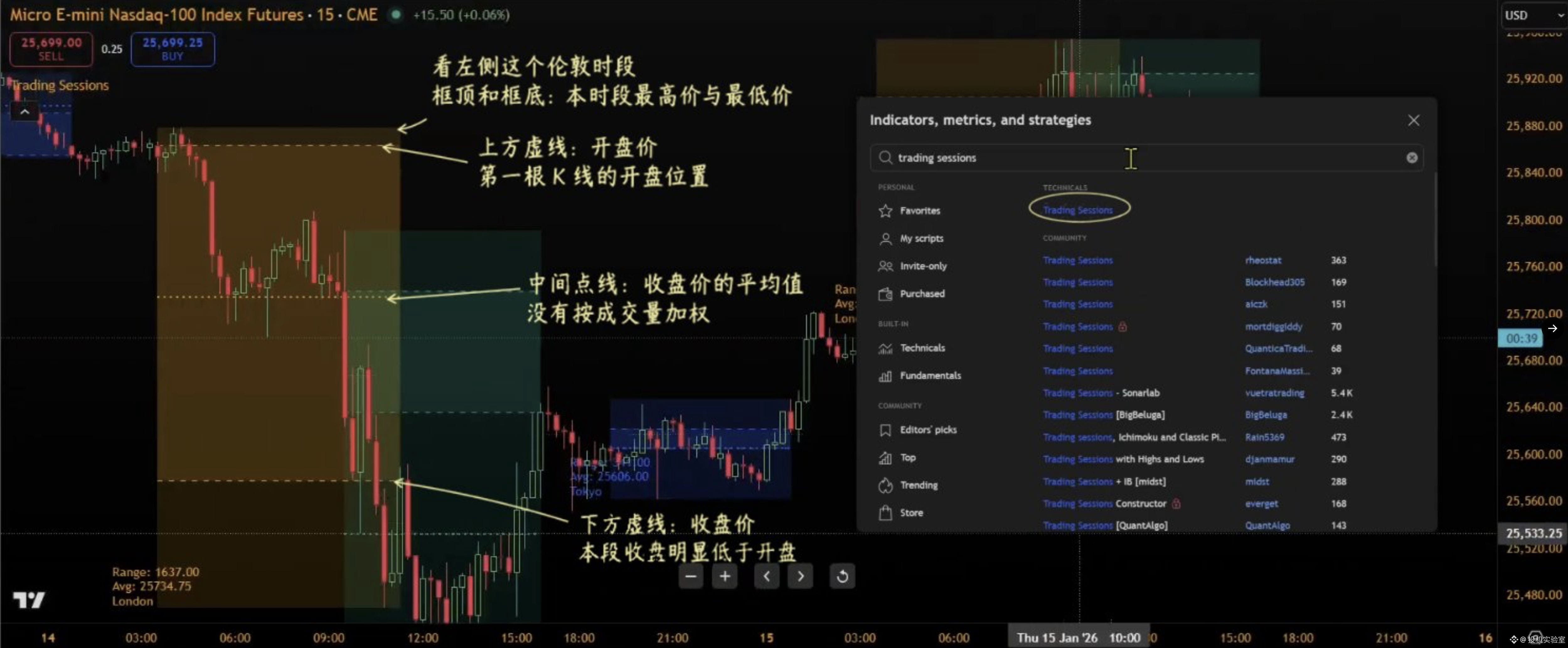
It’s called Trading Sessions, the trading sessions indicator.
You can adjust the start and end time of each session, or keep only the sessions you care about.
It groups the candlesticks that open within the specified session together—the top of the box is the highest price among those candlesticks, and the bottom is the lowest price.
While the session is still ongoing, if a new high or low appears, the box automatically expands to include it.
After the session ends, the high-low range for that period is fixed, making it easy to compare later.
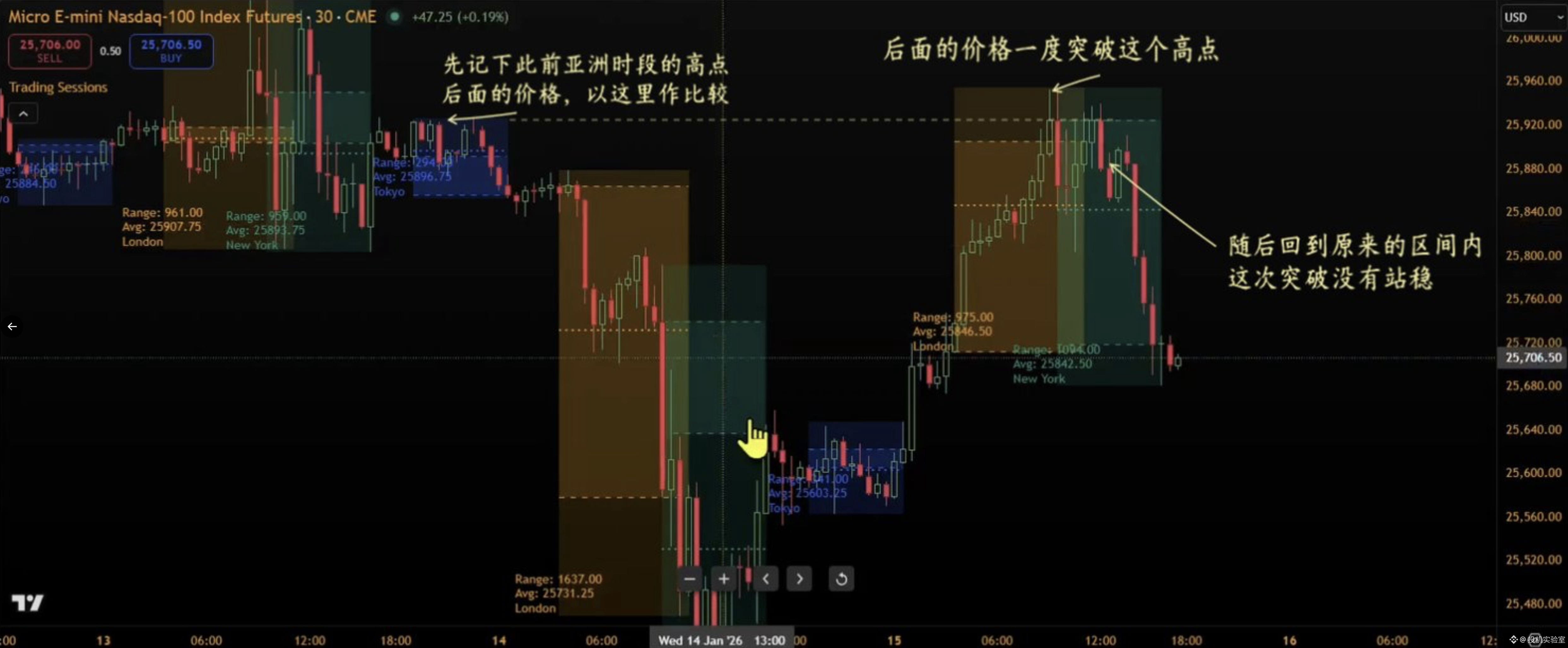
The most practical part is using the high and low points from the previous session to observe how the price behaves afterward.
For example, if the Asian session has been ranging within a certain band, then after the London session opens, the price starts breaking upward.
At that point, you can compare to the Asian session’s upper boundary—watch whether the price can stay outside the original range, and whether it holds that level when it pulls back.
If, after breaking out, the price quickly falls back inside the box again, it suggests the breakout hasn’t truly held. But if the price pulls back to the upper boundary and then continues rising, you can keep monitoring whether it can move even higher.
It can also help you tell whether, within a session, price repeatedly oscillates or instead moves overall in one direction.
Turn on the opening line and closing line to compare this session’s open price and close price.
If the box is high but the close is near the open, it means the market fluctuated a lot during the session, but the overall rise/fall was small. If the close is near the highest point and clearly above the open, it indicates that by the end of the session the price still retained most of its upward movement.
Inside the box, you can also display a mid/average price line. The method is to add up the close prices of each candlestick in that session and divide by the number of candles. This makes it easy to compare where the current price sits relative to that session’s average—but it is not volume-weighted, so it can’t be treated as the average cost of holdings.
When setting it up, be sure to pay attention to the time zone.
New York uses America/New_York, and London uses Europe/London. It can automatically adjust with local daylight saving time, so the boxed times won’t shift by an hour after the seasons change. If you only care about the first hour after the U.S. stock market opens, you can also set that as a separate session, so the indicator will automatically mark the high and low points for that hour every day and then you can watch whether later price action breaks out.$BTC
It’s called Trading Sessions, the trading sessions indicator.
You can adjust the start and end time of each session, or keep only the sessions you care about.
It groups the candlesticks that open within the specified session together—the top of the box is the highest price among those candlesticks, and the bottom is the lowest price.
While the session is still ongoing, if a new high or low appears, the box automatically expands to include it.
After the session ends, the high-low range for that period is fixed, making it easy to compare later.
The most practical part is using the high and low points from the previous session to observe how the price behaves afterward.
For example, if the Asian session has been ranging within a certain band, then after the London session opens, the price starts breaking upward.
At that point, you can compare to the Asian session’s upper boundary—watch whether the price can stay outside the original range, and whether it holds that level when it pulls back.
If, after breaking out, the price quickly falls back inside the box again, it suggests the breakout hasn’t truly held. But if the price pulls back to the upper boundary and then continues rising, you can keep monitoring whether it can move even higher.
It can also help you tell whether, within a session, price repeatedly oscillates or instead moves overall in one direction.
Turn on the opening line and closing line to compare this session’s open price and close price.
If the box is high but the close is near the open, it means the market fluctuated a lot during the session, but the overall rise/fall was small. If the close is near the highest point and clearly above the open, it indicates that by the end of the session the price still retained most of its upward movement.
Inside the box, you can also display a mid/average price line. The method is to add up the close prices of each candlestick in that session and divide by the number of candles. This makes it easy to compare where the current price sits relative to that session’s average—but it is not volume-weighted, so it can’t be treated as the average cost of holdings.
When setting it up, be sure to pay attention to the time zone.
New York uses America/New_York, and London uses Europe/London. It can automatically adjust with local daylight saving time, so the boxed times won’t shift by an hour after the seasons change. If you only care about the first hour after the U.S. stock market opens, you can also set that as a separate session, so the indicator will automatically mark the high and low points for that hour every day and then you can watch whether later price action breaks out.$BTC