The SOL reached the US$ 120 range, but this move didn’t happen “out of nowhere”.
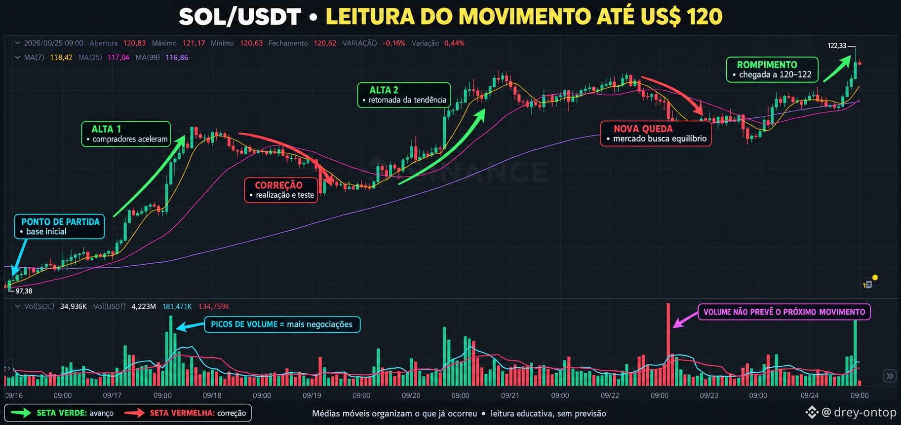
In the image, the arrows show the entire path: where the price started, when it accelerated, where it corrected, how it regained strength, and why the volume peaks stand out.
Pay special attention to the green and red arrows: they help you understand that an uptrend also has pauses and pullbacks along the way.
📊 Open the image and follow it step by step.
Educational content — chart reading only, no forecast or recommendation. WILL WE SEE A DOWNTURN AGAIN?
In the image, the arrows show the entire path: where the price started, when it accelerated, where it corrected, how it regained strength, and why the volume peaks stand out.
Pay special attention to the green and red arrows: they help you understand that an uptrend also has pauses and pullbacks along the way.
📊 Open the image and follow it step by step.
Educational content — chart reading only, no forecast or recommendation. WILL WE SEE A DOWNTURN AGAIN?