CLASS: HOW TO READ THIS LINK/USDT MOVE
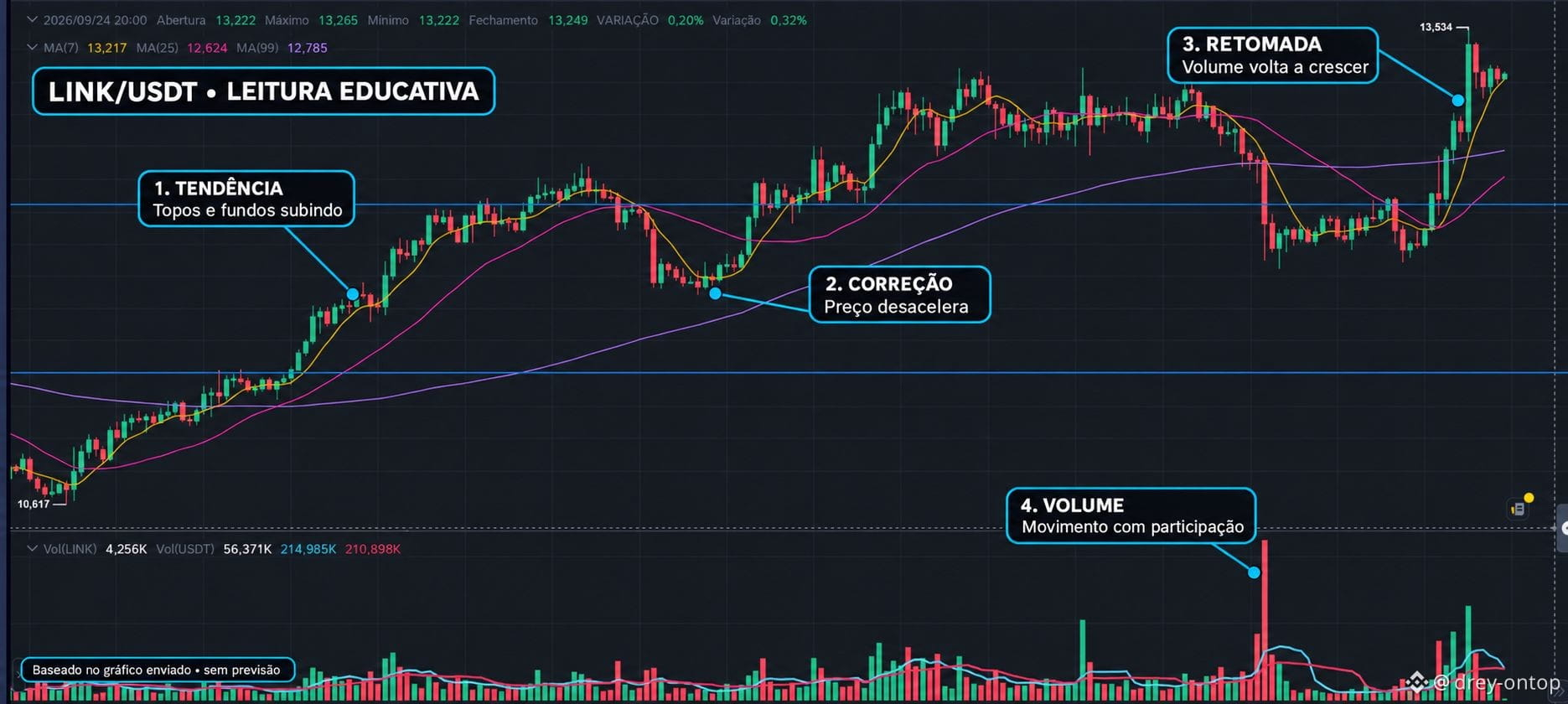
This chart shows an important sequence: uptrend, correction, recovery, and a new attempt to advance. Instead of looking only at the last candle, the idea is to understand how each step was built.
TREND
In the first part, the price leaves the marked area near 10,617 and starts forming higher highs and higher lows. In simple terms: after each pause, the chart managed to reach a region above the previous one. This behavior shows that, during that period, buying pressure was more present.
CORRECTION
No trend goes up in a straight line. In the middle of the chart, LINK slows down and makes a correction. Correction does not automatically mean reversal: it’s a phase in which the price gives back part of the move and the market tests whether there is still interest.
The blue lines help you see regions that were relevant on the chart. When the price returns to respect a band that was already observed, it starts to serve as a visual reference for understanding where a dispute occurred between buyers and sellers.
MOVING AVERAGES
In the displayed candle, the price is at 13,249. The averages shown are MA(7) at 13,217, MA(25) at 12,624, and MA(99) at 12,785. The price is above all three averages in this excerpt.
This describes the recent behavior: the price stayed above the references calculated with earlier candles. But moving averages don’t predict the future; they only help organize what has already happened.
RESUMPTION AND RECENT TOP
After a new phase of ranging, LINK rises again and reaches the visible high of 13,534. Then smaller candles appear and a slight pullback. This shows that the higher region also found selling and profit-taking.
This chart shows an important sequence: uptrend, correction, recovery, and a new attempt to advance. Instead of looking only at the last candle, the idea is to understand how each step was built.
TREND
In the first part, the price leaves the marked area near 10,617 and starts forming higher highs and higher lows. In simple terms: after each pause, the chart managed to reach a region above the previous one. This behavior shows that, during that period, buying pressure was more present.
CORRECTION
No trend goes up in a straight line. In the middle of the chart, LINK slows down and makes a correction. Correction does not automatically mean reversal: it’s a phase in which the price gives back part of the move and the market tests whether there is still interest.
The blue lines help you see regions that were relevant on the chart. When the price returns to respect a band that was already observed, it starts to serve as a visual reference for understanding where a dispute occurred between buyers and sellers.
MOVING AVERAGES
In the displayed candle, the price is at 13,249. The averages shown are MA(7) at 13,217, MA(25) at 12,624, and MA(99) at 12,785. The price is above all three averages in this excerpt.
This describes the recent behavior: the price stayed above the references calculated with earlier candles. But moving averages don’t predict the future; they only help organize what has already happened.
RESUMPTION AND RECENT TOP
After a new phase of ranging, LINK rises again and reaches the visible high of 13,534. Then smaller candles appear and a slight pullback. This shows that the higher region also found selling and profit-taking.