🚨 Important data for $BTC and altcoins! 🚨
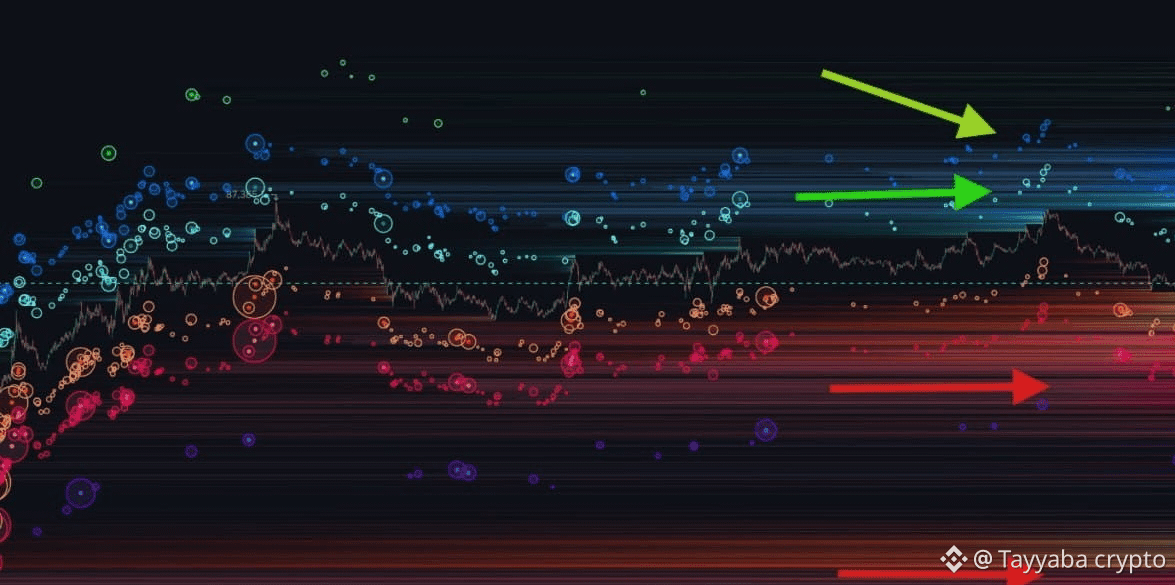
The #Bitcoin chart you see here is slightly different from the usual liquidation maps. First, the bubbles in the chart represent the positions of real traders, so the idea of a “bubble burst” becomes very clear here. 💥
Even though it may not look very obvious in the upper area, there is a high level of potential liquidation—especially after logging around $1.3B in liquidations coinciding with Bitcoin’s rise by about $5,000 in the last move.
With even a small price increase, many traders immediately start opening short positions. 📉
Global markets and negative economic data clearly affect these moves, but I repeat what I said from the beginning:
📌 The market often moves against the crowd of traders’ positions.
Therefore, leveraged short positions may continue to face liquidation risk if the price keeps rising. Reaching the $90,000 area could be a plausible scenario, but it remains tied to market movement and liquidity.
⚠️ Monitor liquidation levels and manage risk, and don’t enter a trade based on this analysis alone.
DYOR — do your own research before making any decisions.
The #Bitcoin chart you see here is slightly different from the usual liquidation maps. First, the bubbles in the chart represent the positions of real traders, so the idea of a “bubble burst” becomes very clear here. 💥
Even though it may not look very obvious in the upper area, there is a high level of potential liquidation—especially after logging around $1.3B in liquidations coinciding with Bitcoin’s rise by about $5,000 in the last move.
With even a small price increase, many traders immediately start opening short positions. 📉
Global markets and negative economic data clearly affect these moves, but I repeat what I said from the beginning:
📌 The market often moves against the crowd of traders’ positions.
Therefore, leveraged short positions may continue to face liquidation risk if the price keeps rising. Reaching the $90,000 area could be a plausible scenario, but it remains tied to market movement and liquidity.
⚠️ Monitor liquidation levels and manage risk, and don’t enter a trade based on this analysis alone.
DYOR — do your own research before making any decisions.