

The previous week, I focused on understanding the RSI and on observing how its reading changed across three timeframes: 5 minutes, 15 minutes, and 1 hour.
Understanding each part helped me train my eye better and observe the charts with a bit more order.
The next step was to get closer to the Japanese candles.
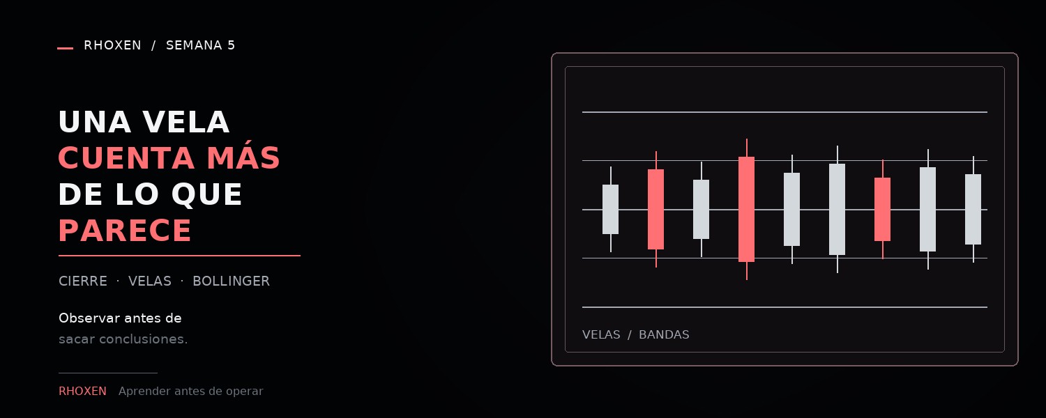
At first I saw them mainly as green or red bars. Then I understood that each candle summarizes more information:
Where the price opened.
Where it closed.
How high it reached.
What path it took during that period.
The body shows the distance between the opening and the closing. The wicks show the areas the price reached, even if it didn’t finish closing there.
An isolated candle doesn’t tell the whole story. To understand it better, I need to look at the previous candles, the time frame, and the context of the move.
I also started observing the Bollinger bands.
The middle band represents a recent average price. The upper band shows a high zone relative to that average, and the lower band shows a low zone.
What caught my attention the most was the distance between the bands. When they are more separated, the price is covering wider ranges. When they come closer, the recent move seems more limited.
I still need to get used to not confusing amplitude with direction. If the bands separate, it doesn’t automatically tell me whether the price will go up or down.
For now, the simplest way I found to relate these elements is:
The RSI helps me observe the recent strength of the move.
The candles show me how that move happened.
The Bollinger bands help me observe how wide the range was that the price traveled.
I don’t feel like I fully understand these indicators yet. But I can say that the chart is starting to stop looking like a random combination of unrelated lines and colors.
Now I can ask more specific questions about what I’m seeing.
This is what I am doing, not financial advice.