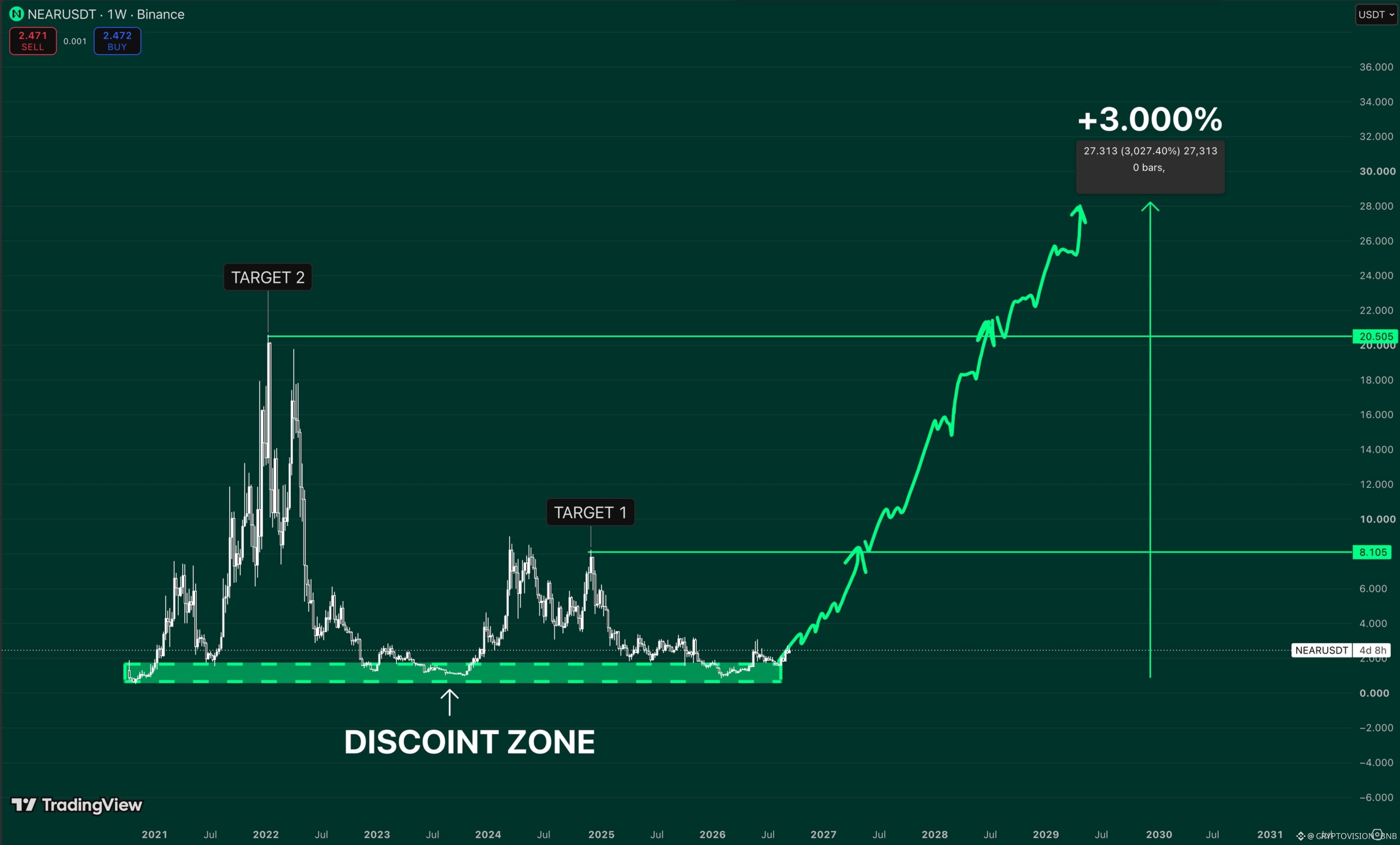
$NEAR is hovering around $2.47 and almost nobody cares.
That’s exactly what makes this chart so interesting to me.
For years, the same area has acted like a discount zone.
The price leaves it, jumps up strongly, and eventually returns
and everyone assumes the story is over.
I’m watching first at $8.10.
Then $20.50: the much bigger historical level.
Beyond that, my scenario on the chart extends to about $28, or roughly +3,000% from the marked base.
That sounds insane from down there.
But that’s the paradox: at $2, nobody wants $NEAR .
$NEAR
That’s exactly what makes this chart so interesting to me.
For years, the same area has acted like a discount zone.
The price leaves it, jumps up strongly, and eventually returns
and everyone assumes the story is over.
I’m watching first at $8.10.
Then $20.50: the much bigger historical level.
Beyond that, my scenario on the chart extends to about $28, or roughly +3,000% from the marked base.
That sounds insane from down there.
But that’s the paradox: at $2, nobody wants $NEAR .
$NEAR