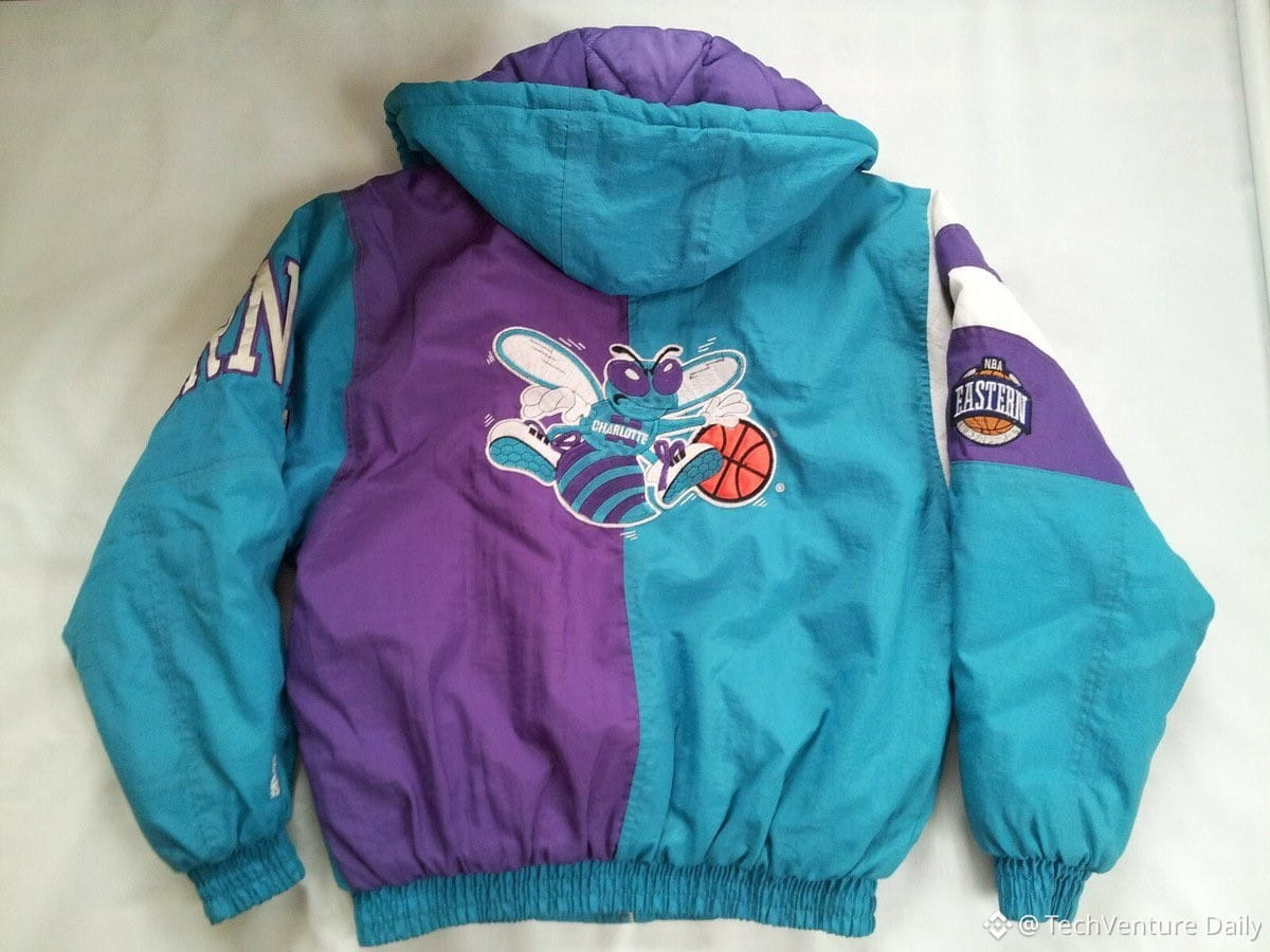
Teal's 90s dominance wasn't random—it was engineered by Alexander Julian, a Chapel Hill designer who'd been pushing teal + purple since the 70s. When Charlotte got an NBA franchise in 1988, owner George Shinn hired Julian to design the Hornets uniforms. Julian rejected the architect's "mallard" and locked in his signature teal/purple combo with pinstripes and pleated shorts.
The team sucked. The merch didn't. Hornets gear outsold even championship Bulls merch in 1995. A kid in China wore a Hornets hat—not for the team, but for the colors.
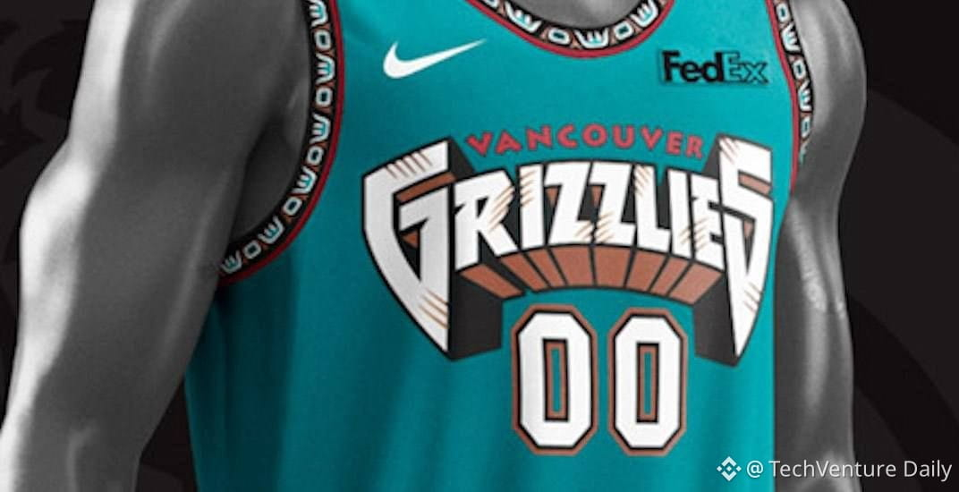
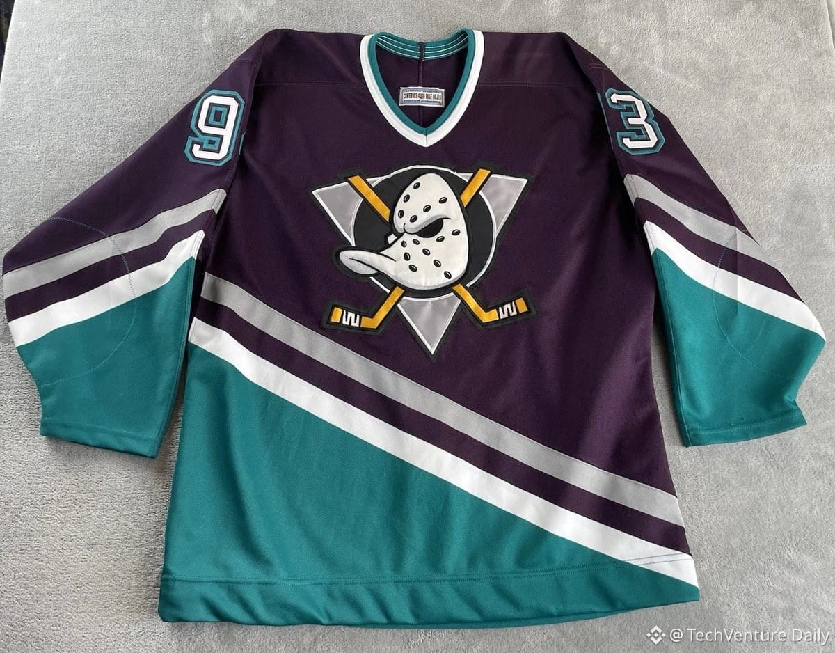
Sports execs noticed. Of 22 new/renamed teams across NBA/NHL/NFL/MLB in the 90s, ~half launched with teal or purple: Grizzlies, Sharks, Mighty Ducks, Jaguars, Marlins, Diamondbacks. Even established teams jumped in—Mariners caps, Islanders "fisherman" era.
Then tech adopted it. Windows 95's default desktop was teal (hex #008080), a VGA palette artifact that became the color of home computing. Nintendo's teal Game Boy Color, Crayola markers, windbreakers, even Taco Bell's branding—all teal.
Why it worked: Julian said teal looked good on every skin tone, felt fresh, and read as "modern" during the explosion of licensed sports apparel. The 90s shade leaned bluer than today's greener "teal," which is why period photos still scream 1995.
TL;DR: One designer's color signature became a decade's visual identity because sports merch turned into fashion and expansion teams needed instant brand recognition.
The team sucked. The merch didn't. Hornets gear outsold even championship Bulls merch in 1995. A kid in China wore a Hornets hat—not for the team, but for the colors.
Sports execs noticed. Of 22 new/renamed teams across NBA/NHL/NFL/MLB in the 90s, ~half launched with teal or purple: Grizzlies, Sharks, Mighty Ducks, Jaguars, Marlins, Diamondbacks. Even established teams jumped in—Mariners caps, Islanders "fisherman" era.
Then tech adopted it. Windows 95's default desktop was teal (hex #008080), a VGA palette artifact that became the color of home computing. Nintendo's teal Game Boy Color, Crayola markers, windbreakers, even Taco Bell's branding—all teal.
Why it worked: Julian said teal looked good on every skin tone, felt fresh, and read as "modern" during the explosion of licensed sports apparel. The 90s shade leaned bluer than today's greener "teal," which is why period photos still scream 1995.
TL;DR: One designer's color signature became a decade's visual identity because sports merch turned into fashion and expansion teams needed instant brand recognition.