$SOL $TRUMP $ETH #تنبيه
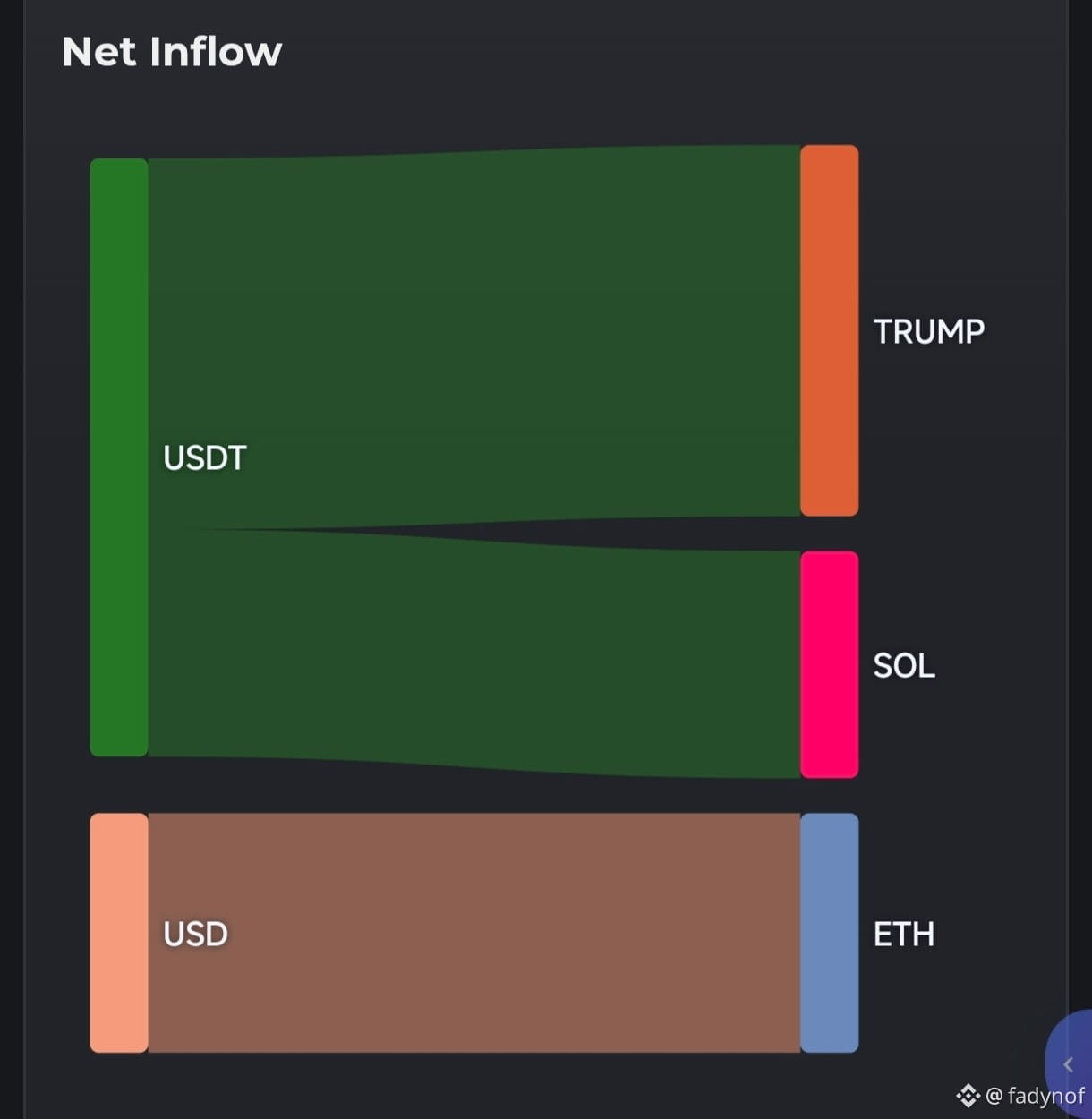
The chart (Sankey Diagram) shows the net inflow flows of digital currencies, indicating a massive movement of liquidity from USDT toward the coins TRUMP and SOL.
Source of liquidity: The stablecoin USDT is the only source of incoming inflows, meaning there are direct buying operations using digital dollars.
Distribution of flows:
TRUMP: Takes the largest share of the liquidity inflows (roughly exceeding 50% of the total movement).
SOL: Receives the remaining liquidity inflows directly and in a similarly large volume.
Market implication: The diagram reflects strong accumulation and a large inflow of capital (Capital Inflow) toward TRUMP and SOL at the expense of stablecoins, indicating a strong willingness to take risks and increase buying of these two coins in the current period.
The chart (Sankey Diagram) shows the net inflow flows of digital currencies, indicating a massive movement of liquidity from USDT toward the coins TRUMP and SOL.
Source of liquidity: The stablecoin USDT is the only source of incoming inflows, meaning there are direct buying operations using digital dollars.
Distribution of flows:
TRUMP: Takes the largest share of the liquidity inflows (roughly exceeding 50% of the total movement).
SOL: Receives the remaining liquidity inflows directly and in a similarly large volume.
Market implication: The diagram reflects strong accumulation and a large inflow of capital (Capital Inflow) toward TRUMP and SOL at the expense of stablecoins, indicating a strong willingness to take risks and increase buying of these two coins in the current period.