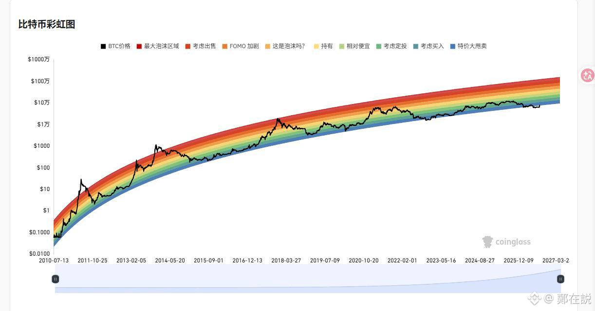
Just came across CoinGlass’s $BTC Bitcoin rainbow chart. I have to say, every time I look at it, it feels a little healing for my anxiety 😂
Here’s a simple breakdown of the current rainbow chart data for everyone:
1、Regarding predicting the peak: Using the logarithmic channel of the rainbow chart, if this bull run really can push all the way to the top red box (“maximum bubble area”), the theoretical upper limit is $20W - $30W+. But if we stay rational, as the market matures, the rate of increase tends to decay. If it can reach the orange-red area, around $18W - $25W, that would already be extremely powerful.
2、Can you buy now? Just look at the black price line on the chart—right now BTC is still firmly sitting in the light blue and green ranges (i.e., the chart’s “consider buying / DCA / relatively cheap”). It’s still far from the red top area. So just buy directly.
3、My personal plain-language summary: Macroscopically, the current price absolutely doesn’t match “the bubble at the end of a bull market.” If you’re investing long-term or planning to DCA, holding positions at this level doesn’t create much psychological burden. Of course, the rainbow chart is just a historical logarithmic model—don’t treat it as absolute scripture. But to calibrate your market emotions and not blindly FOMO, it’s definitely quite useful.
What are the target prices for this round’s $BTC and $ETH ?
Here’s a simple breakdown of the current rainbow chart data for everyone:
1、Regarding predicting the peak: Using the logarithmic channel of the rainbow chart, if this bull run really can push all the way to the top red box (“maximum bubble area”), the theoretical upper limit is $20W - $30W+. But if we stay rational, as the market matures, the rate of increase tends to decay. If it can reach the orange-red area, around $18W - $25W, that would already be extremely powerful.
2、Can you buy now? Just look at the black price line on the chart—right now BTC is still firmly sitting in the light blue and green ranges (i.e., the chart’s “consider buying / DCA / relatively cheap”). It’s still far from the red top area. So just buy directly.
3、My personal plain-language summary: Macroscopically, the current price absolutely doesn’t match “the bubble at the end of a bull market.” If you’re investing long-term or planning to DCA, holding positions at this level doesn’t create much psychological burden. Of course, the rainbow chart is just a historical logarithmic model—don’t treat it as absolute scripture. But to calibrate your market emotions and not blindly FOMO, it’s definitely quite useful.
What are the target prices for this round’s $BTC and $ETH ?