

IT Home, August 25 — On August 21, the Document Foundation published a blog post again criticizing Microsoft’s Microsoft 365 office suite, arguing that the Ribbon interface lacks choice. It said although the technical solution may be common, it is not suitable for all users, and noted that there is no “best” Ribbon—only the most suitable one.
The Document Foundation recognizes that the Ribbon design is excellent, and that it is indeed a mature solution. The original intent of the design is to help infrequent or intermediate users not have to rely on a large amount of memorization, and instead discover features through browsing.
However, this design is not suitable for all users. For advanced users who mainly operate via the keyboard, they may care more about operation speed and vertical screen space. Meanwhile, users who rely on assistive technology, as well as users on small-sized or low-resolution screens, may have different needs.
In its blog post, the Document Foundation emphasizes that since Microsoft 365 only offers this specific interface and is intended for all users, trade-offs are inevitably required, and those trade-offs are imposed on users.
LibreOffice takes the exact opposite approach, offering a wide range of UX options, such as traditional menu and toolbar layouts, a tabbed interface, a compact tabbed layout, grouped toolbars, a sidebar, and a single-toolbar mode. IT Home has included the relevant screenshots below:
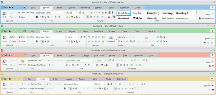
TDF points out that one of the main differences between LibreOffice’s UX and Microsoft Office is that it allows users to weigh various options according to their own needs, thereby achieving the best user experience.