

When someone starts in the world of trading, one of the first things they encounter is a screen full of candles, lines, numbers, and seemingly chaotic movements. At first, a chart may seem complicated. However, learning to interpret it is one of the fundamental skills for anyone who wants to analyze financial markets in general.
A trading chart does not predict the future. It is a visual representation of past and present price behavior, and it allows us to study trends, important levels, volatility, and possible scenarios.
In this article we will look at the main types of charts, what information each one provides, and how to start using them correctly.
🕯️ 1. Japanese candlestick chart
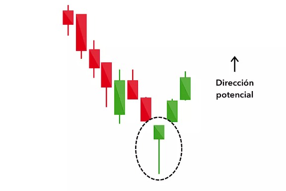
The Japanese candlestick chart (candlestick chart) is probably the most used by traders.
Each candle represents price behavior during a certain period: one minute, five minutes, one hour, four hours, one day, etc.
A candle contains four main data points:
Open: price at the beginning of the period.
Close: price at the end.
High: highest price reached.
Low: lowest price reached.
The body shows the difference between open and close, while the wicks show how far price went during that period.
For example, a candle with a large body and a close far above the open shows strong buying pressure. A candle with a sharp drop may indicate seller dominance.
But an isolated candle rarely tells the whole story.
Context is essential.
📈 2. Line chart
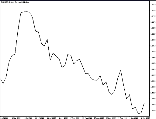
The line chart is much simpler. It generally connects the closing prices of each period with a line.
Its main advantage is that it allows you to quickly observe the overall direction of the market without being distracted by intraperiod movements.
It is especially useful for:
Identifying general trends.
Comparing assets.
Observing historical movements.
Analyze markets in a simple way.
Its disadvantage is that it removes important information such as highs, lows, and opening prices.
That is why, although it is excellent for getting a general view, traders who perform detailed technical analysis usually prefer Japanese candlesticks.
📊 3. Bar chart
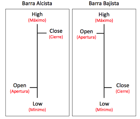
The bar chart provides similar information to Japanese candlesticks, but through vertical bars.
Each bar represents:
open + high + low + close.
For many years it was one of the main technical analysis tools. Today Japanese candlesticks are much more popular because they make it easier to visually interpret market behavior.
Even so, the bar chart remains perfectly valid for analyzing price and structure.
⏱️ 4. Timeframes
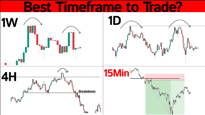
One of the most important decisions when looking at a chart is selecting the timeframe.
We can find charts of:
1M → 5M → 15M → 1H → 4H → 1D → 1W → 1M
The letter M can represent minutes depending on the platform, while H represents hours, D days, and W weeks.
Here a fundamental concept appears:
The same asset can be bullish on 5 minutes and bearish on the daily chart.
That is why we should not analyze a chart in isolation from the rest.
A trader can use, for example, the daily chart to identify the main trend, the 4-hour chart to study structure, and a 15-minute chart to look for an entry.
📈 5. Trends: the structure behind price
One of the first things we must learn to identify is the trend.
There are three main scenarios:
🟢 Bullish trend
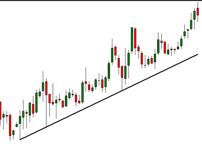
Price forms higher highs and higher lows.
In simple terms:
high → correction → higher high → correction → new high
This shows that buyers are maintaining control.
🔴 Bearish trend
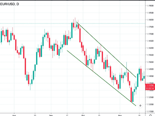
The opposite happens.
The market begins to form:
lower highs + lower lows.
Here sellers have greater control.
🟡 Sideways market
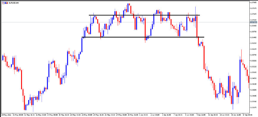
Price moves within a relatively defined range without a clear direction.
In these scenarios, support and resistance frequently appear.
🧱 6. Support and resistance
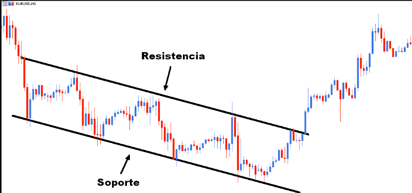
Support and resistance are some of the most important concepts in technical analysis.
A support is a zone where, historically, price has found buyers and had difficulty continuing to fall.
A resistance is a zone where selling pressure has appeared and price has had difficulty continuing upward.
But we must avoid thinking of them as magical lines.
In reality, they are often zones.
When a resistance is broken with strength, it can later become support.
This is known as a polarity change and is one of the structures many traders look for.
📉 7. Volume
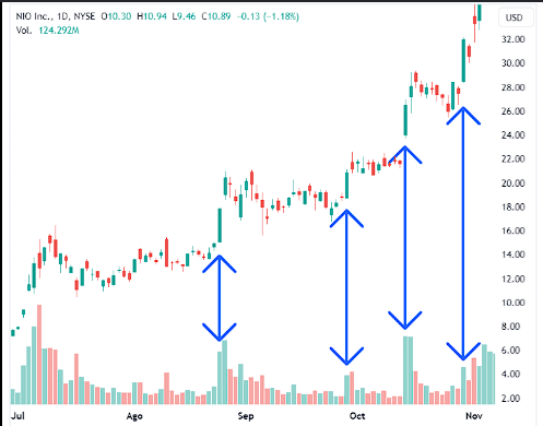
Price tells part of the story.
Volume can help us understand how much activity lies behind that move.
For example:
📈 Price rises + volume increases → move potentially supported by greater participation.
📈 Price rises + volume decreases → the move deserves more caution.
📉 Price falls + volume increases → strong selling pressure may exist.
Volume does not guarantee that a move will continue, but it provides context.
📊 8. Technical indicators
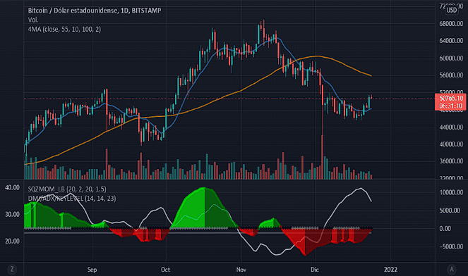
Charts can be complemented with indicators.
Some of the most used are:
RSI
The Relative Strength Index measures the speed and magnitude of certain price movements.
Traditionally, a scale from 0 to 100 is observed and zones such as 70 and 30 are used as overbought and oversold references.
But beware:
a high RSI does not automatically mean you should sell, nor does a low RSI automatically mean you should buy.
An asset can remain overbought during a strong bullish trend.
MACD
MACD tries to show changes in momentum and the relationship between moving averages.
Crossovers between its lines and the histogram can help study accelerations or weakening of the move.
Moving averages
EMA 20, EMA 50, and EMA 200, for example, are frequently used to study trend and price dynamics.
An EMA does not predict the future. It simply transforms prior price behavior into a visual reference.
🧠 9. Price patterns
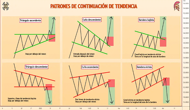
In addition to indicators, traders study certain structures.
Some well-known ones are:
Double top.
Double bottom.
Triangles.
Flags.
Wedges.
Head and shoulders.
Channels.
Range breakouts.
These patterns try to identify repetitive market behavior.
However, we must avoid a very common mistake:
see patterns where they really do not exist.
If we desperately look for a pattern in every chart, we will probably end up finding one.
🔥 10. How to combine all the information
Good technical analysis is not about placing twenty indicators on the chart.
In fact, too much information can produce exactly the opposite of what we seek: confusion.
A simple methodology could be:
1. Trend: is the market rising, falling, or moving sideways?
2. Structure: is it forming higher highs and lows, or lower highs and lows?
3. Support and resistance: where are the important zones?
4. Volume: is there participation behind the move?
5. Indicators: do RSI, MACD, or moving averages support or contradict the reading?
6. Risk: where would our scenario be invalidated?
This last question is possibly the most important.
🎯 The chart is not a crystal ball
The biggest mistake of a beginner is believing that technical analysis serves to know exactly what will happen.
It does not work like that.
A chart allows us to build scenarios and probabilities, not certainties.
For example:
“If Bitcoin breaks this resistance with volume, it could continue toward the next zone.”
That is very different from saying:
“Bitcoin is going to go up.”
The first is a hypothesis that can be validated or invalidated. The second is an absolute prediction.
And that difference can completely change the way you trade.
🚀 Conclusion
Learning to read trading charts is not about memorizing hundreds of patterns or filling the screen with indicators.
It consists of learning to read price behavior.
Candles show what happened.
Timeframes show when it happened.
Structure shows the trend.
Support and resistance show important zones.
Volume adds context.
Indicators help complement the reading.
But none can guarantee the next move.
The real skill is in bringing all that information together, building a scenario, establishing where it stops making sense, and managing risk when the market shows we were wrong.
Because in trading, it is not necessarily the one who predicts the future most often who wins.
The winner is the one who knows what to do when the future does not happen as expected.
This is not financial advice. Always manage your risk and never risk more capital than you are willing to lose.