Under the order book there is a B/S strip. I thought it was a hint about direction. I checked it on four tickers and the rule broke.
The strip shows the share of buy orders versus sell orders in the visible order book. Logic: more buyers — price goes up.
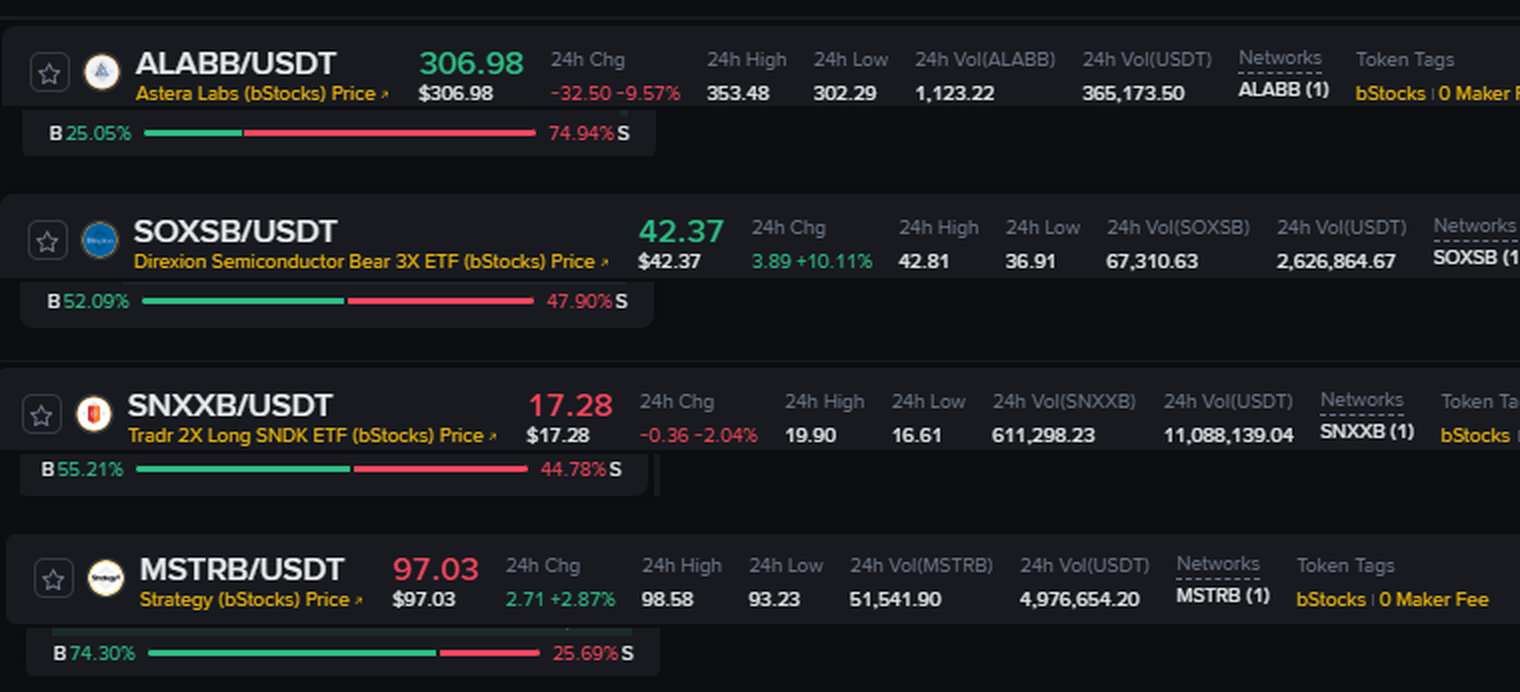
I removed four bStocks at 14:50, one moment.
$ALABB : B 25.05% - change -9.57%
SOXSB: B 52.09% - change +10.11%
SNXXB: B 55.21% - change -2.04%
$MSTRB : B 74.30% - change +2.87%
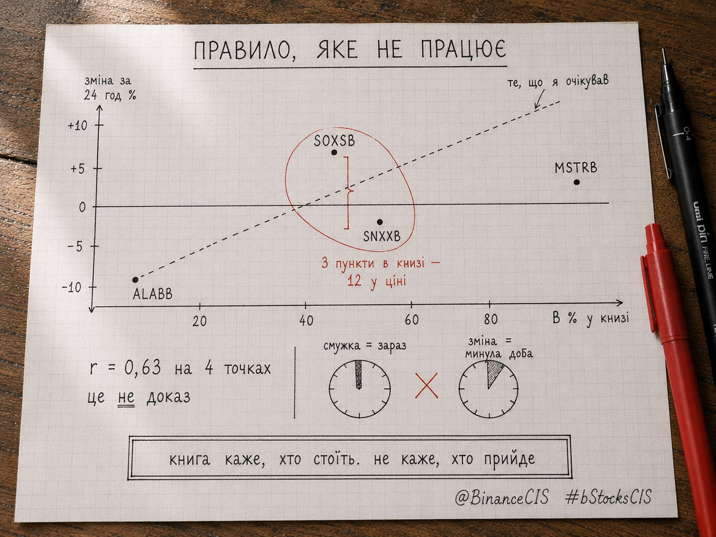
At the edges the rule works. The fewest buyers are in ALABB, and it fell the deepest. The most is in MSTRB, and it’s up.
Now the middle.
SOXSB and SNXXB are almost the same: 52.09% versus 55.21%, a 3-point difference.
Daily change: +10.11% versus -2.04%. A 12-point difference.
Three points in the book and twelve in price. The rule explains nothing here.
Correlation across four points r = 0.63. It seems there’s a link, but with such a small sample it proves nothing.
Here’s where I was wrong. The strip shows the book right now, in this second. The 24-hour change shows what has already happened. I compared the current slice with the previous day and expected one to explain the other.
Practically: read the strip as the queue status at this moment, not as a forecast.
Limitations: four tickers, one slice. To draw a conclusion, you need dozens of measurements on different days.
The book tells you who is standing there right now. It doesn’t tell you who will come.
@BinanceCIS #bStocksCIS
The strip shows the share of buy orders versus sell orders in the visible order book. Logic: more buyers — price goes up.
I removed four bStocks at 14:50, one moment.
$ALABB : B 25.05% - change -9.57%
SOXSB: B 52.09% - change +10.11%
SNXXB: B 55.21% - change -2.04%
$MSTRB : B 74.30% - change +2.87%
At the edges the rule works. The fewest buyers are in ALABB, and it fell the deepest. The most is in MSTRB, and it’s up.
Now the middle.
SOXSB and SNXXB are almost the same: 52.09% versus 55.21%, a 3-point difference.
Daily change: +10.11% versus -2.04%. A 12-point difference.
Three points in the book and twelve in price. The rule explains nothing here.
Correlation across four points r = 0.63. It seems there’s a link, but with such a small sample it proves nothing.
Here’s where I was wrong. The strip shows the book right now, in this second. The 24-hour change shows what has already happened. I compared the current slice with the previous day and expected one to explain the other.
Practically: read the strip as the queue status at this moment, not as a forecast.
Limitations: four tickers, one slice. To draw a conclusion, you need dozens of measurements on different days.
The book tells you who is standing there right now. It doesn’t tell you who will come.
@BinanceCIS #bStocksCIS