In the header of the page, two digits hang there that I read separately for a month. It turned out they need to be divided.
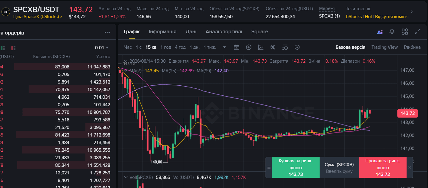
I opened $SPCXB and pulled the volume for the day:
158 557,50 SPCXB
22 654 400,34 USDT
I divided:
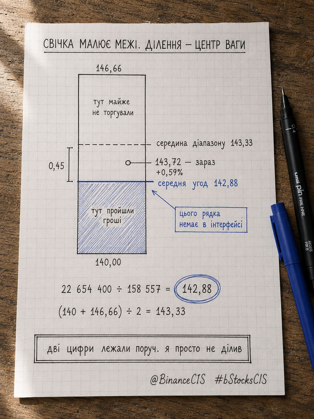
22 654 400 ÷ 158 557 = 142,88
This is the average price of all trades for the day. Not the middle of the candle and not the price at which the money actually passed.
Current: 143,72
(143,72 − 142,88) ÷ 142,88 = 0,59%
The average participant for the day is up by 0,59%.
But what came next was more interesting.
Range for the day: 140,00 - 146,66
Midpoint: (140 + 146,66) ÷ 2 = 143,33
The real average is 142,88. That’s 0,45 lower.
Most of the money went through below the candle’s midpoint. The upper half of the range looks just as solid on the chart, but they traded there much less.
Here’s where I was wrong. I read the range as an area where the market was. In reality, it shows the extreme points—not where the volume stood. The candle draws the boundaries. Division shows the center of mass.
Practical: if the price is higher than 142,88, then those who entered are in profit.
If it breaks down below it, most of the day will be in the red, and on the rebound a seller will appear.
Limitations: this is an average by volume, not by people. Someone both bought and sold within the day. The number doesn’t tell who still holds—only where the bulk of the volume passed.
The two digits were lying next to each other the whole time. I just wasn’t dividing them.
@BinanceCIS #bStocksCIS
I opened $SPCXB and pulled the volume for the day:
158 557,50 SPCXB
22 654 400,34 USDT
I divided:
22 654 400 ÷ 158 557 = 142,88
This is the average price of all trades for the day. Not the middle of the candle and not the price at which the money actually passed.
Current: 143,72
(143,72 − 142,88) ÷ 142,88 = 0,59%
The average participant for the day is up by 0,59%.
But what came next was more interesting.
Range for the day: 140,00 - 146,66
Midpoint: (140 + 146,66) ÷ 2 = 143,33
The real average is 142,88. That’s 0,45 lower.
Most of the money went through below the candle’s midpoint. The upper half of the range looks just as solid on the chart, but they traded there much less.
Here’s where I was wrong. I read the range as an area where the market was. In reality, it shows the extreme points—not where the volume stood. The candle draws the boundaries. Division shows the center of mass.
Practical: if the price is higher than 142,88, then those who entered are in profit.
If it breaks down below it, most of the day will be in the red, and on the rebound a seller will appear.
Limitations: this is an average by volume, not by people. Someone both bought and sold within the day. The number doesn’t tell who still holds—only where the bulk of the volume passed.
The two digits were lying next to each other the whole time. I just wasn’t dividing them.
@BinanceCIS #bStocksCIS