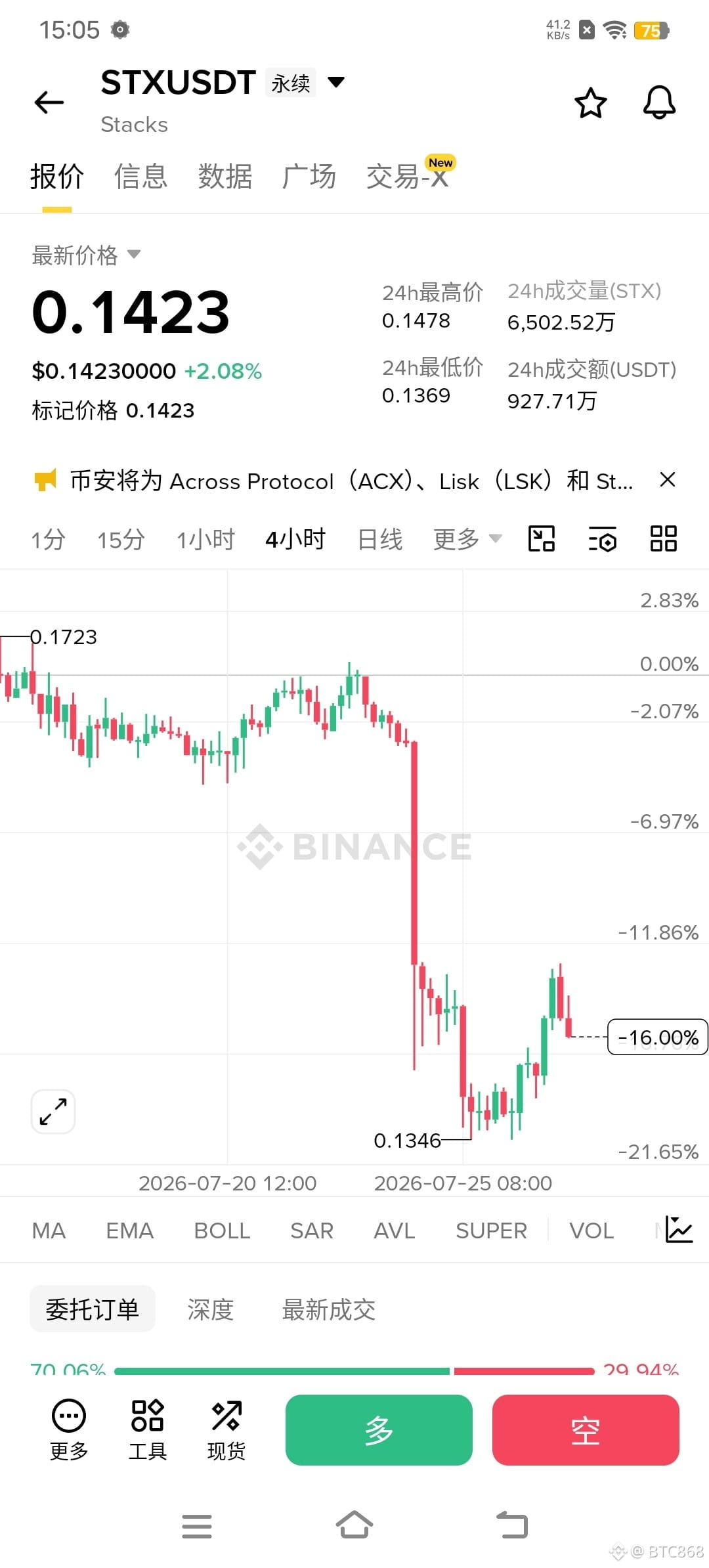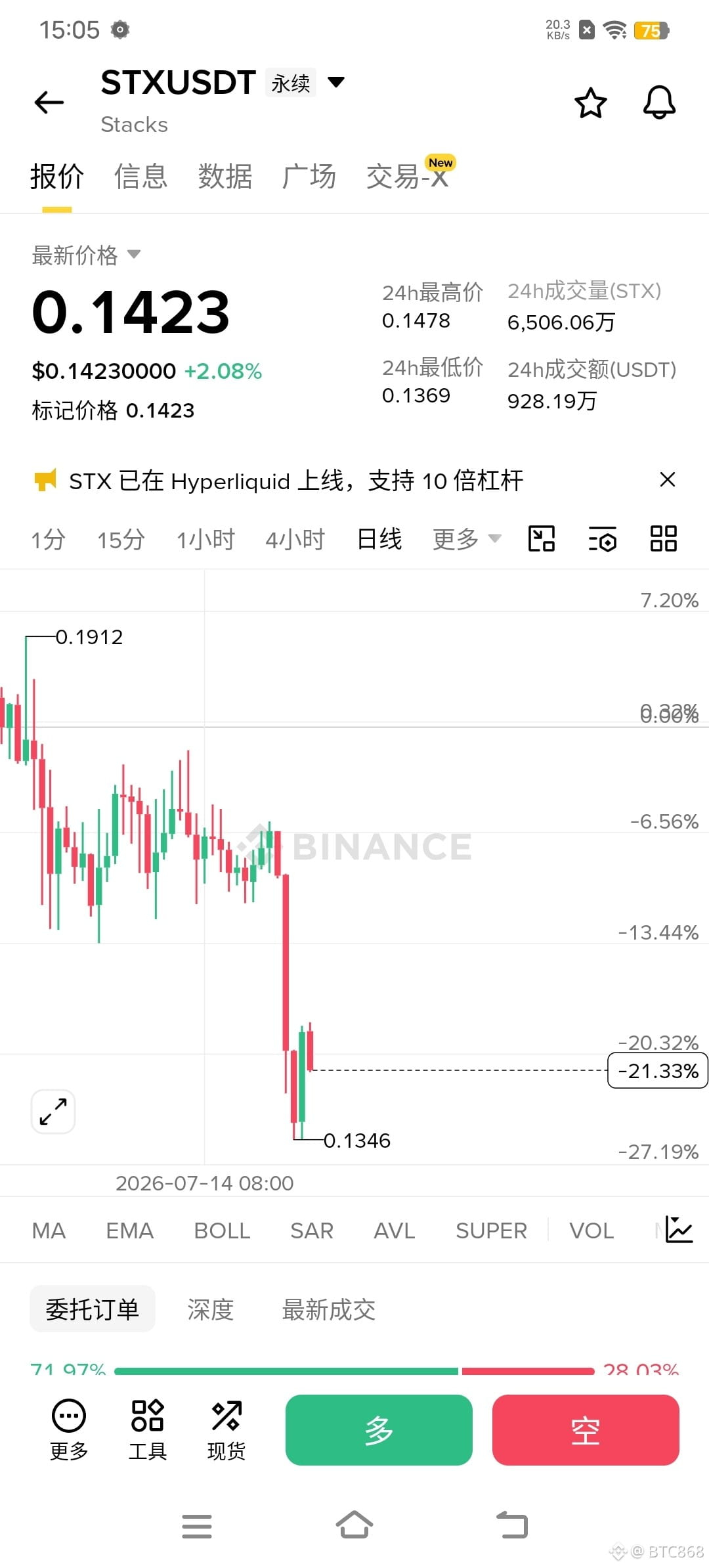
You look for yourselves—does this daily chart look right? On the four-hour chart, starting from the fourth-to-last candle at 0:00 on the 27th, so right now the daily chart should at least have a long upper shadow. After messing around for all this time, are they saying the daily chart is showing a fake picture?