


MACD is a trend-following indicator that consists of the long-term moving average MACD, the short-term line DIF, red energy bars (bullish), green energy bars (bearish), and the O axis (the dividing line between bullish and bearish). It uses the crossover of the short-term moving average DIF and the long-term moving average MACD as a signal. Below, Xidan will share the wonderful applications of the MACD indicator: the 'Sell when not golden' method and the 'Buy when not dead' method!
The 'Sell when not golden' method applied to several major indicators:
Golden Cross: It means that a shorter-term moving average crosses above a longer-term moving average, and if both moving averages are trending upwards, this combination of moving averages is called a 'Golden Cross.'
Death cross: The opposite of the golden cross is the death cross, but if the long-term moving average is downward or slowing while the short-term moving average crosses upward, it cannot be called a golden cross; the same applies to death crosses.
MACD 'will gold not gold' selling method:
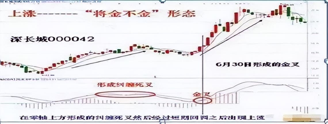
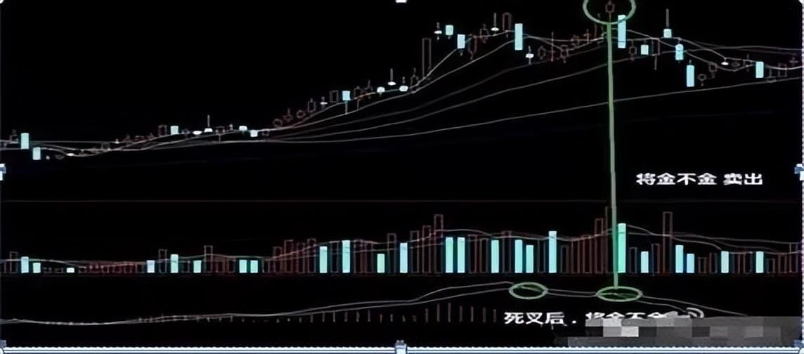
It is common knowledge that when the two curves of the MACD indicator form a golden cross, the stock price will rise. However, sometimes after the two curves of the MACD form a high position death cross, the stock price may also rise, and sometimes it will reach new highs. This is like when a train is running at high speed; it can't stop immediately after applying the brakes; the huge inertia will cause the train to continue moving forward for a distance before it stops.
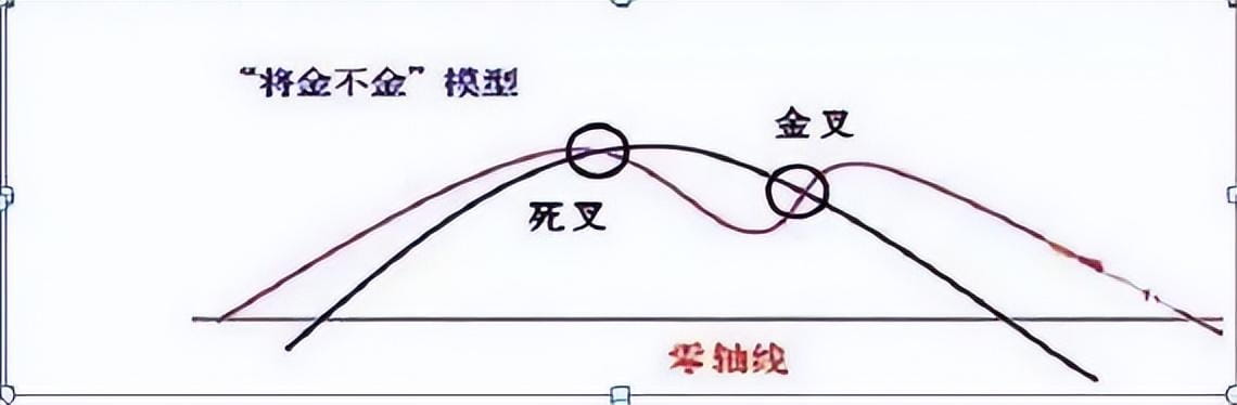
After the MACD two curves form a death cross and give a sell signal, the stock price continues to rise, just like the inertia of a train pushing forward. This is the inertia effect of the formed upward trend and the final surge of an upward market. As the stock price continues to rise with inertia, the high position death cross will lead to a slight upward turn of the DIF, and the MACD will soon form a golden cross (not yet formed), and then the DIF will turn downward again, forming the 'will gold not gold' pattern. When the MACD two curves form the 'will gold not gold' pattern, a new round of decline is expected in the market.
Using the high-precision golden cross signal to buy:
The MACD fast line DIF crosses the DEA slow line from below to above, and the MACD changes from green bars to red bars, indicating that the stock price starts to rise from a decline, signifying the beginning of a bullish market.
Golden cross 1: When the white line DIFF and the yellow line DEA are both running below the zero axis, when the white line crosses above the yellow line forming a golden cross, it indicates that the market will strengthen, at which point investors can buy the individual stock.
Golden cross 2: When both the white line and the yellow line are operating below the zero line, and when the white line crosses the yellow line above the zero axis, it indicates that the individual stock enters a bullish market, and investors can add positions at this point, which is highly reliable.
Golden cross 3: When the yellow line and the white line are both operating above the zero line, DIFF breaks upward through DEA to form a golden cross, indicating that the stock price will rise again, at which point investors can add positions to buy.
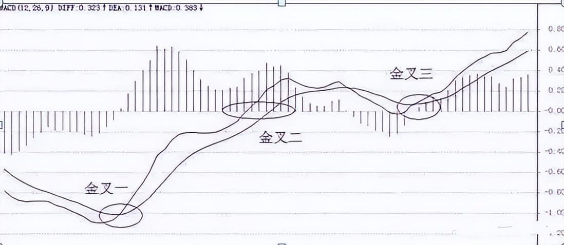
(1) When a MACD golden cross appears below the zero axis, it is considered a weak golden cross; such a golden cross is not so strong and may only result in a short-term rebound, and the trend shift cannot be determined. Therefore, it is not advisable to blindly enter the market at this time.
(2) When the yellow and white lines cross above the zero axis, it forms a golden cross, similar to the golden cross above the zero axis, indicating that the market has entered a bullish market.
(3) When both the yellow and white lines are above the zero line, it indicates that the market is in a bullish state. When DIFF breaks upward through DEA, it is a buying opportunity.
Using the high-precision death cross signal to sell:
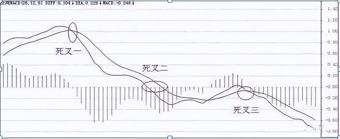
Death cross: MACD death cross refers to the DIF fast line crossing down through the DEA slow line, and the MACD bars change from red to green, indicating that the stock price changes from rising to falling, signifying the start of a bearish market. Depending on the position of the death cross and its relationship with the zero line, it can be divided into death cross above zero and death cross below zero.
Death cross 1: When DIFF breaks downward through DEA to form a death cross while running above the zero axis, it indicates that the market may enter a weak market, and the stock price will adjust, signaling a sell.
Death cross 2: When both DIFF and DEA are above the zero line, and both cross below the zero axis, it indicates the arrival of a bearish market, and investors should exit promptly.
Death cross 3: When both DIFF and DEA are below the zero line, and DIFF breaks down through DEA, it indicates that the stock market is in a weak market, and the stock price will continue its previous downtrend.
Explanation of MACD 'will die but not die':
Pattern Meaning
This is when the DIFF line receives support from the DEA line. When the DIFF line running above the DEA line retraces near the DEA line, it is supported by the DEA line and moves upward again. It indicates that the market's upward momentum remains dominant and will exert force again, leading to another wave of price increase. You can buy when the DIFF line rises again.
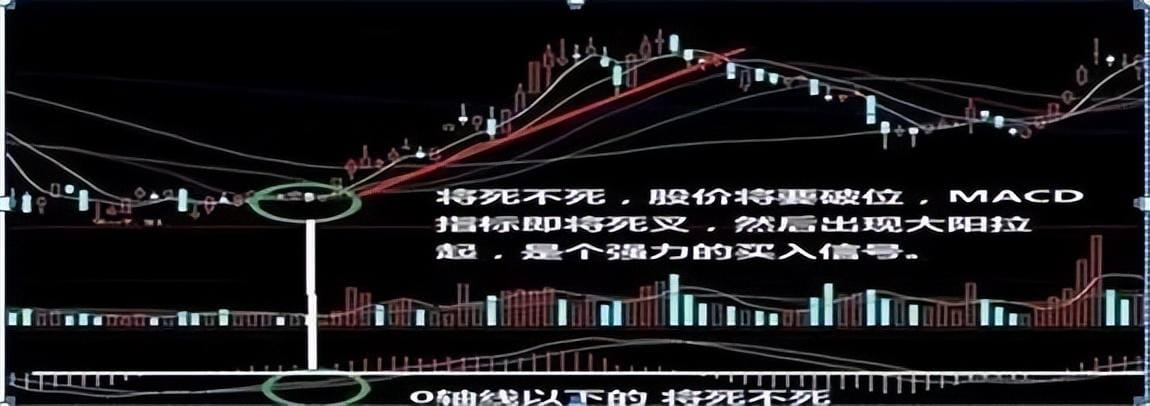
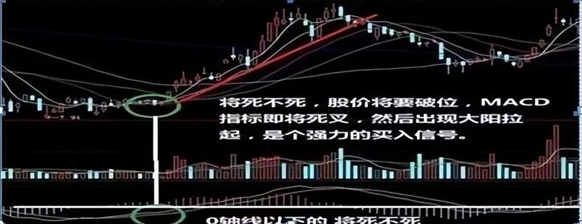
① The MACD 'will die but not die' buy signal has different market significance when it appears below the zero line and when it appears above the zero line. When the MACD 'will die but not die' buy signal appears below the zero line, the stock price is still running below the 60-day moving average. Therefore, when the MACD 'will die but not die' buy signal appears below the zero line, it can initially be viewed as a rebound.
When the MACD 'will die but not die' buy signal appears above the zero line, the stock price is already running above the 60-day moving average. Thus, it is evident that the MACD 'will die but not die' buy signal appearing above the zero line is a sign of strength, allowing for active buying, especially when the MACD 'will die but not die' buy signal first appears near the zero line.
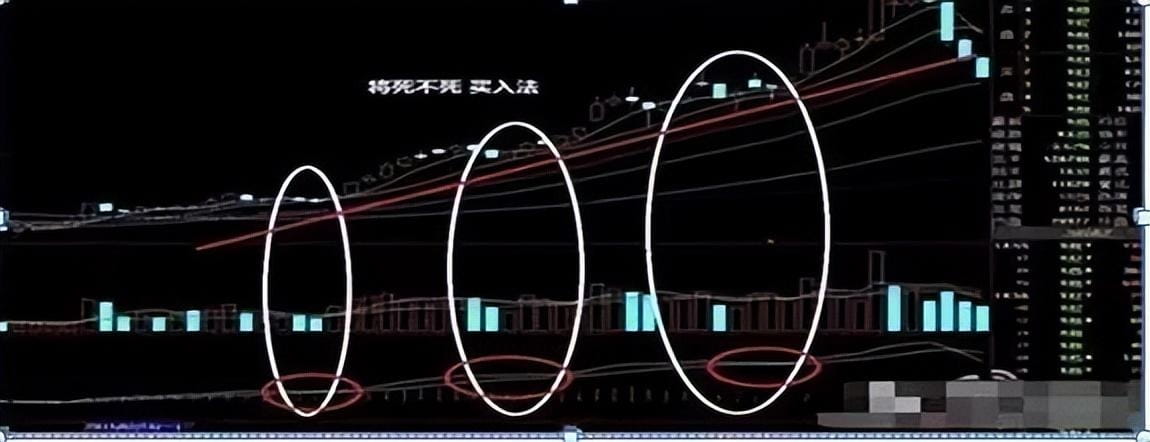
Due to the close correlation between MACD and the 60-day moving average, some market professionals consider the 60-day moving average as the 'stock price take-off line,' which makes sense. When the MACD shows the 'will die but not die' buy signal above the zero line, if the DIF opens upward on that day, and if some stocks have a trading volume less than the 5-day average volume, in such cases, to avoid missing out, aggressive investors may initially make a small exploratory buy, and increase their positions when the trading volume exceeds the 5-day average volume on that day. As shown in the figure:
② When a bullish arrangement forms at the 20-day, 120-day, and 250-day moving averages, and the stock price is supported by the 20-day moving average, if the MACD shows the 'will die but not die' buy signal above the zero line, the upward momentum is stronger, making it a winning 'secret weapon' for selecting strong stocks in a bullish market.
③ 'Things don't happen three times.' When MACD continuously shows the 'will die but not die' buy signal three times, one should be wary of the appearance of a top. As shown in the figure:

When the two curves of the MACD have the same values, just touching or the two curves are very close to forming a death cross (not yet crossed), and then the DIF opens upward, the red bar lengthens again. This is a good opportunity to re-enter the stock. The MACD 'will die but not die' buying method must also meet the following conditions: on the day the stock price just breaks through the 20-day moving average or is already running above the 20-day moving average, a bullish candlestick appears. The trading volume on that day must be greater than the 5-day average volume, and the 5-day average volume must be greater than the 10-day average volume.
In fact, this is also discussing the 'golden cross' that comes after the 'death cross.' After the stock price has undergone a long-term rise, a death cross forms at the top, and then it does not immediately fall but instead undergoes consolidation, then forms a golden cross again. This scenario cannot be too certain.
Case analysis: As shown in the figure
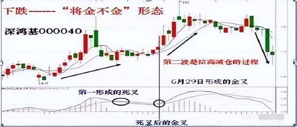
1. Using the method of buying with two golden crosses at low positions with MACD:
In actual use, investors may feel that if they completely follow the golden cross to buy and death cross to sell, it is difficult to profit or may even lead to losses. Therefore, a method of buying with two golden crosses at low positions can be used, as shown in the figure.
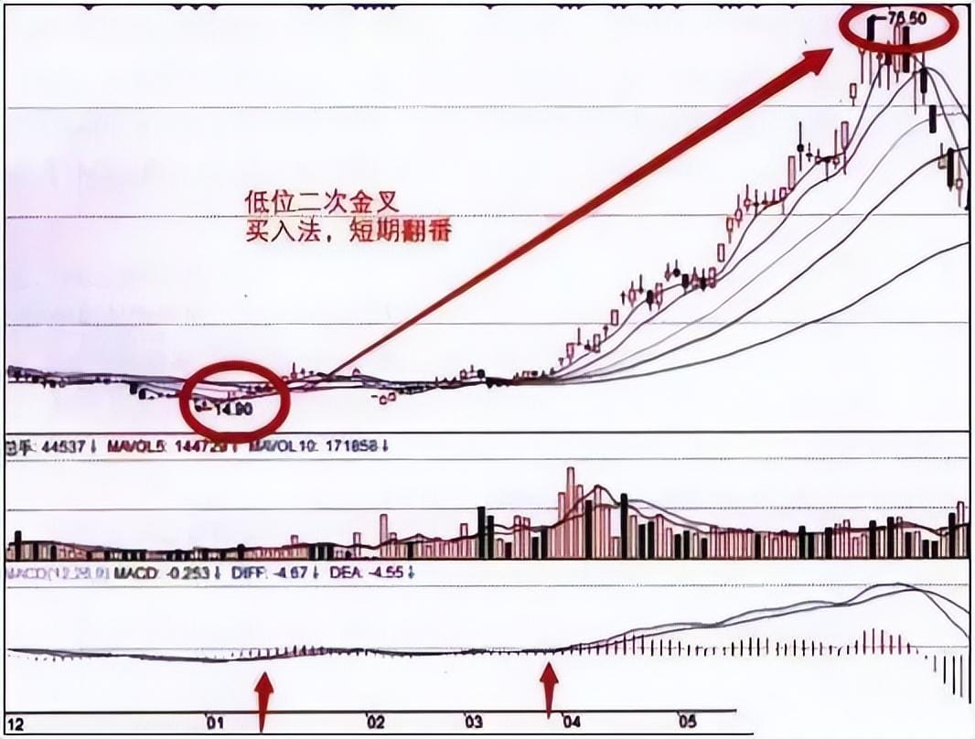
(1) Whether the divergence breaks through previous high (low) levels.
(2) At high positions, as long as there is a possibility of a top divergence, it is generally advisable to sell, avoiding the risk of a rebound unless a large bullish candlestick or limit up occurs.
(3) This is an excellent method for finding short-term buy and sell signals, with a short-term amplitude exceeding 15%, but the medium-term trend should be analyzed in conjunction with long-term patterns and others.
2. Using MACD to capture the best sell signals:
It means that after a significant price surge, the stock price enters a consolidation phase, forming a relative high point. Investors, especially those with substantial capital, must sell at the first sell signal or reduce positions. The technique for determining the validity of the first sell signal is to observe horizontal consolidation in stock price and sell when MACD forms a death cross, as shown in the figure.
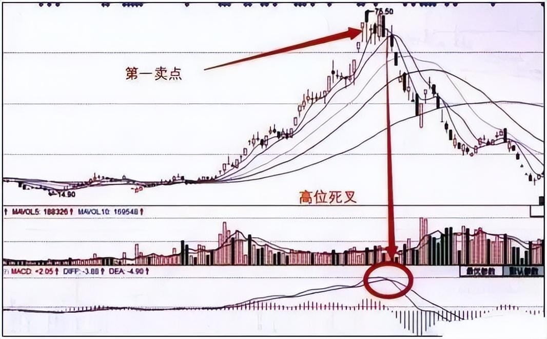
After the first sell signal forms, some stocks do not experience a significant drop but instead pretend to break upward after a pullback to conceal distribution. The bullish main force makes a final push before distribution, also known as a fake upward surge. The high point formed at this time often becomes the peak of a bull market, hence also referred to as the absolute peak. If one cannot exit smoothly at this point, the consequences could be dire.
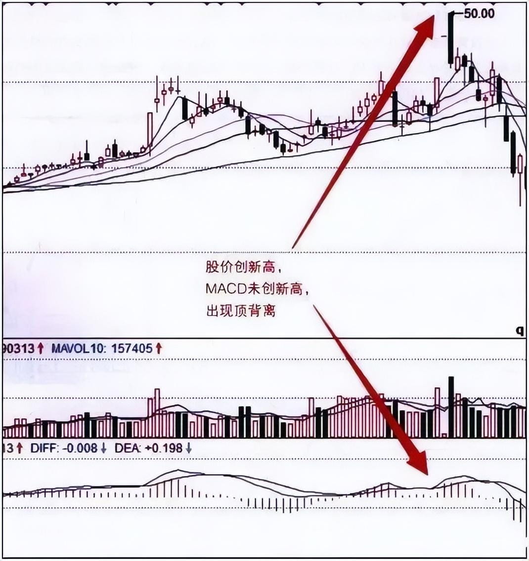
The technique for determining the absolute peak is to sell when the price and MACD show divergence, that is, when the stock price experiences a fake upward surge to create a new high, but the MACD fails to sync with a new high, causing a divergence in the movements of the two, which is a clear signal that the stock price has peaked. It indicates that when selling stocks at the absolute peak, one must not wait until the MACD forms a death cross before selling, as the stock price would have already declined considerably by that time. When selling stocks at the peak of a fake surge, reference to the candlestick pattern is essential.
3. MACD peak divergence to escape the top:
After the peak divergence, if the stock price's high points are decreasing, it is necessary to sell the stock.
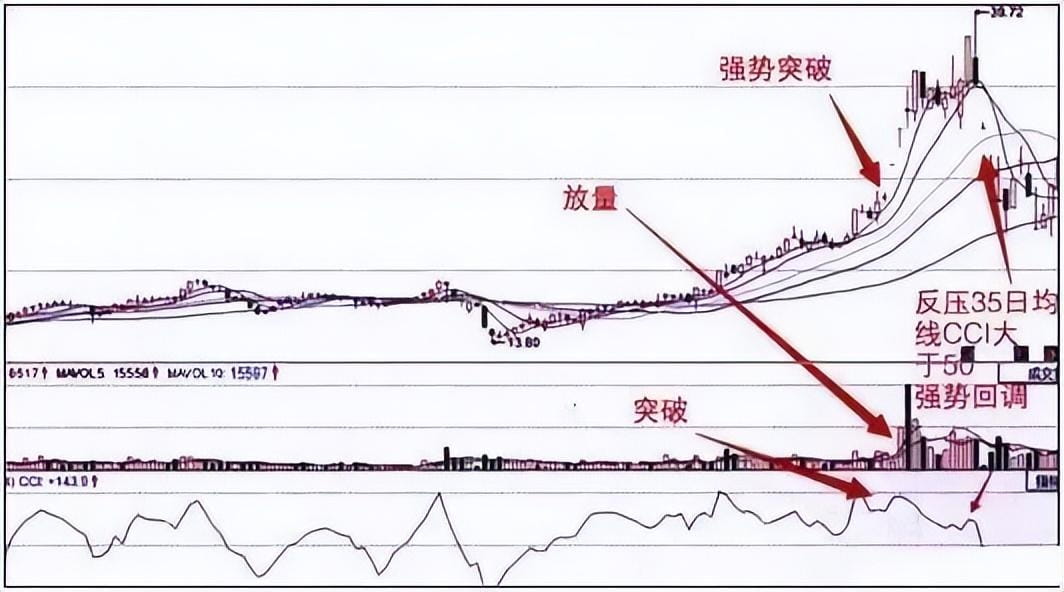
4. Combined judgment on sell signals:
When the high position 5-day moving average and 10-day moving average form a death cross, MACD death cross, high trading volume with bearish movement, and other pattern combinations appear, a comprehensive analysis of the technology is required, as the success rate will be higher. If a particular stock shows such sell signal information at several technical points, it should be taken seriously.
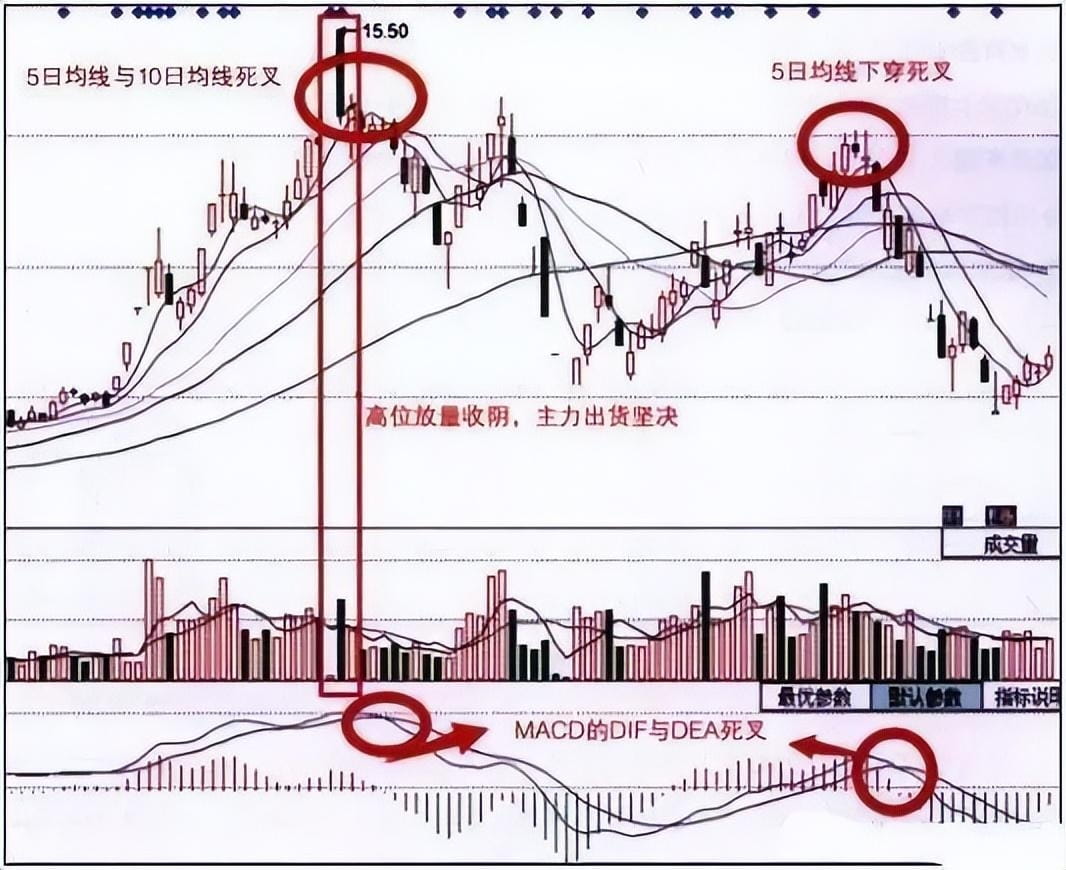
Retail investors should pay attention to the four key principles of MACD:
1. The 30-day moving average changes from a decline to a flat or upward turn, and the 5-day, 10-day, and 30-day lines ideally present a bullish arrangement.
2. Trading volume gradually expands from shrinkage; the trading volume on that day should ideally be greater than the average trading volume of the previous five days.
3. The shorter the red bar of the first MACD turning red, the better, preferably running below a horizontal line above the zero axis.
4. The best daily K-line for the stock is just breaking through the 30-day moving average or is running above the 30-day moving average.
When using the MACD indicator, the following points should be noted:
1. The MACD indicator's most significant characteristic is its high stability, providing relatively stable buy and sell signals over a longer period.
2. The biggest disadvantage of the MACD indicator is that its signal is too slow. The MACD indicator at the daily level is not suitable for short-term operations.
3. When in a medium to long-term uptrend or downtrend, investors find the MACD indicator to be relatively effective.
Although the MACD indicator is extremely simple, there are still very few investors who can use it to the fullest extent. In the stock market, everyone still needs to strengthen their own learning; only by mastering more comprehensive and professional investment techniques can one make profits in the stock market.
Ultimately, using the aforementioned 'dumb' method, whether you earned 8 million depends not only on the amount of your investment but also on which bull market you managed to catch.
Today's stock trading tips are shared here. Wang Zhanfu will explain stock selection techniques tonight, how to find good stocks that can continuously hit the limit up, helping everyone learn a suitable profit model. Trading stocks is not just about a few simple codes; more importantly, it involves logical thinking behind them. I hope the experiences I share can help everyone avoid detours.
Learning is a process; please do not rush for success to avoid paying a huge financial price in the future and having to start all over again.
A single tree cannot form a boat; a lonely sail cannot travel far! In this circle, if you do not have a good circle and lack first-hand news from the cryptocurrency circle, it is recommended to follow Lao Wang, who will guide you to get on board for free. Welcome to join!!!$BTC $ETH