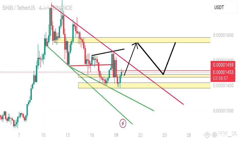
To understand the currency chart practically, you need to focus on three main elements: price movement -- time -- volume.
First, look at the type of chart being used, whether it is candles, lines, or bars. Candlestick charts provide more details about market behavior. Each candle represents a specific time period and shows the opening and closing prices, as well as the highest and lowest points during that period.
Start by determining the overall trend: whether it is upward, downward, or sideways. Look at how the price moves from left to right. If the price is gradually rising, the trend is upward; if it is falling, the trend is downward; if it moves within a narrow range, the market is fluctuating.
Then observe the peaks and troughs. Rising peaks indicate a continuation of the uptrend, while falling troughs indicate a continuation of the downtrend. If the peaks and troughs are at the same level, the market is in a state of fluctuation.
Look at the support and resistance areas. Support is the level from which the price bounces upward, and resistance is the level from which the price bounces downward. When the price breaks one of these levels, it often continues in that direction.
Watch the trading volume. If high volume is available during a breakout, it gives credibility to the move. If the volume is weak, the breakout may be false.
Follow reversal candles like the hammer or bullish engulfing, as they provide signals for a change in direction, especially if they appear at support or resistance areas.
Don't forget to compare the current movement with the previous movement. See how the price behaved under the same circumstances before. Did it bounce back? Did it continue? Did it fluctuate? This gives you an idea about market behavior.
If you understand these points, you can read any currency chart and determine entry and exit opportunities practically without complication.