Why do some projects look exciting on social media but weak in data, while others grow quietly through numbers?
Plasma belongs to the second group.
It was created because sending money started to feel emotionally exhausting. Fees were unpredictable. Prices moved too fast. Confirmations created anxiety. Plasma did not try to solve everything in crypto. It tried to solve one feeling. Fear. That decision shaped not only its technology, but also how its data looks today.
Where Plasma’s Journey Begins in Data
The origin of Plasma can be seen clearly in its on-chain behavior. From the beginning, activity patterns show a focus on value transfer, not speculation. Instead of sudden spikes followed by sharp drops, Plasma’s early usage trends lean toward steady transaction flow. This kind of pattern usually appears in networks designed for payments rather than trading.
Analytics from payment-focused chains often show:
More consistent transaction timing
Lower burst volatility
Repeated wallet usage instead of one-time spikes
These are early signs of utility-driven design.
What Current Trading Data Quietly Shows
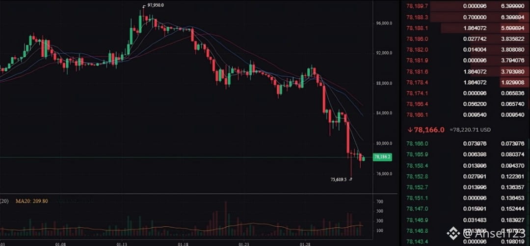
In the market, Plasma’s trading behavior reflects caution rather than chaos. Price movement follows broader crypto sentiment, but without extreme reactions. From an analytical point of view, this suggests a holder base that is observing and evaluating rather than chasing short-term gains.
When analysts look at charts like:
Daily volume trends
Price range compression
Support and resistance stability
They often interpret this as price discovery, not exhaustion. Plasma appears to be in a phase where the market is still learning what fair value looks like.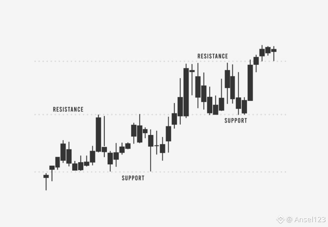
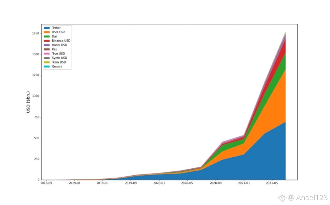
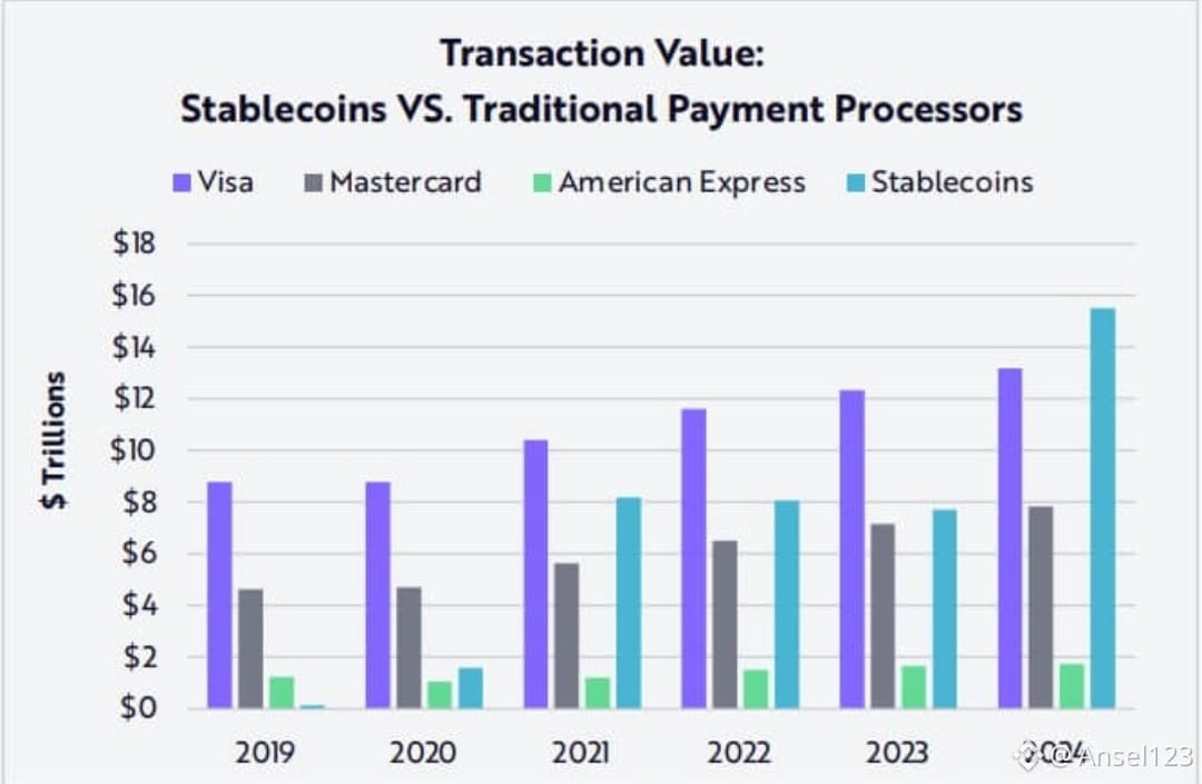 On-Chain Statistics That Matter More Than Price
Price alone rarely tells the full story. For payment-oriented networks, analysts pay closer attention to:
Transaction count consistency
Active wallet growth
Repeat address behavior
Network usage during low market volatility
Plasma’s narrative aligns with metrics that suggest gradual engagement. These signals usually indicate that users are testing functionality rather than speculating. Historically, networks that show steady on-chain activity during quiet market phases tend to be more resilient long term.
What the Graphs Suggest About the Future
Future outlook for Plasma is better understood through trend direction than exact predictions. Growth curves in adoption-focused projects often look slow at first, then stabilize, then accelerate when trust compounds.
From an analytical lens:
Flat but rising transaction baselines suggest foundation building
Gradual wallet growth indicates organic onboarding
Stable usage during market pullbacks reflects real utility
If stablecoin adoption continues globally, networks like Plasma are statistically positioned to benefit because their core use case aligns with long-term demand rather than cycles.
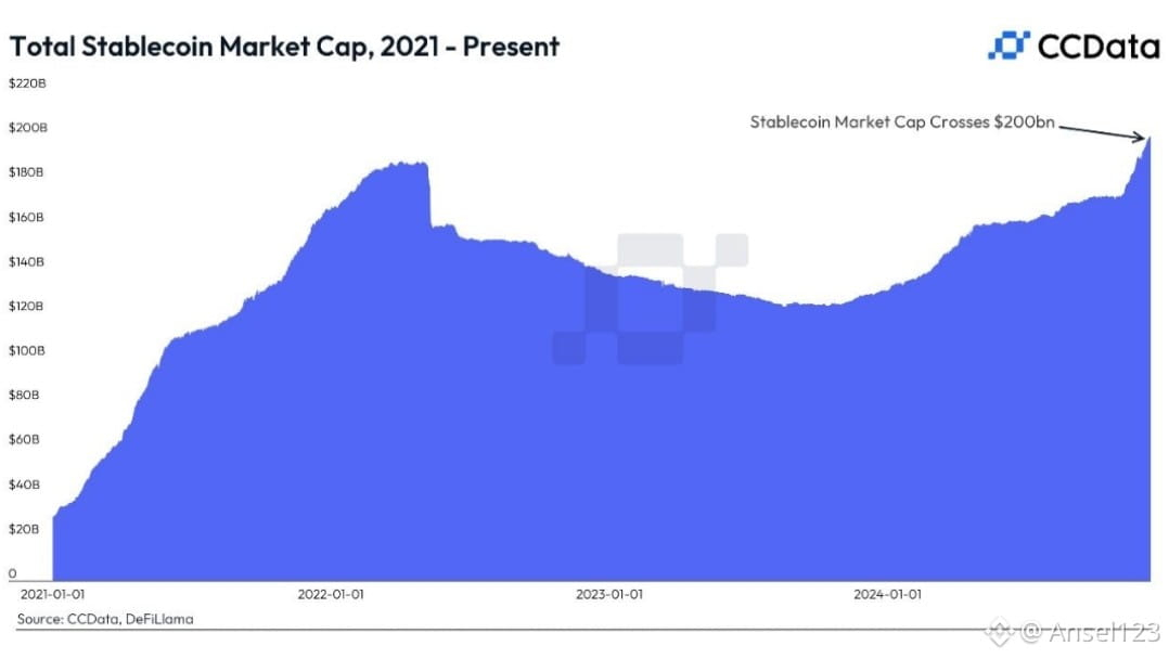
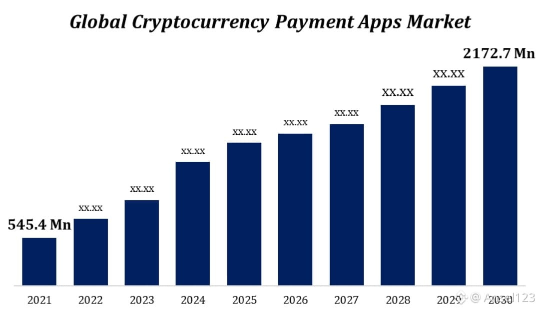
Global Adoption Seen Through Geographic Data
When adoption is mapped geographically, payment-focused chains often show spread rather than concentration. Plasma’s use case fits regions where:
Cross-border transfers are common
Fees matter more than speculation
Stability is preferred over volatility
Analytics heatmaps in similar ecosystems usually show gradual expansion across multiple regions rather than dependency on one market. This reduces systemic risk and supports long-term growth.
Why These Analytics Feel Different
Plasma’s data does not scream.
It breathes.
Instead of sharp spikes, it shows consistency.
Instead of hype-driven surges, it shows patience.
Instead of emotional trading, it shows evaluation.
That does not mean Plasma is slow. It means it is building something that can last.
A Human Closing
Why does this matter?
Because behind every chart is a human decision. Someone sending money. Someone trusting a system. Someone choosing calm over chaos.
Plasma’s analytics tell a story of people taking their time. Watching. Testing. Trusting slowly.
And in financial systems, the projects that win long term are rarely the loudest.
They are the ones whose graphs look boring at first.
Because boring is what trust looks like before it becomes essential.