



A breakout pushed up by leverage crashes into an invisible cost wall
Data timestamp: late September 2026. This article is a plain-text version of the main body. All specific figures, breakdowns, and charts have been compiled into five accompanying information infographics for readers to follow along with visuals and text.
Opening: One number, two versions
In mid-September, on a single trading day, Bitcoin’s spot ETF saw its largest net inflow of the year in one day. Many media outlets framed it as proof that “institutions are back,” and Bitcoin was pushed to its highest level since the start of the year.
But on the very same day, another data provider’s reported net inflow figure was nearly 40% lower than the mainstream measure. On the same trading day, two authoritative sources differed so widely that it was equivalent to the scale of a mid-sized fund.
This may not be anyone forging anything; it could just be different statistical definitions. But what I truly want to say is that the gap between these two numbers is exactly the truth of this whole market move: everyone agrees “someone is buying,” but nobody can explain what kind of money it is.
I went back and re-checked everything from the past two weeks—on-chain data, fund flows, holdings, and historical cycle data. The conclusion is crystal clear:
This breakout is real, but the texture is not good. What’s gone up is leverage and urgency, not institutional demand. And right now the price is exactly stuck in the middle of that wall where underwater capital is densest.
Below is my verification process and the evidence behind it—explained clearly in words.
1. What happened
First, make one thing clear: on that breakout day, the scale of the whole market liquidations and the scale of ETF inflows were comparable in magnitude.
This means that in the funds pushing price, forced liquidations (buy pressure created by squeezing shorts) and active allocation (institutional spot buying) are almost evenly matched. Any narrative attributing this rally entirely to “institutional demand” misses the other half.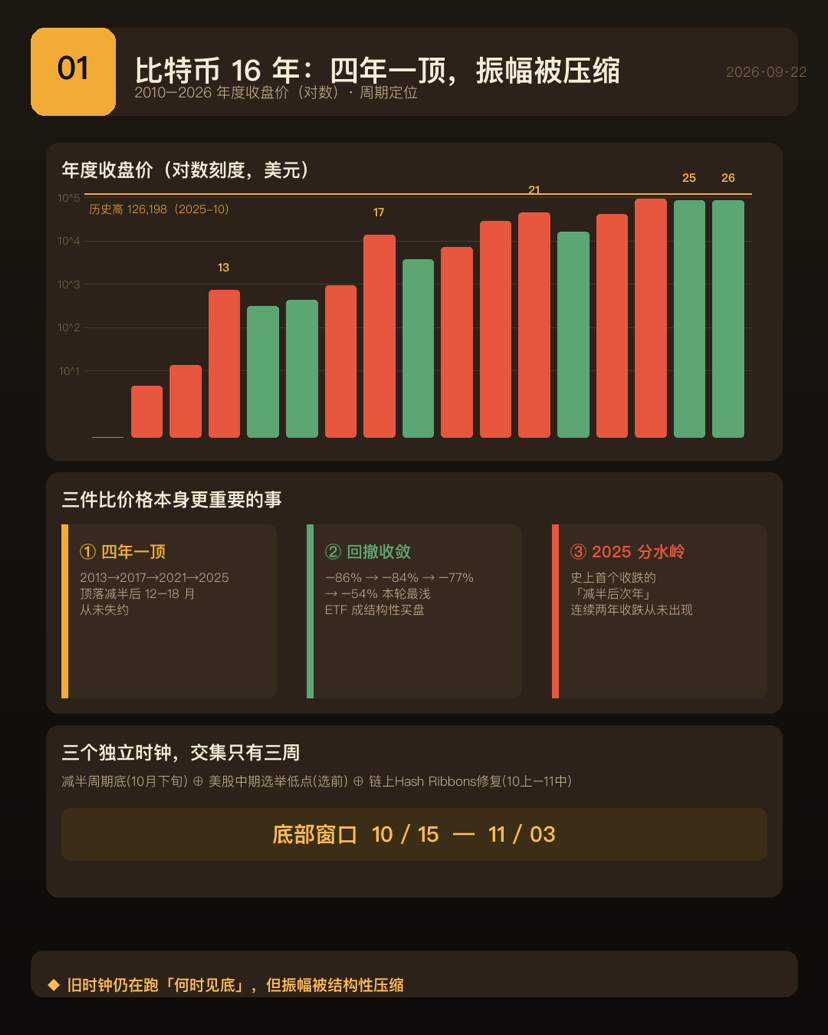
So this isn’t a bearish article. It’s a reminder: any report that only tells one side of the story is worth cutting its credibility in half.
2. Who is actually buying that net inflow?
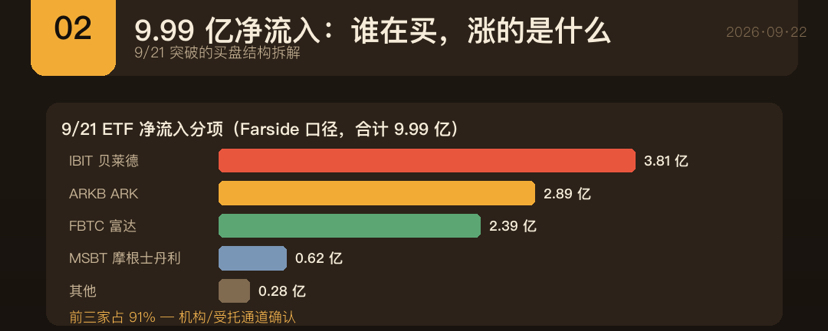
Based on itemized data, on the day, inflows were highly concentrated among a handful of issuers— the top three channels accounted for over 90%. Off-exchange, corporate treasuries are also increasing their holdings.
That means the buying base is indeed configured by institutions and delegated funds through a few large asset-management and brokerage channels—not retail chasing high in panic. This holds true.
But there are three deductions, and none can be missing.
First, volume doesn’t support this magnitude of rise. One analyst pointed out that the day’s total ETF trading volume relative to the price increase was rather mild. If there were sustained large capital sweeping purchases, volume wouldn’t be this calm.
Second, since the beginning of this year, ETFs overall are still net outflows. September inflows were less than half of the month before. That day’s inflow was the last day in a third consecutive day streak—“bleeding control,” not “trend reversal.”
Third, and most critical: the temperature-gauge indicator most directly representing U.S. spot demand turned negative again on the day the price climbed to high levels. It had already been negative for nearly a hundred straight days, and the seven-day moving average has been negative for more than four months. In other words, U.S. institutional spot demand has not confirmed this breakout.
3. Retail is frantic, and it’s using leverage
Another set of signals shows internal contradiction, but both are true: retail sentiment is extremely greedy, while retail wallets overall are still net distributing.
The explanation is that retail isn’t “hoarding,” it’s “chasing.” They buy as it rises and take profits as they buy. The characteristic of this behavior is leverage—and leverage is the fuel during drawdowns.
Here is the most worrying divergence of this round: retail investors are chasing wildly, while the indicator representing U.S. institutional spot demand has turned negative again. Historical experience repeatedly shows that when the two point in opposite directions, the former is usually not the winning side.
4. On-chain: stockpiles are hoarded; flows are distributed.
This is the set of phenomena that needs the most clarification in the entire piece, and is also the most commonly misquoted.
A commonly quoted line used as a bullish argument is: “The supply from long-term holders has reached a new high.” You need to reclaim half of this statement. The reason is that a substantial portion is simply exchange-held reserved coins that haven’t moved for a long time; under the statistical definitions, they’re mechanically reclassified as long-term holders. This isn’t someone actively hoarding—it's statistics aging out. Some researchers even argue this actually indicates that short-term demand is insufficient.
Remember this rule: look at aging for stock (inventory), and look at distribution for flows. That “new high in supply” is just on the books. The true money leaving comes from the direction of net outflows from long-term holders. The proportion of long-term holders taking stop-loss exits has been rising since the beginning of the year—from low levels to recent highs. The direction has already flipped.
5. That invisible wall
Regarding “underwater capital,” I must first correct myself. I initially called it “the biggest potential source of sell pressure on the rebound path,” but that was overstated—I take it back.
More accurately: it’s not a net unrealized loss amount; it’s the total size of the coins still in loss, valued at their respective purchase costs. This doesn’t contradict “most coins are in profit.” Much of the profitable chunk is dormant coin supply that hasn’t moved for years and has extremely low costs— it will never be sold. The truly loss-making part is the large lots bought near the top of the last bull market. Within this underwater capital, only a portion would actually sell; dormant coins, early creator addresses, and lost coins don’t create sell pressure.
Follow this logic down: the average cost of those underwater coins lines up exactly with the buyers around the top of the prior bull market. What it tells you isn’t “how much selling pressure there is,” but “where the wall is.”
And the position the price is currently in is exactly in the middle of that zone where costs are most concentrated: below, a batch of coins that has just recovered breakeven is the most recent wall; above, another batch of holdings represented by large ETF channels is still in overall unrealized loss—once the price returns near their cost lines, redemptions and profit-taking will show up.
So the corrected conclusion is: that huge underwater capital describes the “locked-in amount.” What will actually get dumped is only the active portion within it. And that portion’s cost-dense zone is exactly squeezing the current price in the middle.
6. Miners: the most abnormal line this round
If there’s anything in this round that’s unprecedented in history, it’s the miners’ side.
Network-wide computing power has seen a deep fall unseen for years, and the listed mining firms’ hashrate has dropped even faster than the network average. In the short term, this is actually a positive for the supply side—miners are reluctant to sell, and the coins flowing to exchanges are nearly exhausted—explaining why the price hasn’t fallen very deep.
The reason is structural: for the same unit of electricity, the revenue gap between leasing it to AI compute centers and using it for mining can be several times. The scale of compute-power retooling contracts already signed is enormous; although the capacity that truly generates revenue is still only a small fraction on paper. Several leading mining companies have already cut reserves significantly, and even plan to basically exit mining.
This leads to three transmission effects. First, compute power shifts from “reversible across cycles” to “partly irreversible.” In the past, you could shut down, watch the coin price rise, then come back online. This round’s electricity is locked in with long-term rigid leases, and capacity likely never returns. Second, the safety budget is shrinking— the next halving is when the real “bills come due.” Third, concentration is increasing: after listed miners exit, the share moves toward more opaque operators.
To gauge the actual impact on coin prices, look in three layers: short-term positive, medium-term neutral, and long-term the most underestimated change—miners are shifting from “longs on the coin price” to “landlords of electricity.” In future bear markets, the familiar bottom signal of “miners capitulating and dumping” may no longer appear, but the simultaneous disappearance of “miners holding back to prop up prices” will also happen.
Here’s another counterintuitive piece of good news: AI rent has kept these miners alive. One of the ignition points in the last systemic breakdown was the collapse of the asset-liability statements of miners and lending platforms. Now that miners have fixed rental income, the probability of systemic blowups is actually lower.
7. Historical coordinates: one peak every four years, but this time there are two differences
Looking at the annual price over a longer timescale, there’s one highly regular pattern: a top appears every four years, never missed. And all four tops fall 12 to 18 months after the halving.
But because the drawdown is tightening systemically, this round has been the shallowest bear market on record—directly related to ETFs becoming a structural buy.
What’s truly worth noting: the previous round was Bitcoin’s first ever “down close in the year after the halving,” while this year to date is still closing slightly down. Two consecutive years of down closes have never happened in Bitcoin’s history.
There’s plenty of hard evidence supporting “this round is different”: the shallowest drawdown, no systemic blowups, a sharp decline in volatility, and shifting pricing power from miners to ETF fund flows. But the cycle hasn’t died— the peak is still precisely 17 and a half months after the halving. The old clock is still working on “when we’ll bottom.”
More precisely: “different” means the amplitude is compressed, not the clock being canceled. The old clock is still running; only the magnitude has been structurally compressed. The downside shouldn’t be expected to come with imagination based on the deepest historical drawdowns, and the upside shouldn’t be expected to deliver the kind of ten-plus-times years seen in the early days. Both sides are blunted.
8. Institutional holdings: for every few bitcoins, one is in institutional hands
In terms of total amount, the bitcoins held in aggregate by institutions already make up a substantial portion of total supply. Spot ETFs and corporate treasuries are the absolute main force, and within these two categories the holdings are highly concentrated among a few giants—one ETF and one listed treasury company, each accounting for a few percentage points of total supply.
As for how much retail truly accounts for, this is the biggest definitional trap in the entire table. Two numbers can both be checked and they’re mutually consistent: one definition counts ETF and corporate treasuries as institutions, implying a low retail share; the other argues that the ultimate beneficiaries behind ETF shares are still retail, implying a high retail share. The only difference is whose money counts as ETF-related.
My view is: from the perspective of economic interests, ETFs are retail; from the perspective of control rights, they belong to institutions—because buying and selling is done by fund managers, and when retail redeems, they don’t themselves pick timing. When understanding who is driving this rally, the decision-rights framing is more explanatory.
There are three structural facts worth watching most: first, floating supply is shrinking systemically; second, corporate buy pressure continues to exceed new issuance—this is structural support for price, not sentiment; but third, concentration risk is extremely high, especially that listed treasury company with the largest stake—an indebted enterprise that relies on equity-price financing to stay alive, and is currently the most fragile link.
9. Bad events timeline: not three accidents, but a chain reaction
In the industry, those famous breakdowns need to be viewed separately by what they are: milestones versus bad events. For milestones: the halving, the first break above $1,000, the approval of spot ETFs, the first time exceeding 100,000, and the establishment of strategic reserves—these are turning points. For bad events: from early exchange bankruptcies and theft, to the biggest recent pyramid scheme, the collapse of algorithmic stablecoins, hedge fund liquidations, the shortfall in lending platforms, the bankruptcy of major exchanges, and recently the largest single cold-wallet theft in history.
But the key insight is this: that most severe round of cascading blowups wasn’t three independent accidents—it was a roughly half-year chain reaction. One project’s collapse dragged down a hedge fund, which then dragged down a lending platform, and finally detonated a top exchange. To understand crypto’s systemic risk, you have to trace the chain, not just look at isolated points.
10–11 early: resonance of three clocks
First correct a premise: that election was a midterm election, not a presidential election. It was a renewal of parts of the two chambers of Congress, and the template of price skyrocketing after a presidential win a few years ago doesn’t apply.
There are three models that are not related to each other, whose overlap falls in those three weeks from mid-October to early November: the bottom window inferred from the halving cycle, the trough front-loaded by patterns pointed to after the midterm election in U.S. stocks, and the price-repair range led by on-chain repair signals. And now, we’re standing inside that historical bottom window.
But the logic of “if uncertainty is eliminated, it will rise” has precise failure conditions. U.S. stocks do have that effect, and it’s strong—the driving mechanism is “uncertainty resolution,” not which party wins. But whenever it has failed, it’s been in years of Fed tightening— and this year we are in a rate-hike cycle. The pattern you’re betting on just happens to be the macro environment in which it historically failed.
A few technical deductions as well: election outcomes have largely been priced in by the market in advance, so that surge was likely part of the pre-game scenario—when it lands, the information content is close to zero. What is being removed is “who controls Congress,” but the policy direction itself could get worse. A midterm election can’t solve any macro problem—rate hikes, oil prices, and inflation are the main contradictions of this round.
On the legislative front, the core crypto regulatory bill in this round has effectively been shelved. The market’s reaction to legislative failure is actually a rise—legislative risk has long been priced in, and the market no longer cares about Washington. Meanwhile, another stablecoin bill has already become law, locking in the effective timeline; the election won’t change that.
11. One thing I must retract: the October effect is a trap
I once listed “October seasonality” as a bullish factor, but that was not rigorous enough—I take it back. Breaking down by quarters in bear years: historically, all the bear-year fourth quarters finish down, and the final lows are made from the fourth quarter to early the next year, and all are below the mid-year lows. In other words, historically, the mid-year low might not be the final bottom. People who dare to call for a bottom in October aren’t just casually talking bearish—they have model-based reasoning.
12. Scenario probabilities and an observation checklist
In the catalysts over roughly the next month, the biggest pressure point is the window for rate hikes, while the election and geopolitical variables are more like noise.
I divided scenarios through year-end into four tiers: the highest probability is a pullback with consolidation digestion; the next-highest is a breakdown and downside continuation; then a direct surge higher; and the smallest is systemic risk. As for the “shape” of the bottom, it won’t be the kind of deepest historical drawdown “last smash”—more likely it will grind out the bottom within a range, because there have been no blowups, no inventory collapse-style distribution, and the drawdown is only half as deep as the first two rounds.
I only look at three things: whether the temperature gauge for U.S. spot demand stays positive—this is the judge of “real buys or fake buys” by institutions; whether the just-breakeven coins underfoot are being digested or pushed back down; and whether compute power can return to the threshold that confirms the end of miner capitulation.
The conditions that would falsify my view are also clear: if it holds above key integer levels and ETFs post net inflows for multiple consecutive trading days, I’ll admit this is a trend reversal rather than a mere rebound. If key long-term moving averages are broken down effectively, this breakout is invalidated and the market reverts to the historical script.
Conclusion: what’s rising, and where it gets stuck
Condense the logic above into one sentence: the breakout day was pushed out by the dual engines of “urgent buy pressure” and “passive forced liquidations”—and neither has self-sustaining persistence. And the location it pushed the price to is exactly in the middle of that wall with the densest underwater capital. The miners’ side is net-bullish right now, but that bullishness comes from “permanent retooling,” and it won’t revert with the coin price.
This is not a bearish article. Multiple on-chain indicators all land in the early phase to mid-cycle portion, far from the historical top area—there are no top signals.
This is a reminder: this is a point in time when there’s a rapid surge over a short period, extreme greed in sentiment, and the position happens to be near the ETF cost line. This is the worst chase-high spot in terms of cost-effectiveness, and also the easiest place to make wrong decisions.
And the biggest risk, in my view, isn’t “down.”
It’s “a drop shallower than you think,” but you’ve been sitting in cash waiting for a price that would match the deepest historical drawdown—an old script that asks you to wait for a price that won’t come. This round’s pullback is only half as deep as the first two rounds, with no blowups, and the ETF is a structural buy that didn’t exist in the early years.
The most common mistake in this round is using an old map to find new territory.
Disclaimer: This article is a compilation and subjective interpretation based on publicly available data. The views represent subjective judgment rather than model output, and do not constitute investment advice. Crypto assets are extremely volatile; historical performance does not predict future returns. Please make an independent judgment based on your own risk tolerance, and if necessary consult a licensed professional institution.