

#etharium
etharium
345 views
17 Discussing
Hot
Latest

·
--
Bullish
#ETHETFsApproved
{future}(ETHUSDT)
#Etharium It will be worth $10,000 by 2030. 🤩 So buy it. Benefit in the future 😍💵🏬🚗
#ETHETFsApproved
#Etharium It will be worth $10,000 by 2030. 🤩 So buy it. Benefit in the future 😍💵🏬🚗
#Etharium It will be worth $10,000 by 2030. 🤩 So buy it. Benefit in the future 😍💵🏬🚗

1
8


·
--
Bullish
Most of the people lost their money due to greed and panic buying and selling. Here are some tips to increase your chances for profit.
1. Avoid buying at month ends.
2. Try to avoid or minimize investing in coins with no or valid mechanism.
3. Invest only in trusted coins like #ZECUSDT #solana #Etharium #btc #xrp and so on check the past performance and listing as well.
4. First two weeks of the month are best to make profit and exit the market.
Most of the people lost their money due to greed and panic buying and selling. Here are some tips to increase your chances for profit.
1. Avoid buying at month ends.
2. Try to avoid or minimize investing in coins with no or valid mechanism.
3. Invest only in trusted coins like #ZECUSDT #solana #Etharium #btc #xrp and so on check the past performance and listing as well.
4. First two weeks of the month are best to make profit and exit the market.
1. Avoid buying at month ends.
2. Try to avoid or minimize investing in coins with no or valid mechanism.
3. Invest only in trusted coins like #ZECUSDT #solana #Etharium #btc #xrp and so on check the past performance and listing as well.
4. First two weeks of the month are best to make profit and exit the market.
165

·
--
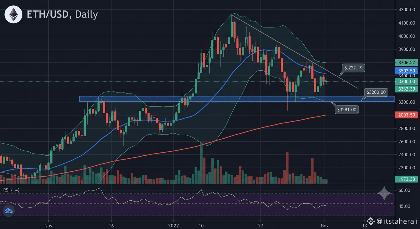
$ETH The Multi-Year Support Cluster ($2,800 - $3,000): This is the single most important zone on the chart.
Horizontal Support: The broad, shaded green zone represents major historical support dating back to previous market cycles. This is where demand has repeatedly stepped in.
200-Day Moving Average (Purple Line): This long-term trend indicator is perfectly converging with this horizontal support zone. When price meets the 200-DMA after a long time, it is usually a high-probability reversal area.
Technical Squeeze: Price is now squeezed tightly between this support cluster and an overhead descending trendline that has defined the correction.
Short-Term Resistance and Indicators:
Descending Trendline (Red Dash): This line, starting from the $4,800 peak, continues to cap all recovery attempts. A daily close above this line is required to invalidate the bearish correction structure.
Volume Profile: Volume has been generally declining during this consolidation phase, which is typical before a large, breakout move.
MACD (Lower Panel): The MACD histogram is showing declining bearish momentum (getting closer to zero), hinting that the selling pressure is exhausting itself at this critical support.
Outlook and Potential Scenarios:
The technical confluence at the $2,800 - $3,000 zone makes it a high-conviction area for a potential market reversal.
Bullish Breakout Scenario (The Washout and Recovery): The high-probability setup from this chart is that the current zone provides the platform for the next major leg up. If ETH can break above the overhead descending trendline (at roughly $3,400), it would trigger a strong 'V-shape' or 'Rounding Bottom' recovery, with initial targets back toward $4,000 and the all-time high.
Bearish Confirmation Scenario (The Breakdown): In the event of extreme negative market sentiment,
CrudeBrieflyFallsBelow$90
#BrentCrudeFallsAbout6%
#CXMTStarMarketIPORaises57.9BYuan
#WTICrudeFuturesFall8%
#ETH
#Etharium
{spot}(ETHUSDT)
$ETH The Multi-Year Support Cluster ($2,800 - $3,000): This is the single most important zone on the chart.
Horizontal Support: The broad, shaded green zone represents major historical support dating back to previous market cycles. This is where demand has repeatedly stepped in.
200-Day Moving Average (Purple Line): This long-term trend indicator is perfectly converging with this horizontal support zone. When price meets the 200-DMA after a long time, it is usually a high-probability reversal area.
Technical Squeeze: Price is now squeezed tightly between this support cluster and an overhead descending trendline that has defined the correction.
Short-Term Resistance and Indicators:
Descending Trendline (Red Dash): This line, starting from the $4,800 peak, continues to cap all recovery attempts. A daily close above this line is required to invalidate the bearish correction structure.
Volume Profile: Volume has been generally declining during this consolidation phase, which is typical before a large, breakout move.
MACD (Lower Panel): The MACD histogram is showing declining bearish momentum (getting closer to zero), hinting that the selling pressure is exhausting itself at this critical support.
Outlook and Potential Scenarios:
The technical confluence at the $2,800 - $3,000 zone makes it a high-conviction area for a potential market reversal.
Bullish Breakout Scenario (The Washout and Recovery): The high-probability setup from this chart is that the current zone provides the platform for the next major leg up. If ETH can break above the overhead descending trendline (at roughly $3,400), it would trigger a strong 'V-shape' or 'Rounding Bottom' recovery, with initial targets back toward $4,000 and the all-time high.
Bearish Confirmation Scenario (The Breakdown): In the event of extreme negative market sentiment,
CrudeBrieflyFallsBelow$90
#BrentCrudeFallsAbout6%
#CXMTStarMarketIPORaises57.9BYuan
#WTICrudeFuturesFall8%
#ETH
#Etharium
Horizontal Support: The broad, shaded green zone represents major historical support dating back to previous market cycles. This is where demand has repeatedly stepped in.
200-Day Moving Average (Purple Line): This long-term trend indicator is perfectly converging with this horizontal support zone. When price meets the 200-DMA after a long time, it is usually a high-probability reversal area.
Technical Squeeze: Price is now squeezed tightly between this support cluster and an overhead descending trendline that has defined the correction.
Short-Term Resistance and Indicators:
Descending Trendline (Red Dash): This line, starting from the $4,800 peak, continues to cap all recovery attempts. A daily close above this line is required to invalidate the bearish correction structure.
Volume Profile: Volume has been generally declining during this consolidation phase, which is typical before a large, breakout move.
MACD (Lower Panel): The MACD histogram is showing declining bearish momentum (getting closer to zero), hinting that the selling pressure is exhausting itself at this critical support.
Outlook and Potential Scenarios:
The technical confluence at the $2,800 - $3,000 zone makes it a high-conviction area for a potential market reversal.
Bullish Breakout Scenario (The Washout and Recovery): The high-probability setup from this chart is that the current zone provides the platform for the next major leg up. If ETH can break above the overhead descending trendline (at roughly $3,400), it would trigger a strong 'V-shape' or 'Rounding Bottom' recovery, with initial targets back toward $4,000 and the all-time high.
Bearish Confirmation Scenario (The Breakdown): In the event of extreme negative market sentiment,
CrudeBrieflyFallsBelow$90
#BrentCrudeFallsAbout6%
#CXMTStarMarketIPORaises57.9BYuan
#WTICrudeFuturesFall8%
#ETH
#Etharium
70
Log in to explore more content
Join global crypto users on Binance Square
⚡️ Get latest and useful information about crypto.
💬 Trusted by the world’s largest crypto exchange.
👍 Discover real insights from verified creators.
Email / Phone number
Trending Topics
1
#ADAGains10%Above$0.27
10,426 views
153 Discussing
2
#ETHUp70%InQ3ButLiquidityFalls
117,270 views
918 Discussing
3
#EthStakingExitQueueHits2026High
42,459 views
669 Discussing
4
#FedOctoberHoldOdds82.3%
41,055 views
631 Discussing
5
#Nikkei225Jumps2.5%ToThreeMonthHigh
71,465 views
1,005 Discussing
6
#CircleMints$2.75BUSDCOnSolanaIn7Days
1,438 views
38 Discussing
7
#DriftHackVictimsBeginClaims
161,056 views
1,664 Discussing
8
#SolanaTokenizedStockVolumeTops$4.4BInSeptember
12,556 views
130 Discussing
9
#BitcoinSpotETFsDraw$6.34BInflowsInQ3
51,437 views
261 Discussing
10
#EthereumValidatorExitQueueJumps392%
292,309 views
2,525 Discussing