Web3 could use a little of hao123’s down-to-earth simplicity: helping first-time visitors know where to click next.
Back in the day, web directories put frequently used sites on a single page. Their value lay in saving people the effort of searching. The pages weren’t particularly cool, but they solved a very specific problem: I want to go online, but I don’t know where to go.
When I look at wallets and on-chain apps today, I find myself asking the same question. A user might just want to send some money, but the screen first asks them to choose a network, find gas, understand permissions, and then guess which button to press next. Every term is familiar to experienced users, but strung together, they can put off a newcomer.
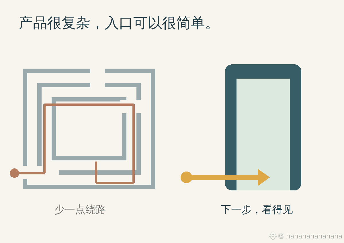
I’d rather applaud improvements like these: clearly explaining how funds will arrive, showing the fees upfront, and making it easy to find what to do if something goes wrong. The features can be complex; the first-time experience doesn’t have to be a maze.
The next great on-ramp might start with giving users one less reason to ask, “What do I do here?”
Back in the day, web directories put frequently used sites on a single page. Their value lay in saving people the effort of searching. The pages weren’t particularly cool, but they solved a very specific problem: I want to go online, but I don’t know where to go.
When I look at wallets and on-chain apps today, I find myself asking the same question. A user might just want to send some money, but the screen first asks them to choose a network, find gas, understand permissions, and then guess which button to press next. Every term is familiar to experienced users, but strung together, they can put off a newcomer.
I’d rather applaud improvements like these: clearly explaining how funds will arrive, showing the fees upfront, and making it easy to find what to do if something goes wrong. The features can be complex; the first-time experience doesn’t have to be a maze.
The next great on-ramp might start with giving users one less reason to ask, “What do I do here?”