
Crypto4light
5.5k Posts

Crypto4light
 Square Verified+
Report
Block User
Find everywhere - @Crypto4light 🔥 | Daily trading ideas | My custom indicators analysis | Educational content | Crypto News |

Level 1 Creator
Open Trade
Frequent Trader
5.8 Years
0 Following
67.8K+ Followers
39.6K+ Liked
1 Badges
Posts
Portfolio
All
Quotes
Videos
Live
PINNED
·
--

Article
The best indicators set for tradingCrypto4light Indicators Set
I spent a lot of time with backtesting and coding to create this set. 6 indicators which can cut all noise on your charts and bring more light in your trading strategy.🐳 Trade ON indicator
➡️ Buy/Sell The signal appears when you can open a position for buying or selling. Stop Loss can be set according to your risk management. Entry into the position can be at the appearance of the Buy/Sell signal and the closing of the candle. Stop Loss by the body or wick of this candle. Another entry option is to wait for the closing of 40-50% of the body of the candle on which you saw the Buy/Sell signal. Stop Loss by the body or wick of the candle on which you saw the Buy/Sell signal. On example you can see 35% profit on spot, 4H timeframe trade. Sometimes you can see signal just blinking, so wait until signal confirmed or try go to lower timeframe to see confirmation for entry by your risk management and strategy.
➡️ Red or Green triangles
Once a Buy/Sell signal appears and you enter a position, you have several options. It all depends on your trading style and risk management.
The first option - If, for example, you entered on the Buy signal, you can close the purchase at the appearance of the Take Profit signal, or at the appearance of the Sell signal, and open a position in another direction.The second option, after opening a position when triangles appear, this is a signal to close a certain percentage of the position in the plus. With each new triangle, you can close % of your position and move the Stop Loss to breakeven.The third option, after opening a position at the appearance of triangles, closing a full position and looking for a possible option to open a position in the other direction, closing the position after the triangles should take place at the appearance of the main Buy/Sell signal.
➡️ Take Profit
➡️ Two identical signals in a row
🐳 Direction indicator
Circles will appear from above or below. The circles will signal that the main market makers are starting to reduce or gain their position. Big players always need liquidity, so they can build or reduce a position for quite a long time. Round dots are not the main signal for tradingA red or green triangle signals a final change in the local or global trend, depending on your timeframe. Market Makers or players with large positions have exited the market, or conversely gained enough position to change the direction of price movement.The green and red solid lines are the levels where the trend is most likely to end
The green and red dashed lines are the levels where the big players are more likely to start gradually selling off or gaining a position to change the trend before the momentum. In the style settings, you can change the input positions of each of the lines, for yourself or for a specific asset. But the settings are already set in the most optimal way.
🐳 ADZ (Accumulation/Distribution Zones)
The red solid zone shows the zone where the big players will complete the sale of their position.The solid green area shows where the big players will accumulate their positions.The middle blue zone shows where medium and small players start to accumulate or sell off their positions.The yellow zone inside the blue zone shows a trend change and this means that most likely the big players have already gained a position to start selling or gaining it depending on the timeframe in which you are trading.
🐳 Take Profit indicator
The first lower "Buy" line, when the price drops to this line is a good point to enter a position or gradually build a position.The bottom green line "Fundamental price" is the real value of the asset. Sometimes when the media background about the asset is negative and buyers are not interested in the asset, the price can fall below its fundamental price. Then this is the best time to buy the asset.The first upper Take Profit line is a line where you can lock part of the profit or close the entire position. There is a possibility of opening a short position if you trade on the futures market
The very top Exit line is the line where you need to close 100% of the trade position. If you are an investor, you do not need to close the entire position and exit the asset, because all lines are dynamic and change depending on the cycle in which the asset is located.
🐳 Market Mood Indicator
On different timeframes, you can view the mood that is currently present in the market. Trend, euphoria, position selection, or lack of interest.
Red and orange color - fear and overbought in the market
Green - Accumulation and purchases on the market
Yellow - Gradual set of position
White - purchases and lack of interest from small investors
Blue - Neutral mood in the market
I rename color zones so you can turn on alerts and easier understand notifications. Some colors got 2 alerts because of gradation based on input data, so you can choose any. You should understand on downtrend for example orange zone can be still be a belief sentiment because traders belief price will not drop.
Dark red - Euphoria
Light red - Thrill
Orange (light and dark) - Belief / Strong Belief
Yellow - Optimism
Green - Hope
Light blue - Disbelief
Dark blue - Capitulation
White - Depression
🐳 Money Power Indicator
When the asset reaches one of the zones, it can serve as a good signal to close a part of the position or to start a gradual acquisition of the position according to your trading timeframe.
An almost ideal signal for deciding whether to enter or exit a position would be a divergence on the price chart and the curve on the Money Power indicator. If you are in a long position, for example, and you see that the price on the chart continues to rise, but in the overbought zone, the lines of the Money Power indicator show lower highs, this is a signal that a large player has almost completely sold out his position on this timeframe.
Of course, the price may continue to grow for some time depending on the timeframe, but such indicators usually indicate the outflow of money from large investors and small players will not be able to keep the asset from falling for a long time. Everything is the same but in a different direction in the oversold zone. When a big player gradually gains a position and we see that the money flow curve goes up, and the price on the chart and candles show lower minimums. This will be a great signal to enter a position. You can enter or close a position by analyzing older timeframes W, 3D 1D depending on your trading style.
In new version you also can find a new signals (explanation with default colors, but you can modify it to your theme)
Yellow block - Whales sell or close % of position
Yellow block with arrow down - Whales strong sell
Blue block - Whales buy
Blue block with arrow up - Whales strong buy
Triangle down - Bearish RSI divergency
Triangle Up - Bullish RSI divergency
Red Circle - Bearish MACD divergency
Green Circle - Bullish MACD divergency
I am not a financial advisor. All indicators created with my own personal experience. Do NOT trade or invest based only on indicators. Always do your own research and due diligence before investing.
All indicators can be used on different timeframes. The higher timeframe, the stronger signal. Your entry or exit point should be base on several indicators from the set, your trading strategy and your risk management. Indicators cannot predict or analyze future events in the world, the release of data in economic reports, statements in the media by public figures, so always follow your risk management when you open trades.
☑️ Always follow risk management and this set of indicators will help you. I wish you successful trading.
#trading #crypto
The best indicators set for trading
Crypto4light Indicators Set
I spent a lot of time with backtesting and coding to create this set. 6 indicators which can cut all noise on your charts and bring more light in your trading strategy.🐳 Trade ON indicator
➡️ Buy/Sell The signal appears when you can open a position for buying or selling. Stop Loss can be set according to your risk management. Entry into the position can be at the appearance of the Buy/Sell signal and the closing of the candle. Stop Loss by the body or wick of this candle. Another entry option is to wait for the closing of 40-50% of the body of the candle on which you saw the Buy/Sell signal. Stop Loss by the body or wick of the candle on which you saw the Buy/Sell signal. On example you can see 35% profit on spot, 4H timeframe trade. Sometimes you can see signal just blinking, so wait until signal confirmed or try go to lower timeframe to see confirmation for entry by your risk management and strategy.
➡️ Red or Green triangles
Once a Buy/Sell signal appears and you enter a position, you have several options. It all depends on your trading style and risk management.
The first option - If, for example, you entered on the Buy signal, you can close the purchase at the appearance of the Take Profit signal, or at the appearance of the Sell signal, and open a position in another direction.The second option, after opening a position when triangles appear, this is a signal to close a certain percentage of the position in the plus. With each new triangle, you can close % of your position and move the Stop Loss to breakeven.The third option, after opening a position at the appearance of triangles, closing a full position and looking for a possible option to open a position in the other direction, closing the position after the triangles should take place at the appearance of the main Buy/Sell signal.
➡️ Take Profit
➡️ Two identical signals in a row
🐳 Direction indicator
Circles will appear from above or below. The circles will signal that the main market makers are starting to reduce or gain their position. Big players always need liquidity, so they can build or reduce a position for quite a long time. Round dots are not the main signal for tradingA red or green triangle signals a final change in the local or global trend, depending on your timeframe. Market Makers or players with large positions have exited the market, or conversely gained enough position to change the direction of price movement.The green and red solid lines are the levels where the trend is most likely to end
The green and red dashed lines are the levels where the big players are more likely to start gradually selling off or gaining a position to change the trend before the momentum. In the style settings, you can change the input positions of each of the lines, for yourself or for a specific asset. But the settings are already set in the most optimal way.
🐳 ADZ (Accumulation/Distribution Zones)
The red solid zone shows the zone where the big players will complete the sale of their position.The solid green area shows where the big players will accumulate their positions.The middle blue zone shows where medium and small players start to accumulate or sell off their positions.The yellow zone inside the blue zone shows a trend change and this means that most likely the big players have already gained a position to start selling or gaining it depending on the timeframe in which you are trading.
🐳 Take Profit indicator
The first lower "Buy" line, when the price drops to this line is a good point to enter a position or gradually build a position.The bottom green line "Fundamental price" is the real value of the asset. Sometimes when the media background about the asset is negative and buyers are not interested in the asset, the price can fall below its fundamental price. Then this is the best time to buy the asset.The first upper Take Profit line is a line where you can lock part of the profit or close the entire position. There is a possibility of opening a short position if you trade on the futures market
The very top Exit line is the line where you need to close 100% of the trade position. If you are an investor, you do not need to close the entire position and exit the asset, because all lines are dynamic and change depending on the cycle in which the asset is located.
🐳 Market Mood Indicator
On different timeframes, you can view the mood that is currently present in the market. Trend, euphoria, position selection, or lack of interest.
Red and orange color - fear and overbought in the market
Green - Accumulation and purchases on the market
Yellow - Gradual set of position
White - purchases and lack of interest from small investors
Blue - Neutral mood in the market
I rename color zones so you can turn on alerts and easier understand notifications. Some colors got 2 alerts because of gradation based on input data, so you can choose any. You should understand on downtrend for example orange zone can be still be a belief sentiment because traders belief price will not drop.
Dark red - Euphoria
Light red - Thrill
Orange (light and dark) - Belief / Strong Belief
Yellow - Optimism
Green - Hope
Light blue - Disbelief
Dark blue - Capitulation
White - Depression
🐳 Money Power Indicator
When the asset reaches one of the zones, it can serve as a good signal to close a part of the position or to start a gradual acquisition of the position according to your trading timeframe.
An almost ideal signal for deciding whether to enter or exit a position would be a divergence on the price chart and the curve on the Money Power indicator. If you are in a long position, for example, and you see that the price on the chart continues to rise, but in the overbought zone, the lines of the Money Power indicator show lower highs, this is a signal that a large player has almost completely sold out his position on this timeframe.
Of course, the price may continue to grow for some time depending on the timeframe, but such indicators usually indicate the outflow of money from large investors and small players will not be able to keep the asset from falling for a long time. Everything is the same but in a different direction in the oversold zone. When a big player gradually gains a position and we see that the money flow curve goes up, and the price on the chart and candles show lower minimums. This will be a great signal to enter a position. You can enter or close a position by analyzing older timeframes W, 3D 1D depending on your trading style.
In new version you also can find a new signals (explanation with default colors, but you can modify it to your theme)
Yellow block - Whales sell or close % of position
Yellow block with arrow down - Whales strong sell
Blue block - Whales buy
Blue block with arrow up - Whales strong buy
Triangle down - Bearish RSI divergency
Triangle Up - Bullish RSI divergency
Red Circle - Bearish MACD divergency
Green Circle - Bullish MACD divergency
I am not a financial advisor. All indicators created with my own personal experience. Do NOT trade or invest based only on indicators. Always do your own research and due diligence before investing.
All indicators can be used on different timeframes. The higher timeframe, the stronger signal. Your entry or exit point should be base on several indicators from the set, your trading strategy and your risk management. Indicators cannot predict or analyze future events in the world, the release of data in economic reports, statements in the media by public figures, so always follow your risk management when you open trades.
☑️ Always follow risk management and this set of indicators will help you. I wish you successful trading.
#trading #crypto
I spent a lot of time with backtesting and coding to create this set. 6 indicators which can cut all noise on your charts and bring more light in your trading strategy.🐳 Trade ON indicator
➡️ Buy/Sell The signal appears when you can open a position for buying or selling. Stop Loss can be set according to your risk management. Entry into the position can be at the appearance of the Buy/Sell signal and the closing of the candle. Stop Loss by the body or wick of this candle. Another entry option is to wait for the closing of 40-50% of the body of the candle on which you saw the Buy/Sell signal. Stop Loss by the body or wick of the candle on which you saw the Buy/Sell signal. On example you can see 35% profit on spot, 4H timeframe trade. Sometimes you can see signal just blinking, so wait until signal confirmed or try go to lower timeframe to see confirmation for entry by your risk management and strategy.
➡️ Red or Green triangles
Once a Buy/Sell signal appears and you enter a position, you have several options. It all depends on your trading style and risk management.
The first option - If, for example, you entered on the Buy signal, you can close the purchase at the appearance of the Take Profit signal, or at the appearance of the Sell signal, and open a position in another direction.The second option, after opening a position when triangles appear, this is a signal to close a certain percentage of the position in the plus. With each new triangle, you can close % of your position and move the Stop Loss to breakeven.The third option, after opening a position at the appearance of triangles, closing a full position and looking for a possible option to open a position in the other direction, closing the position after the triangles should take place at the appearance of the main Buy/Sell signal.
➡️ Take Profit
➡️ Two identical signals in a row
🐳 Direction indicator
Circles will appear from above or below. The circles will signal that the main market makers are starting to reduce or gain their position. Big players always need liquidity, so they can build or reduce a position for quite a long time. Round dots are not the main signal for tradingA red or green triangle signals a final change in the local or global trend, depending on your timeframe. Market Makers or players with large positions have exited the market, or conversely gained enough position to change the direction of price movement.The green and red solid lines are the levels where the trend is most likely to end
The green and red dashed lines are the levels where the big players are more likely to start gradually selling off or gaining a position to change the trend before the momentum. In the style settings, you can change the input positions of each of the lines, for yourself or for a specific asset. But the settings are already set in the most optimal way.
🐳 ADZ (Accumulation/Distribution Zones)
The red solid zone shows the zone where the big players will complete the sale of their position.The solid green area shows where the big players will accumulate their positions.The middle blue zone shows where medium and small players start to accumulate or sell off their positions.The yellow zone inside the blue zone shows a trend change and this means that most likely the big players have already gained a position to start selling or gaining it depending on the timeframe in which you are trading.
🐳 Take Profit indicator
The first lower "Buy" line, when the price drops to this line is a good point to enter a position or gradually build a position.The bottom green line "Fundamental price" is the real value of the asset. Sometimes when the media background about the asset is negative and buyers are not interested in the asset, the price can fall below its fundamental price. Then this is the best time to buy the asset.The first upper Take Profit line is a line where you can lock part of the profit or close the entire position. There is a possibility of opening a short position if you trade on the futures market
The very top Exit line is the line where you need to close 100% of the trade position. If you are an investor, you do not need to close the entire position and exit the asset, because all lines are dynamic and change depending on the cycle in which the asset is located.
🐳 Market Mood Indicator
On different timeframes, you can view the mood that is currently present in the market. Trend, euphoria, position selection, or lack of interest.
Red and orange color - fear and overbought in the market
Green - Accumulation and purchases on the market
Yellow - Gradual set of position
White - purchases and lack of interest from small investors
Blue - Neutral mood in the market
I rename color zones so you can turn on alerts and easier understand notifications. Some colors got 2 alerts because of gradation based on input data, so you can choose any. You should understand on downtrend for example orange zone can be still be a belief sentiment because traders belief price will not drop.
Dark red - Euphoria
Light red - Thrill
Orange (light and dark) - Belief / Strong Belief
Yellow - Optimism
Green - Hope
Light blue - Disbelief
Dark blue - Capitulation
White - Depression
🐳 Money Power Indicator
When the asset reaches one of the zones, it can serve as a good signal to close a part of the position or to start a gradual acquisition of the position according to your trading timeframe.
An almost ideal signal for deciding whether to enter or exit a position would be a divergence on the price chart and the curve on the Money Power indicator. If you are in a long position, for example, and you see that the price on the chart continues to rise, but in the overbought zone, the lines of the Money Power indicator show lower highs, this is a signal that a large player has almost completely sold out his position on this timeframe.
Of course, the price may continue to grow for some time depending on the timeframe, but such indicators usually indicate the outflow of money from large investors and small players will not be able to keep the asset from falling for a long time. Everything is the same but in a different direction in the oversold zone. When a big player gradually gains a position and we see that the money flow curve goes up, and the price on the chart and candles show lower minimums. This will be a great signal to enter a position. You can enter or close a position by analyzing older timeframes W, 3D 1D depending on your trading style.
In new version you also can find a new signals (explanation with default colors, but you can modify it to your theme)
Yellow block - Whales sell or close % of position
Yellow block with arrow down - Whales strong sell
Blue block - Whales buy
Blue block with arrow up - Whales strong buy
Triangle down - Bearish RSI divergency
Triangle Up - Bullish RSI divergency
Red Circle - Bearish MACD divergency
Green Circle - Bullish MACD divergency
I am not a financial advisor. All indicators created with my own personal experience. Do NOT trade or invest based only on indicators. Always do your own research and due diligence before investing.
All indicators can be used on different timeframes. The higher timeframe, the stronger signal. Your entry or exit point should be base on several indicators from the set, your trading strategy and your risk management. Indicators cannot predict or analyze future events in the world, the release of data in economic reports, statements in the media by public figures, so always follow your risk management when you open trades.
☑️ Always follow risk management and this set of indicators will help you. I wish you successful trading.
#trading #crypto
37
17
153
3.6k
·
--
Bearish
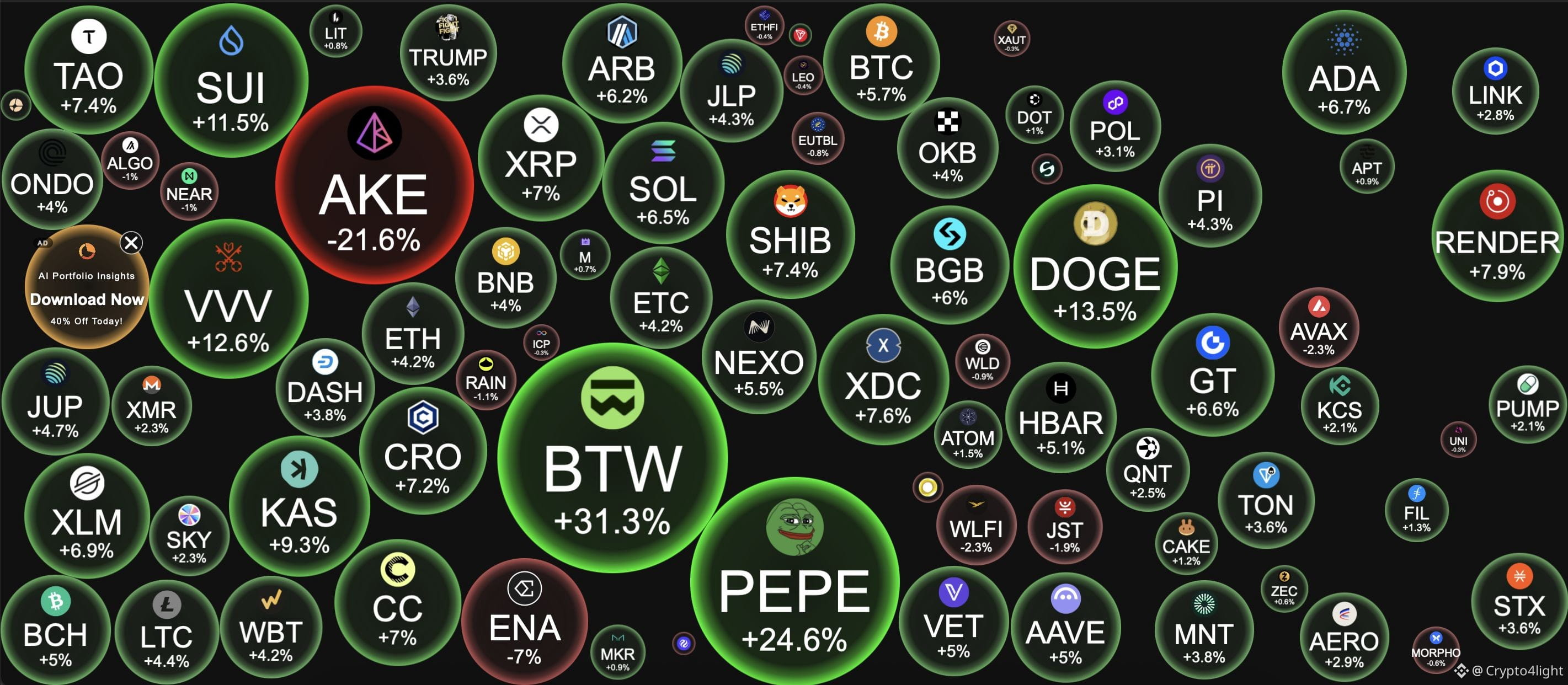
Remember this nice green day) The new “it’s all over,” “it’s a trap,” and “manipulation” crypto posts from influencers this week in 3....2....1 $BTC
Remember this nice green day) The new “it’s all over,” “it’s a trap,” and “manipulation” crypto posts from influencers this week in 3....2....1 $BTC
1
236
·
--
Regarding the Benjamin Cowen situation — all crypto influencers are now massively pushing this narrative and celebrating like crazy that Ben turned out to be wrong about his $BTC analysis. So much so that he probably said for the first time in a video that he was wrong, and then even made this post!
Like… what the fk???
Personally, I don’t always agree with Ben’s ideas. We look at charts differently. He relies more on historical patterns of asset behavior and moving averages, while I currently focus more on algorithmic indicator data, because I’m not a believer in Bitcoin pattern theories at all.
Nobody knows the future. We all work with probabilities!
You don’t even know, sitting at home, what can happen to you, in the next 10 minutes!
But we have price charts, tools to work with, and everyone simply analyzes the market the way they believe is appropriate.
And people forget the main idea of social media: we share ideas.
It doesn’t matter if you have an account with 100 followers or, like Ben, 2–3 million followers across social media. He is still just a person sharing his view.
Some ideas will be right. Some will be wrong.
Personally, the most important thing for me is that someone doesn’t just draw random arrows on a chart, but logically explains and argues their point of view.
THAT’S IT.
Time will show whether the analysis was right or wrong.
But instead, everyone starts pointing fingers and mocking Ben because he turned out to be wrong.
What matters is that you have reasoning behind your ideas. Over time, everyone develops their own perspective and EXPERIENCE.
One thing is Ben openly sharing an idea with an audience of millions.
Another thing is someone like Arthur Hayes intentionally pushing people into certain tokens in front of the same kind of massive audience — you remember those posts — and then systematically selling that same token.
THAT is negative influence and intentionally using your media reach.
Anyway, keep working, keep gaining experience, and don’t be toxic.
We’re all in the same boat. #BTC
Regarding the Benjamin Cowen situation — all crypto influencers are now massively pushing this narrative and celebrating like crazy that Ben turned out to be wrong about his $BTC analysis. So much so that he probably said for the first time in a video that he was wrong, and then even made this post!
Like… what the fk???
Personally, I don’t always agree with Ben’s ideas. We look at charts differently. He relies more on historical patterns of asset behavior and moving averages, while I currently focus more on algorithmic indicator data, because I’m not a believer in Bitcoin pattern theories at all.
Nobody knows the future. We all work with probabilities!
You don’t even know, sitting at home, what can happen to you, in the next 10 minutes!
But we have price charts, tools to work with, and everyone simply analyzes the market the way they believe is appropriate.
And people forget the main idea of social media: we share ideas.
It doesn’t matter if you have an account with 100 followers or, like Ben, 2–3 million followers across social media. He is still just a person sharing his view.
Some ideas will be right. Some will be wrong.
Personally, the most important thing for me is that someone doesn’t just draw random arrows on a chart, but logically explains and argues their point of view.
THAT’S IT.
Time will show whether the analysis was right or wrong.
But instead, everyone starts pointing fingers and mocking Ben because he turned out to be wrong.
What matters is that you have reasoning behind your ideas. Over time, everyone develops their own perspective and EXPERIENCE.
One thing is Ben openly sharing an idea with an audience of millions.
Another thing is someone like Arthur Hayes intentionally pushing people into certain tokens in front of the same kind of massive audience — you remember those posts — and then systematically selling that same token.
THAT is negative influence and intentionally using your media reach.
Anyway, keep working, keep gaining experience, and don’t be toxic.
We’re all in the same boat. #BTC
Like… what the fk???
Personally, I don’t always agree with Ben’s ideas. We look at charts differently. He relies more on historical patterns of asset behavior and moving averages, while I currently focus more on algorithmic indicator data, because I’m not a believer in Bitcoin pattern theories at all.
Nobody knows the future. We all work with probabilities!
You don’t even know, sitting at home, what can happen to you, in the next 10 minutes!
But we have price charts, tools to work with, and everyone simply analyzes the market the way they believe is appropriate.
And people forget the main idea of social media: we share ideas.
It doesn’t matter if you have an account with 100 followers or, like Ben, 2–3 million followers across social media. He is still just a person sharing his view.
Some ideas will be right. Some will be wrong.
Personally, the most important thing for me is that someone doesn’t just draw random arrows on a chart, but logically explains and argues their point of view.
THAT’S IT.
Time will show whether the analysis was right or wrong.
But instead, everyone starts pointing fingers and mocking Ben because he turned out to be wrong.
What matters is that you have reasoning behind your ideas. Over time, everyone develops their own perspective and EXPERIENCE.
One thing is Ben openly sharing an idea with an audience of millions.
Another thing is someone like Arthur Hayes intentionally pushing people into certain tokens in front of the same kind of massive audience — you remember those posts — and then systematically selling that same token.
THAT is negative influence and intentionally using your media reach.
Anyway, keep working, keep gaining experience, and don’t be toxic.
We’re all in the same boat. #BTC
247
·
--
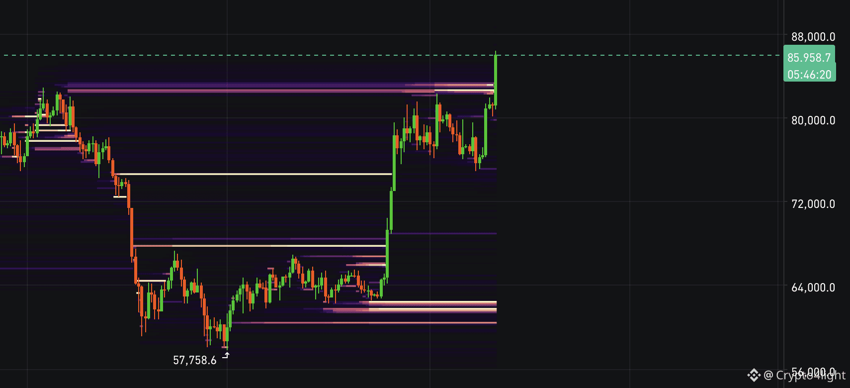
All clusters over 80k done! All others on a screen (Fair line on W also today showed in video)
BTC
$BTC
{future}(BTCUSDT)
All clusters over 80k done! All others on a screen (Fair line on W also today showed in video)
BTC
$BTC
BTC
$BTC
242
·
--
SEI Price Analysis: Is a Big Move Coming? $SEI
SEI Price Analysis: Is a Big Move Coming? $SEI
1
10
2.6k
·
--
Bullish
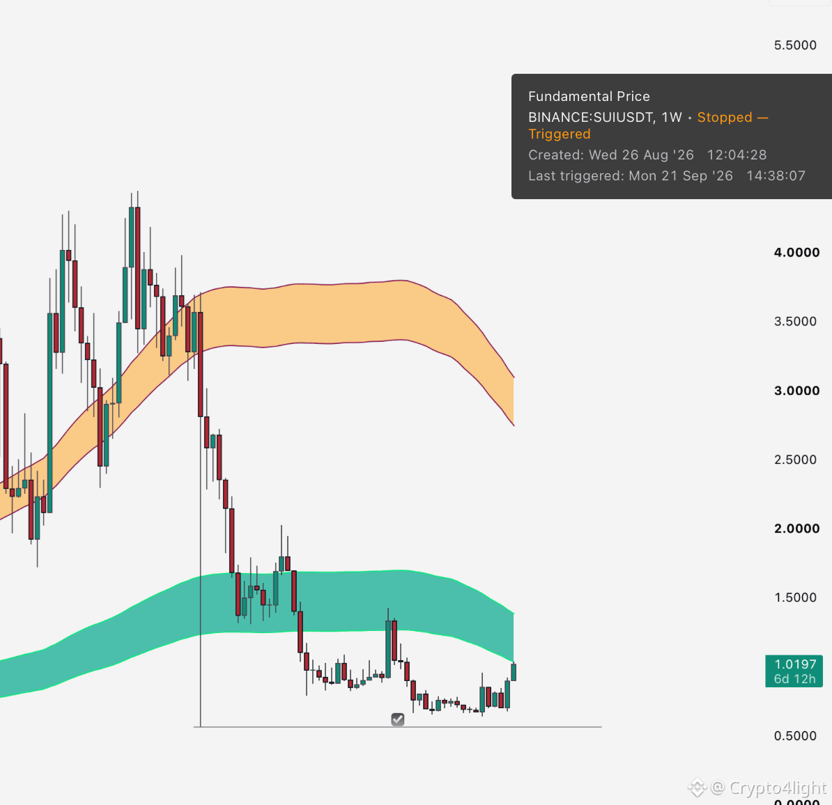
Magic? New alert! $SUI And how many more alerts have already triggered that weren’t even in the video?))) Opportunities are right in front of you — just take them and work with them.
Magic? New alert! $SUI And how many more alerts have already triggered that weren’t even in the video?))) Opportunities are right in front of you — just take them and work with them.
Crypto4light
·
--
$SUI Price Analysis: Why You Should Ignore the Media
4
1
2.5k
·
--
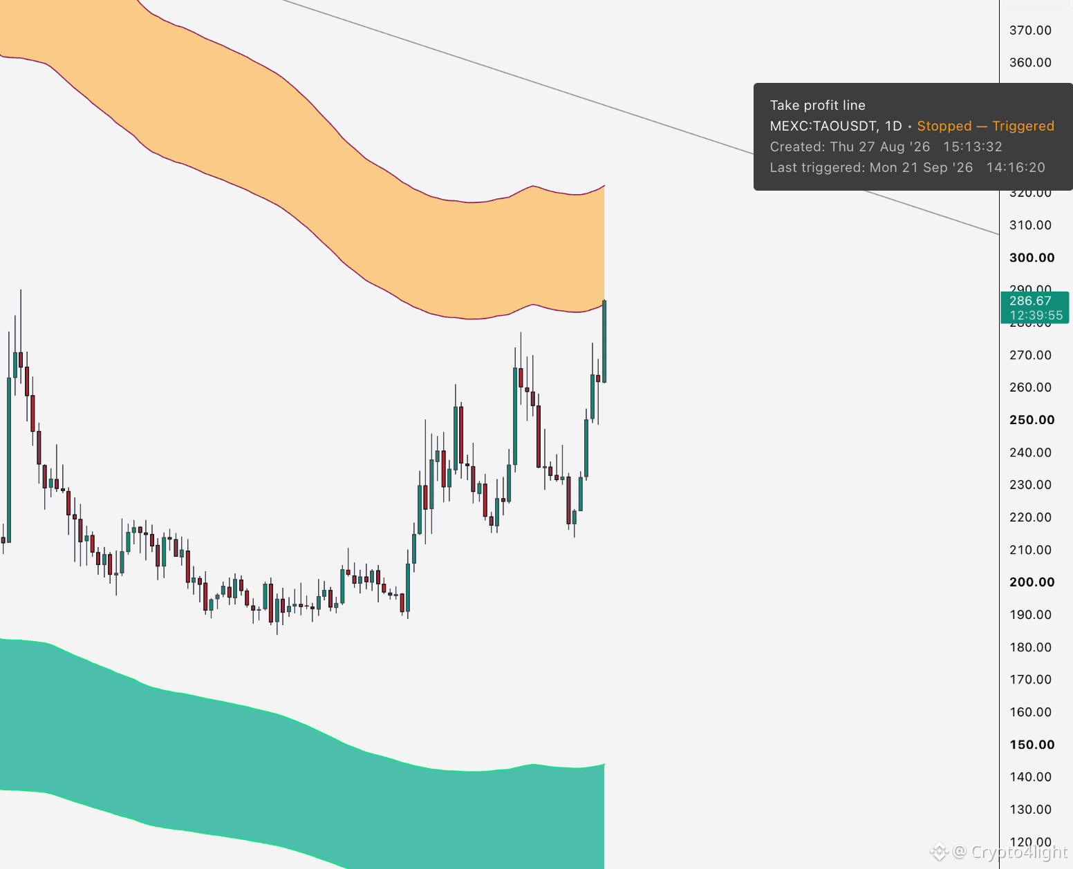
$TAO alert! ✔️ Take profit line D tf in today SEI video this alert appear in live)) So its not after the fact or so))
$TAO alert! ✔️ Take profit line D tf in today SEI video this alert appear in live)) So its not after the fact or so))
1
3.1k
·
--
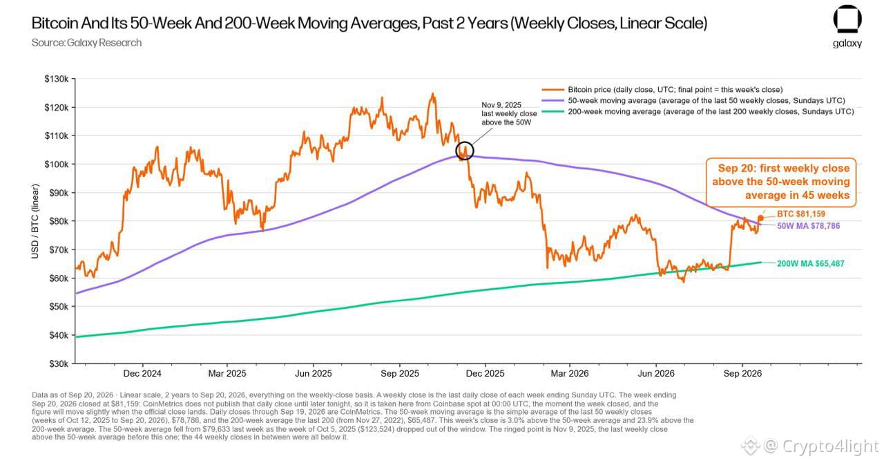
Bitcoin may have signaled the start of a new bull market.
BTC just closed a weekly candle above the 50W MA for the first time in 45 weeks. Historically, Alex Thorn (from Galaxy) says this move has often confirmed that the bottom is already in. 👀
All of this is great! But I just can’t wrap my head around how top companies with billions of dollars behind them, with the best researchers, analysts, coders, and minds in blockchain, determine the bottom of the main asset only when Bitcoin is already at $85,000! And their argument is the 50-week moving average crossover!
So, you had absolutely no arguments at $57–60K that this was the bottom?
Or were you quietly buying yourselves, staying silent, and now you need an audience because you’re opinion leaders — so you have to slowly, little by little, build up interest and then start with your usual narrative about $200K–$300K–$500K, gradually selling it to the crowd?
Secondhand embarrassment. $BTC
{future}(BTCUSDT)
Bitcoin may have signaled the start of a new bull market.
BTC just closed a weekly candle above the 50W MA for the first time in 45 weeks. Historically, Alex Thorn (from Galaxy) says this move has often confirmed that the bottom is already in. 👀
All of this is great! But I just can’t wrap my head around how top companies with billions of dollars behind them, with the best researchers, analysts, coders, and minds in blockchain, determine the bottom of the main asset only when Bitcoin is already at $85,000! And their argument is the 50-week moving average crossover!
So, you had absolutely no arguments at $57–60K that this was the bottom?
Or were you quietly buying yourselves, staying silent, and now you need an audience because you’re opinion leaders — so you have to slowly, little by little, build up interest and then start with your usual narrative about $200K–$300K–$500K, gradually selling it to the crowd?
Secondhand embarrassment. $BTC
BTC just closed a weekly candle above the 50W MA for the first time in 45 weeks. Historically, Alex Thorn (from Galaxy) says this move has often confirmed that the bottom is already in. 👀
All of this is great! But I just can’t wrap my head around how top companies with billions of dollars behind them, with the best researchers, analysts, coders, and minds in blockchain, determine the bottom of the main asset only when Bitcoin is already at $85,000! And their argument is the 50-week moving average crossover!
So, you had absolutely no arguments at $57–60K that this was the bottom?
Or were you quietly buying yourselves, staying silent, and now you need an audience because you’re opinion leaders — so you have to slowly, little by little, build up interest and then start with your usual narrative about $200K–$300K–$500K, gradually selling it to the crowd?
Secondhand embarrassment. $BTC
1.9k
·
--
Bitcoin Is Making an Unstoppable Move! But Here’s the Thing… $BTC
Bitcoin Is Making an Unstoppable Move! But Here’s the Thing… $BTC
2
721
·
--
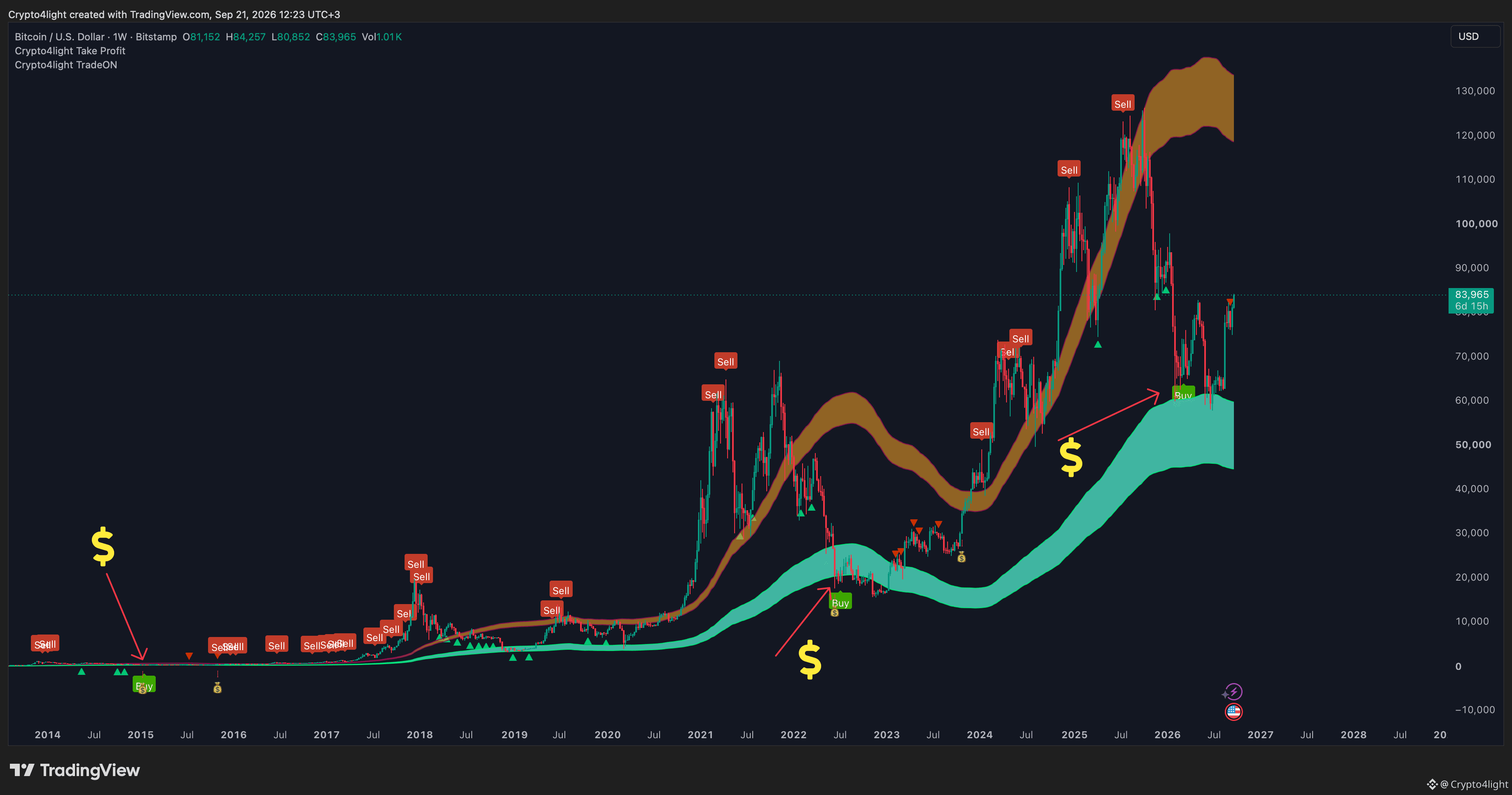
So, if we have already passed the bottom — and most likely, this is the case! I showed the arguments for this in the video — then I think we have the simplest pattern in the world for identifying the #BTC bottom!
Take the weekly timeframe, the oldest chart.
We look at 3 things in a future bear markets!
- Take Profit Money Bag signals (need to close all sales)
- Buy Signal from the Trade On indicator — Weekly
- test the Buy Line on the Take Profit indicator!
$BTC
{future}(BTCUSDT)
So, if we have already passed the bottom — and most likely, this is the case! I showed the arguments for this in the video — then I think we have the simplest pattern in the world for identifying the #BTC bottom!
Take the weekly timeframe, the oldest chart.
We look at 3 things in a future bear markets!
- Take Profit Money Bag signals (need to close all sales)
- Buy Signal from the Trade On indicator — Weekly
- test the Buy Line on the Take Profit indicator!
$BTC
Take the weekly timeframe, the oldest chart.
We look at 3 things in a future bear markets!
- Take Profit Money Bag signals (need to close all sales)
- Buy Signal from the Trade On indicator — Weekly
- test the Buy Line on the Take Profit indicator!
$BTC
1.6k
·
--
Now on social media, we’re going to have a period when everyone who was talking about $50–45K Bitcoin over the summer will quickly flip and become a super bull, and start saying that everything happened exactly as they predicted: supercycle, $300K Bitcoin, and so on! This is just a stream of bs, so filter your news feed carefully!
As for altcoins, many have already tested the Fundamental Value Line, so there aren’t that many tokens left with potential bottoms — and therefore, opportunities! This doesn’t mean they won’t go up, no. It’s just that the best opportunities are always with those who use the best tools rather than simply trying to guess the timing! Logic and a plan!
We still have 10 days of September ahead, the entire month of October, and the U.S. elections! 100%, ahead of the elections we’re going to get a stream of random positive and negative events and news designed to shake up market participants and create uncertainty! Work with a plan. $BTC
{future}(BTCUSDT)
Now on social media, we’re going to have a period when everyone who was talking about $50–45K Bitcoin over the summer will quickly flip and become a super bull, and start saying that everything happened exactly as they predicted: supercycle, $300K Bitcoin, and so on! This is just a stream of bs, so filter your news feed carefully!
As for altcoins, many have already tested the Fundamental Value Line, so there aren’t that many tokens left with potential bottoms — and therefore, opportunities! This doesn’t mean they won’t go up, no. It’s just that the best opportunities are always with those who use the best tools rather than simply trying to guess the timing! Logic and a plan!
We still have 10 days of September ahead, the entire month of October, and the U.S. elections! 100%, ahead of the elections we’re going to get a stream of random positive and negative events and news designed to shake up market participants and create uncertainty! Work with a plan. $BTC
As for altcoins, many have already tested the Fundamental Value Line, so there aren’t that many tokens left with potential bottoms — and therefore, opportunities! This doesn’t mean they won’t go up, no. It’s just that the best opportunities are always with those who use the best tools rather than simply trying to guess the timing! Logic and a plan!
We still have 10 days of September ahead, the entire month of October, and the U.S. elections! 100%, ahead of the elections we’re going to get a stream of random positive and negative events and news designed to shake up market participants and create uncertainty! Work with a plan. $BTC
1
1
2.6k
·
--
$AVAX Price Analysis: Is the Avalanche Bull Run Starting?
$AVAX Price Analysis: Is the Avalanche Bull Run Starting?
2
2
2.7k
·
--
The Crypto Bull Run Has Officially Begun?! $BTC
The Crypto Bull Run Has Officially Begun?! $BTC
1
11
5.1k
·
--
$FLOW Could Be One of the Biggest Opportunities?
$FLOW Could Be One of the Biggest Opportunities?
1
3
2.5k
·
--
Bullish
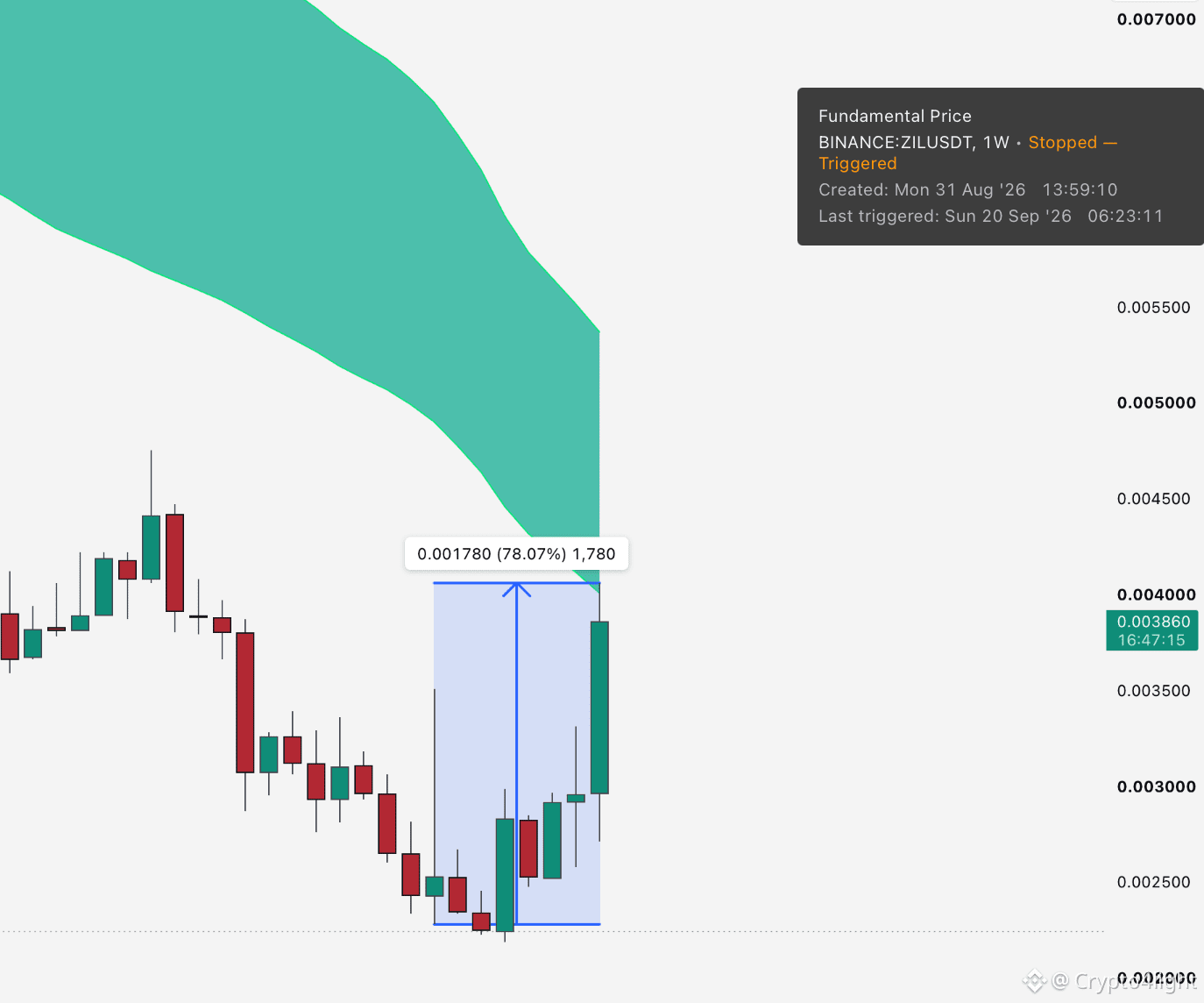
1 tool can give you more value than millions advices around! $ZIL
Take profit indicator Fundamental value line tested!
1 tool can give you more value than millions advices around! $ZIL
Take profit indicator Fundamental value line tested!
Take profit indicator Fundamental value line tested!
Crypto4light
·
--
Zilliqa (ZIL) Price Analysis. Here's What Smart Money Sees $ZIL
1.1k
·
--
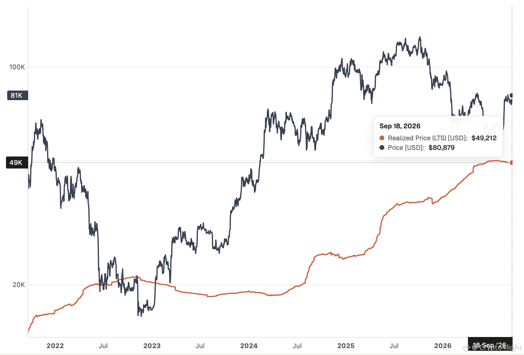
Realized Price – Long-Term Supply (LTS)
We’ve already talked about these metrics! In 2025, not a single one of the 40 indicators used by crypto “experts” signaled the market top.
But for some reason, in 2026 everyone expected and still expects Bitcoin to drop, retest the Realized Price – Long-Term Supply moving line just like before, and only then start moving higher!
Once again, people are not going to get what they’re waiting for. $BTC
{future}(BTCUSDT)
Realized Price – Long-Term Supply (LTS)
We’ve already talked about these metrics! In 2025, not a single one of the 40 indicators used by crypto “experts” signaled the market top.
But for some reason, in 2026 everyone expected and still expects Bitcoin to drop, retest the Realized Price – Long-Term Supply moving line just like before, and only then start moving higher!
Once again, people are not going to get what they’re waiting for. $BTC
We’ve already talked about these metrics! In 2025, not a single one of the 40 indicators used by crypto “experts” signaled the market top.
But for some reason, in 2026 everyone expected and still expects Bitcoin to drop, retest the Realized Price – Long-Term Supply moving line just like before, and only then start moving higher!
Once again, people are not going to get what they’re waiting for. $BTC
1
777
·
--
Bullish
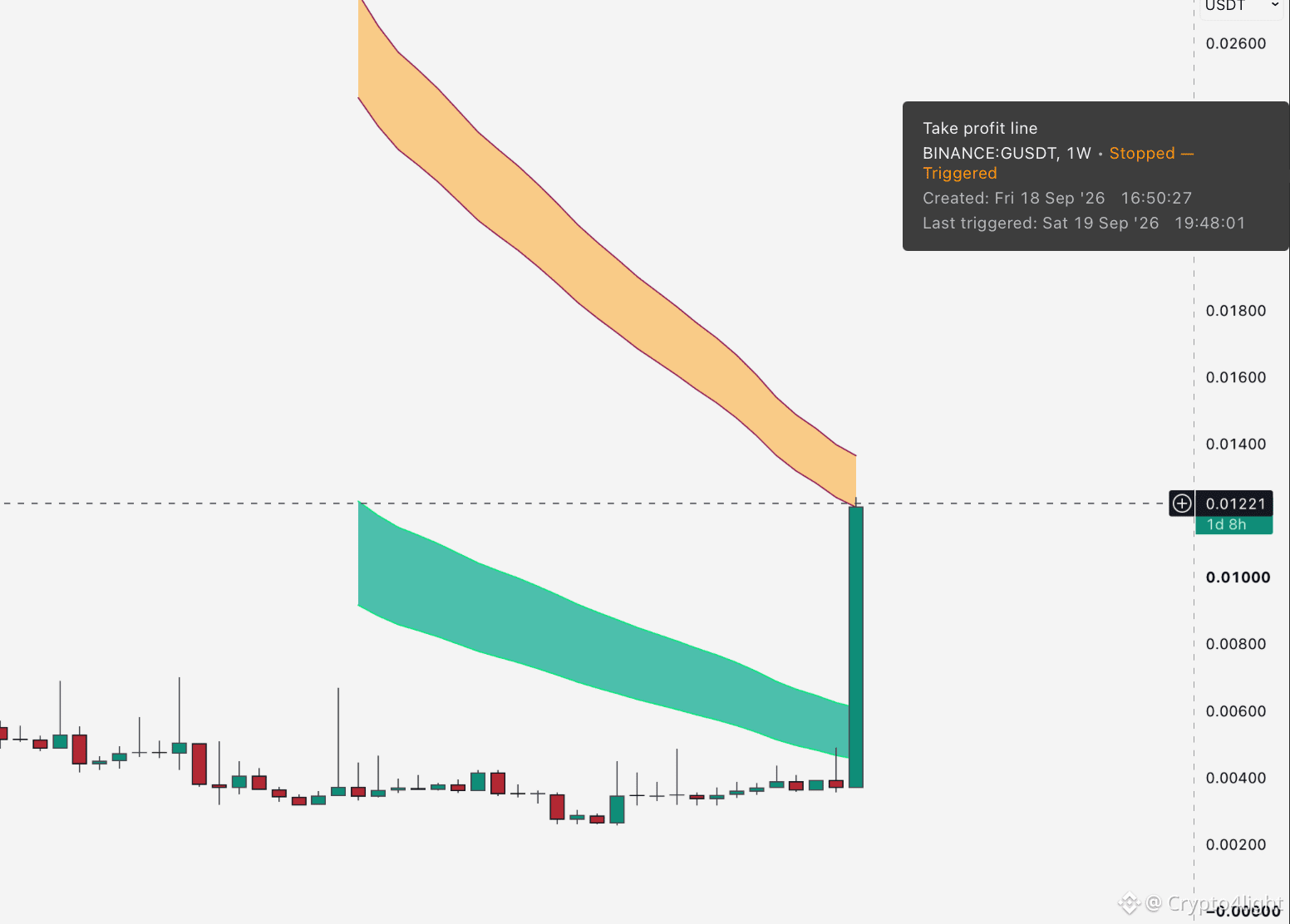
Take profit line alert from video DONE ✔️ $G
dont skip the video and use the same tools for price action!
{future}(GUSDT)
Take profit line alert from video DONE ✔️ $G
dont skip the video and use the same tools for price action!
dont skip the video and use the same tools for price action!
Crypto4light
·
--
Gravity $G Price Analysis: What’s Next for G?
811
·
--
Bullish
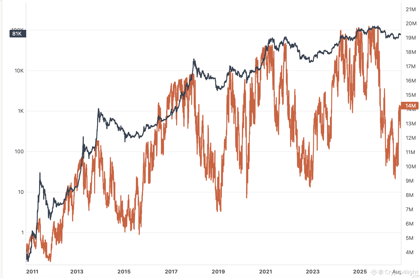
On the positive side! As we can see from the yearly metrics, the circulating volume that is currently in profit is still far from its peak levels! This means that even taking into account local corrections in late September–October, Bitcoin still has huge potential.
Ideally, after the elections, I would like the media to launch a wave of systematic positivity for several months, until May, pumping FOMO into investors like a pump! $BTC
{future}(BTCUSDT)
On the positive side! As we can see from the yearly metrics, the circulating volume that is currently in profit is still far from its peak levels! This means that even taking into account local corrections in late September–October, Bitcoin still has huge potential.
Ideally, after the elections, I would like the media to launch a wave of systematic positivity for several months, until May, pumping FOMO into investors like a pump! $BTC
Ideally, after the elections, I would like the media to launch a wave of systematic positivity for several months, until May, pumping FOMO into investors like a pump! $BTC
2
1
894
Log in to explore more content
Join global crypto users on Binance Square
⚡️ Get latest and useful information about crypto.
💬 Trusted by the world’s largest crypto exchange.
👍 Discover real insights from verified creators.
Email / Phone number
Trending Topics
XRPRises8%
199 views
51 Discussing
#xrprises8%
🚀 The army is waking up, degens! XRP just pumped 8% after Ripple announced that asset managers are prepping for the new Batch V1.1 payment upgrade on the XRP Ledger! 📈🔥
🤔 Is this just following the market trend or something bigger?
It’s definitely the upgrade hyping things up, boys! 30 out of 35 validators are backing Batch V1.1, and it could go live after Sep 29! Either way, I just smashed my TP1 on a juicy 30x LONG on the USDC pair, so life is good! 🥂 Dynamic targets are now locked at $1.50 and $1.80.
📈 What should traders do?
Watch the Sep 29 deadline. Keep an eye on the validator votes.Secure profits. Don't let your winning longs turn into dust.Watch the volume.
⚠️ NFA - This is not financial advice!
👇 Sign up with code VINHTOCDO for massive discounts:
🔗https://www.binance.com/register?ref=VINHTOCDO
👇 Click to trade below to support me:
$XRP $USDC $USDT
#XRP #Ripple #XRPLedger #CryptoPump #altcoins #VINHTOCDO
Vinhtocdo
·2 Likes
·20 views
AppleGoogleSeekStablecoinTokenizedDepositTalent
109 views
37 Discussing
NvidiaToBuyAnother$1.5BSBEnergySharesPreIPO
32 views
8 Discussing