



From Initial Supply to the Right-Shoulder Test and SOW: Understanding the Shift in Supply and Demand Behind the Pattern
Three peaks, with the middle one highest and volume also tapering off on the right. Is that enough to confirm a head and shoulders top?
After reading this section of the original book, I think the most valuable lesson is how supply first emerges and then comes to dominate the decline, and how demand is tested through repeated rallies. First, let’s clarify this chain of reasoning, then compare each step with a stretch of BTC price action.
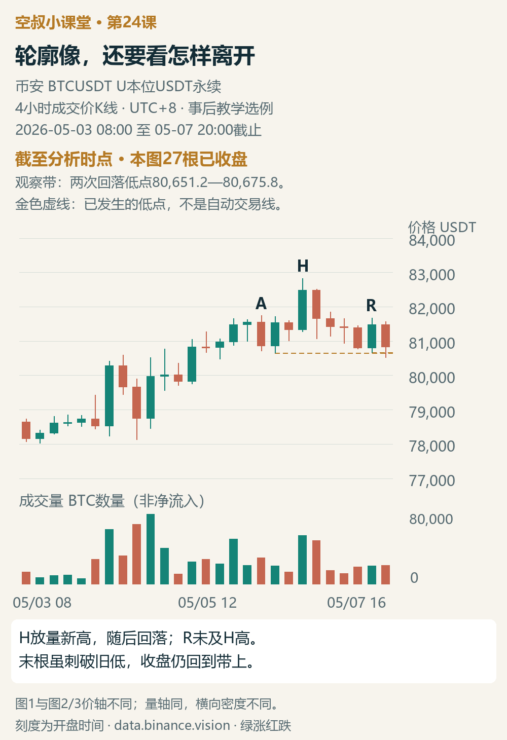
Figure 1 | As of May 7, 20:00: First look at the overall shape; let the evidence guide your supply-and-demand assessment
These are Binance BTCUSDT USDT-margined perpetual 4-hour trade-price candlesticks, all shown in UTC+8, selected after the fact for teaching purposes. Figure 1 starts at 08:00 on May 3, 2026, and runs through 20:00 on May 7, for a total of 27 closed candles.#BTC
A rallies and then pulls back; H makes a new high; R rebounds but doesn’t reach H’s high. Read on with this question in mind: what further evidence would the right side need to provide for us to interpret this pattern as distribution?
The left shoulder and head: supply appears, but that doesn’t mean it has gained the upper hand
The original book links the left shoulder to “initial supply.” Against the backdrop of the preceding rise, selling pressure begins to pull price down noticeably. Only when both the decline and volume expand is there reason to pay attention to the arrival of supply. Merely marking a high on the left doesn’t complete this assessment.
It is first and foremost a warning. Buyers may still absorb this supply and push price higher, so making a new high after the left shoulder isn’t contradictory.
The head corresponds to the “buying climax” discussed by the author: during the rise, a very long bullish candle appears with a surge in volume, as a large number of buyers chasing the price absorb a large number of sell orders. Busy trading shouldn’t be interpreted simply as buyer strength; the key is whether price can remain strong after this wave of demand.
If the decline from the head expands significantly, with supply pushing price down to a lower area, that’s an SOW—a sign of weakness. It means supply has gained the advantage in pushing price down; it isn’t just another name for any bearish candle.
The right shoulder and SOW: testing whether demand can come back
The right shoulder is a testing phase. Here, a “secondary test” means price returns to near the previous high area to reassess supply and demand there.
The original book says to consider lower volume together with weaker candlestick performance: after supply increases and price declines, the rebound lacks both volume support and upward progress, so demand has failed to push price back up. That’s what supports the interpretation of insufficient demand. Lower volume alone, while price rises easily, does not warrant the same conclusion.
The sequence doesn’t have to be neat, either. If an SOW appears after the head, the weak rebound at the right shoulder tests that decline. If the SOW appears only after the right shoulder, supply pushes price down further after a weak demand test. If price surges and then falls back during a retest of the right shoulder, that is also a clue the author uses to assess supply.
Why look at the rebound after the SOW? Because a sharp decline can quickly be recovered by buying. If the following rebound has low volume and limited upward progress, and fails to reclaim the lost area, that supports the view that downward pressure still has the advantage and demand cannot yet recover.
In Figure 3-22 of the original book, the author also discusses a spring effect: price dips and then bounces, but the rebound and retest fail to bring in enough demand. Only then does an SOW appear, followed by a weak rebound that tests it. A bounce is not the same as demand strong enough to reverse the situation.
Put these conditions back in the context of the preceding rise: supply increases, the demand test is weak, and the SOW and subsequent rebound support supply dominance. Only then does the author infer distribution and consider a short-selling opportunity. The positions and spacing don’t have to be perfect; what matters is whether this chain of supply-and-demand evidence holds together.
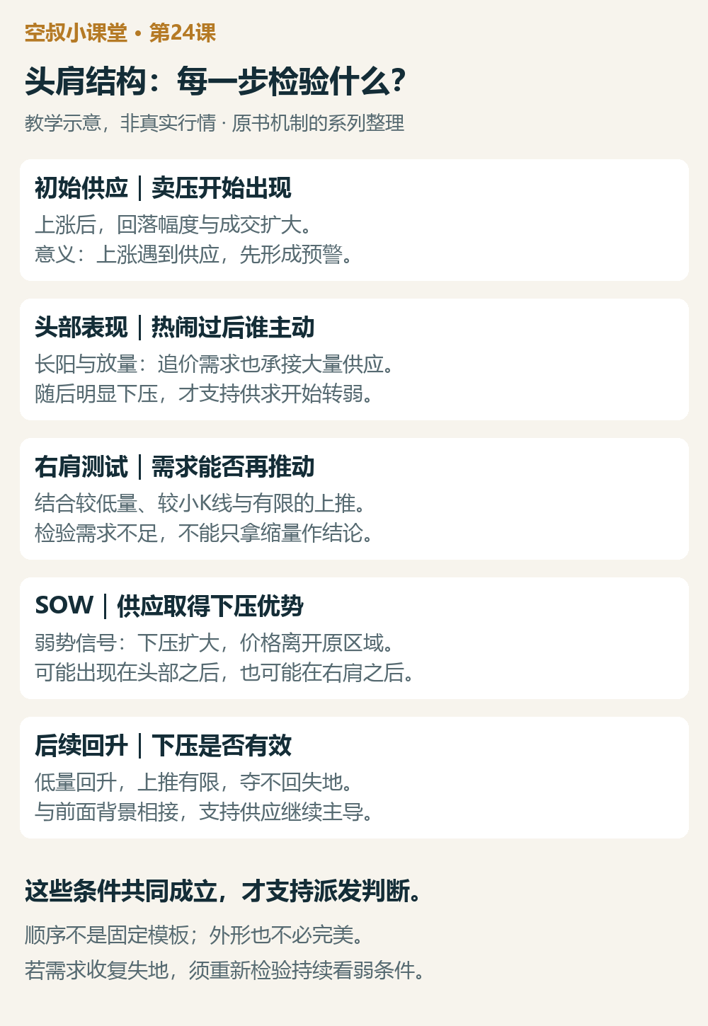
Mechanism card | Teaching illustration, not actual market data: each stage tests a different question; the sequence is not a fixed template
In terms of planning, this is how the series lays it out: when there’s only initial supply or a head-and-shoulders outline, first set aside the default expectation that the uptrend can continue as before, and test demand. Only after the SOW and weak rebound provide support is there reason to list a bearish view as a well-founded candidate plan. Actual execution still requires suitable context, a trigger, and invalidation conditions. Long positions should be exited according to their predefined risk conditions; there’s no need to wait for final distribution confirmation. Exiting a long position does not automatically mean opening a short.
Back to BTC: R’s volume is lower—why isn’t it a complete test yet?
In Figure 1, H’s volume is about 4.05 times that of the immediately preceding candle. Volume surges as price makes a new high at 82,828.7; trading remains active during the ensuing decline, and a portion of the rise is quickly given back. This makes increasing supply a plausible explanation worth testing.
R only reached 81,680.6, below H’s high; its volume was about 37% of H’s. But R did rise about 683 USDT from open to close—it wasn’t a tiny bullish candle that could barely move the price. Although price briefly fell below the earlier lows after R, it closed back above them.
So this example shows a pattern and signs of weakening, but there’s not enough to call R a successful test of exhausted demand. The area around A also doesn’t sufficiently establish the complete initial-supply event described in the original book, and H’s high-volume new high alone can’t confirm a buying climax. This BTC example is used to test the supply-and-demand method, not to force A, H, and R to correspond exactly to every event in the original book.
The lows of the two declines so far are around 80,651–80,676, forming the support area to watch in this example. At the end of Figure 1, we can write down these conditions: if price breaks below the area and then rebounds but fails to reclaim it, the case for supply dominance strengthens; if it moves back above R’s high and holds there, the insufficient-demand hypothesis weakens.
D and the subsequent rebound: local weakness gains a supply-and-demand basis
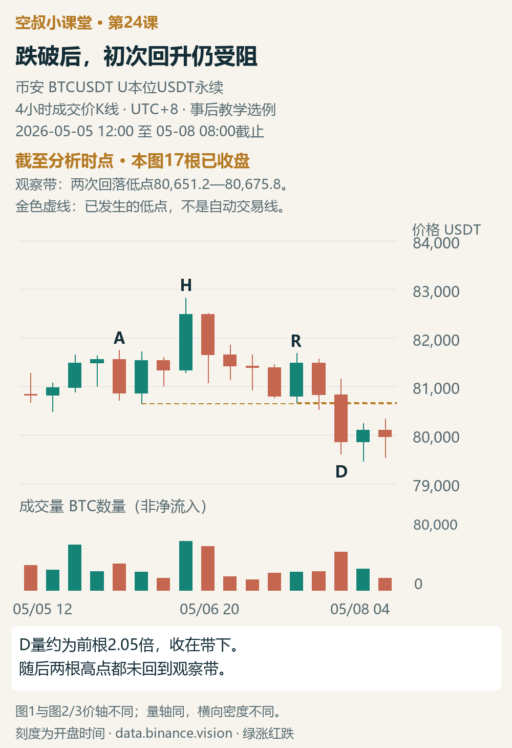
Figure 2 | Through 08:00 on May 8: a high-volume breakdown, followed by a test of whether the rebound can reclaim the original area
We’re now looking at 08:00 on May 8. Figure 2 zooms in on 17 bars starting at 12:00 on May 5; Figure 3 starts there too. Figures 2 and 3 have a narrower price-axis range than Figure 1, so the horizontal density differs, while the volume axis is the same; compare the values when looking across figures.
D is the candle that opened at 20:00 on May 7. Its volume is about 2.05 times that of the previous candle, its high-to-low range expands, and it closes at 79,861.6, near its low and well below the watch area.
This fits the interpretation of the local SOW in this example: increased volume accompanies a larger downward move, and the close doesn’t reclaim the lost ground. Supply dominance is no longer inferred solely from the three peaks.
In the next two bars, the first rebounds and closes higher, while the second pulls back slightly. Both have lower volume than D, and neither reaches the lower edge of the watch area. A rebound did occur, but it still hasn’t reclaimed the original area. This is an initial test of D’s downward impact and supports the view of local weakness at that point.
The significance of the weak rebound on low volume comes from the context: price had just been pushed down by supply, and buyers needed to push it back up but were temporarily unable to. It’s not about treating “lower volume” by itself as a sell signal.
At this point, “the rebound is blocked, followed by another downward move” can be listed as a condition for maintaining a bearish view. If price reclaims the area and stays above it, the plan that relied on resistance below the area should be dropped; moving above R’s high would further weaken the bearish case. The breakdown and weak rebound in this segment are supported by evidence, but on their own they can’t confirm a complete distribution.
Follow-up test: demand pushes price back up
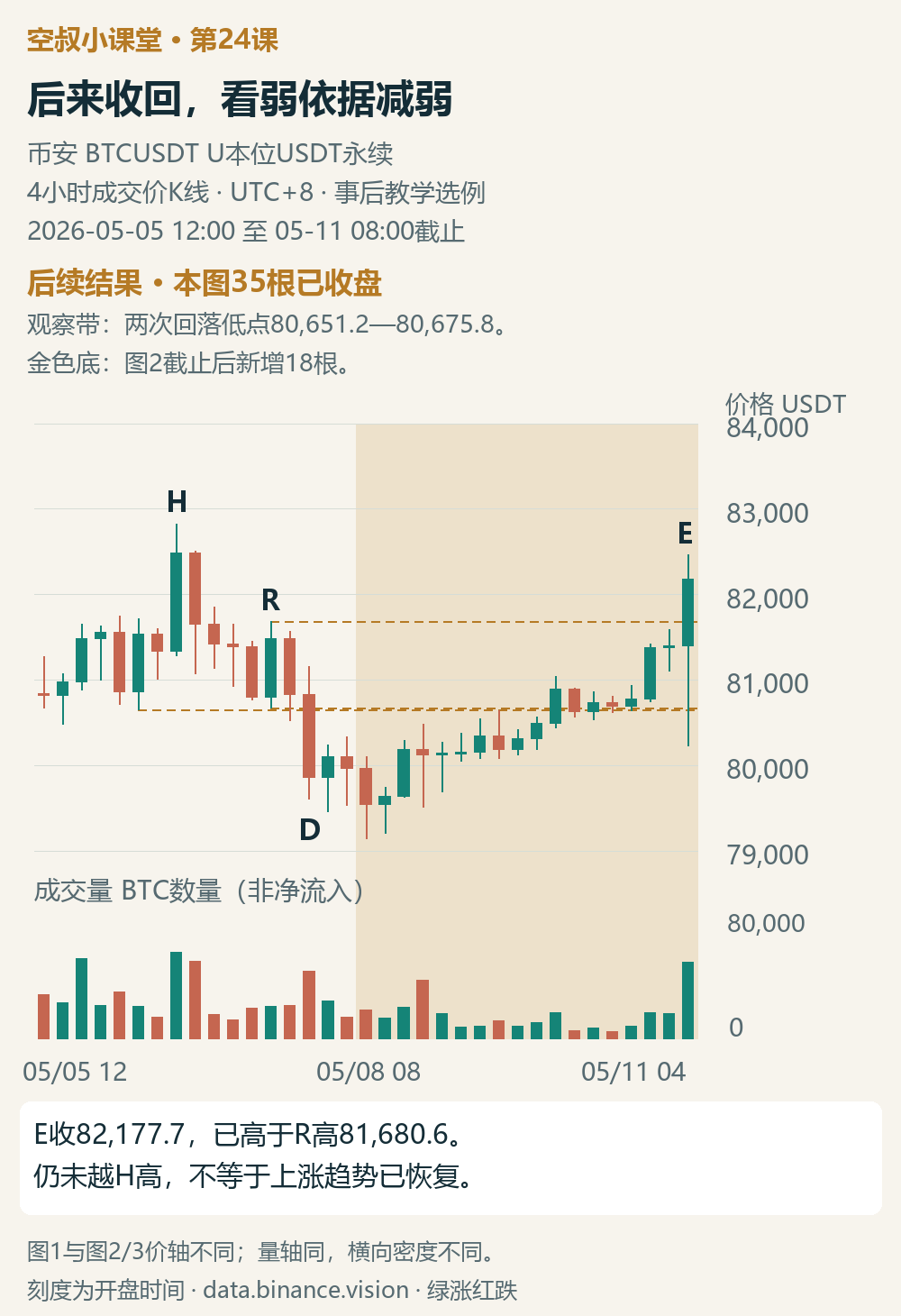
Figure 3 | Gold area shows what followed: price reclaims the watch area and moves above R’s high
The results are shown through 08:00 on May 11; the gold area contains 18 new bars after Figure 2.
Price initially continued lower. The candle opening at 00:00 on May 10 was the first to close back above the watch area; the next candle slipped slightly back below it. The recovery was uneven, but price eventually continued to climb. E closed at 82,177.7, above R’s high, and its volume was noticeably higher than that of the immediately preceding candle.
This wave of demand produced real upward progress: the area previously lost was reclaimed, and the high on the right was exceeded. The conditions that “demand can’t come back” and “supply continues to cap the rebound” have been invalidated, so the original plan to remain bearish can no longer be used.
E still hasn’t moved above H’s high, and price also fell back below the watch area intrabar, so this example doesn’t confirm that the uptrend has resumed. What it clearly tests is that the local weakness after D was once supported, but later failed to develop into a sustained move under supply pressure.
My learning summary
The new chart-reading approach in this lesson is to assign a different question to each part of the head-and-shoulders structure: at the left shoulder, ask whether supply is beginning to increase; at the head, ask who takes control after the buying frenzy; at the right shoulder, test demand; and use the SOW and the subsequent rebound to assess whether supply can continue to dominate.
The full chain of conditions supports a distribution thesis; if any link is missing, stop the conclusion where the evidence ends. The BTC example doesn’t complete the whole chain. What’s most worth retaining is how it moves from a locally supported SOW to a renewed strengthening of demand.
A quick exercise
Looking only at Figures 1 and 2: R’s volume is only about 37% of H’s, so why can’t we call it a successful test of exhausted demand? What does D test, and what do the next two bars test? Name one possible subsequent development that would invalidate the explanation that supply continues to dominate the rebound.
Feel free to share your reasoning in the comments—don’t just answer “up” or “down.” I’ll add a sample analysis to the comments on this post later.
On the trading journey, Uncle Kong is here to grow with you.