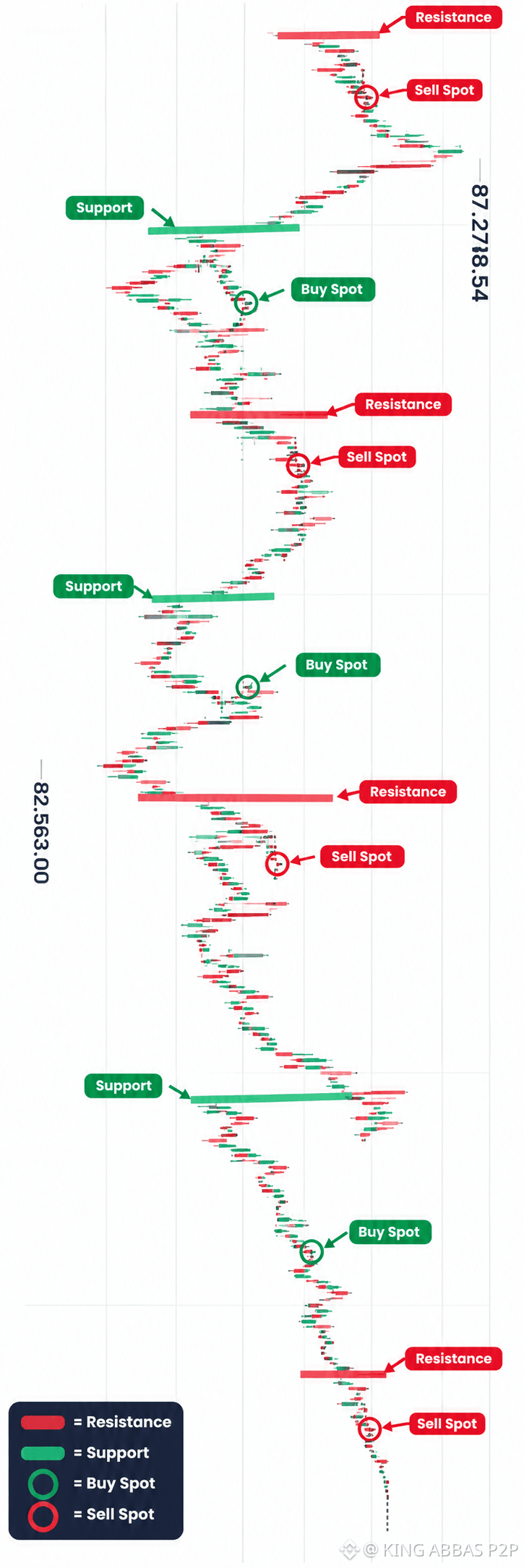
BTC Support & Resistance - My Learning Chart Study 📊
This is an EDUCATIONAL chart study I made to understand market structure better. Not a trading signal.
What this chart shows for LEARNING:
🔴 Red Line = Resistance Zone
Where price faced selling pressure before. Historically sellers become active here.
🟢 Green Line = Support Zone
Where price found buying interest before. Historically buyers stepped in here.
🟢 Circle = Buy Spot (Concept)
Example area where traders LEARN to watch for potential bounce - for study only.
🔴 Circle = Sell Spot (Concept)
Example area where traders LEARN to watch for potential rejection - for study only.
Market never moves straight. It moves Support -> Resistance -> Support.
I am still learning. This chart is made for my own education and to share knowledge with our Pakistan community.
What do you think? Do you also use Support & Resistance in your learning?
👇 Comment your thoughts - Let's learn together!
⚠️ DISCLAIMER: This chart is for educational purposes only. Not financial advice. Not a buy/sell recommendation. Crypto trading is highly risky. Always Do Your Own Research (DYOR). I am not a financial advisor.
#BTC #Bitcoin❗ #BTCUSDT! #SupportAndResistanc #TechnicalAnalysis #CryptoEducation #LearnCrypto #TradingEducation #NotFinancialAdvice #BinanceSquare #PakistanCryptoFuture #KINGABBASP2P
This is an EDUCATIONAL chart study I made to understand market structure better. Not a trading signal.
What this chart shows for LEARNING:
🔴 Red Line = Resistance Zone
Where price faced selling pressure before. Historically sellers become active here.
🟢 Green Line = Support Zone
Where price found buying interest before. Historically buyers stepped in here.
🟢 Circle = Buy Spot (Concept)
Example area where traders LEARN to watch for potential bounce - for study only.
🔴 Circle = Sell Spot (Concept)
Example area where traders LEARN to watch for potential rejection - for study only.
Market never moves straight. It moves Support -> Resistance -> Support.
I am still learning. This chart is made for my own education and to share knowledge with our Pakistan community.
What do you think? Do you also use Support & Resistance in your learning?
👇 Comment your thoughts - Let's learn together!
⚠️ DISCLAIMER: This chart is for educational purposes only. Not financial advice. Not a buy/sell recommendation. Crypto trading is highly risky. Always Do Your Own Research (DYOR). I am not a financial advisor.
#BTC #Bitcoin❗ #BTCUSDT! #SupportAndResistanc #TechnicalAnalysis #CryptoEducation #LearnCrypto #TradingEducation #NotFinancialAdvice #BinanceSquare #PakistanCryptoFuture #KINGABBASP2P