
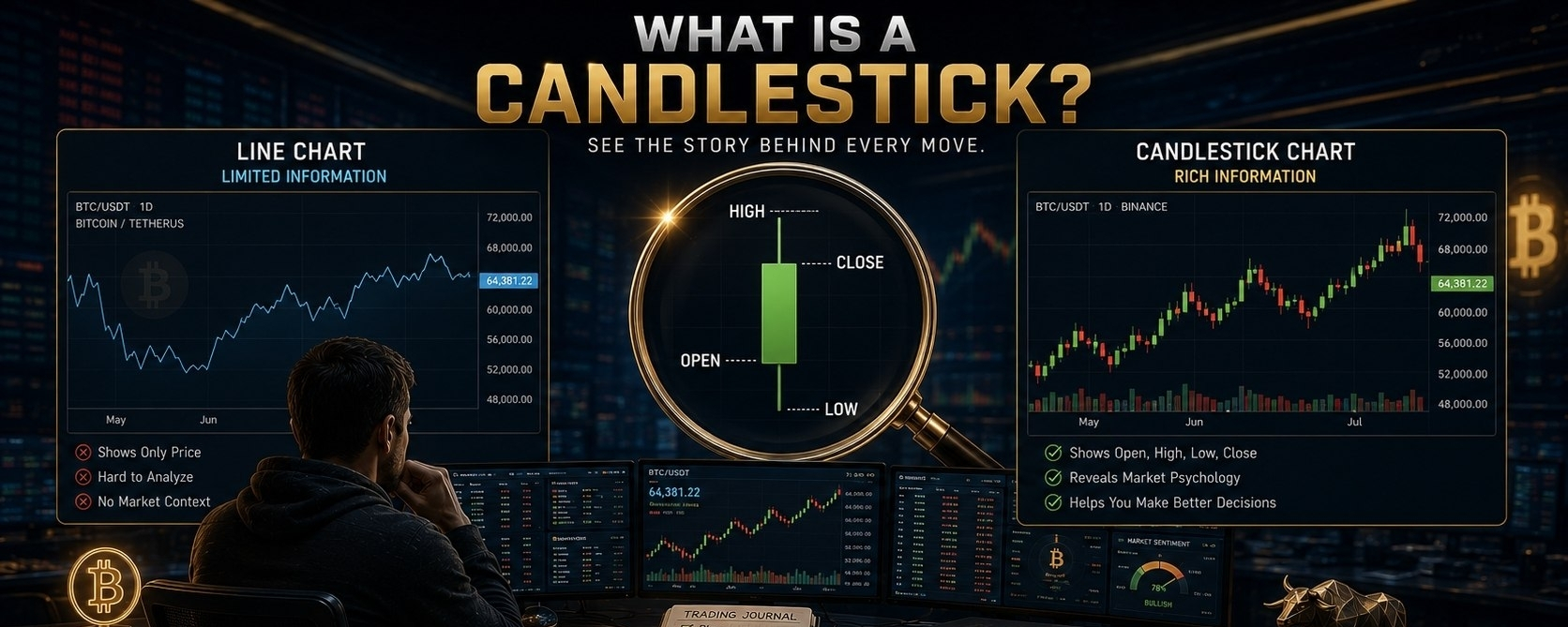

Imagine you're watching Bitcoin climb from $100,000 to $102,000.
A line chart shows you only one thing...
Price went up.
But it doesn't tell you how it got there.
Did buyers dominate from start to finish?
Did sellers almost take control before buyers fought back?
Was there panic... or confidence?
That's why professional traders don't rely on line charts.
They read candlesticks.
🔹️ What Is a Candlestick?
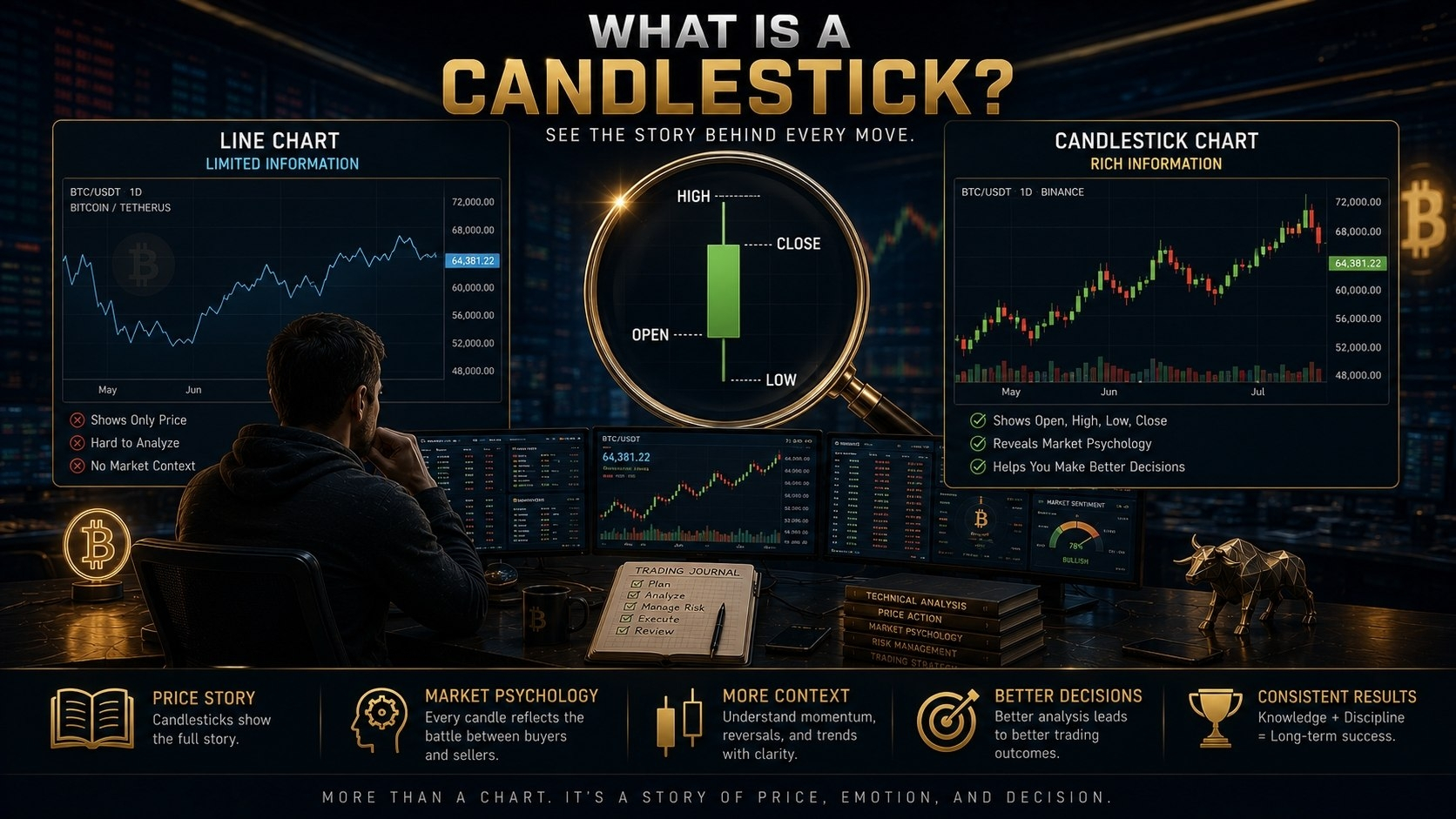
A candlestick is a visual representation of how price moved during a specific period of time.
Depending on your chart, one candle could represent:
▪️ 1 minute
▪️ 15 minutes
▪️ 1 hour
▪️ 4 hours
▪️ 1 day
Each candle summarizes everything that happened during that timeframe.
Instead of showing just one price, it tells the complete story of the battle between buyers and sellers.
Why Candlesticks Are the Foundation of Technical Analysis
Before traders learn indicators like RSI or Moving Averages...
They first learn to read candlesticks.
Why?
Because indicators are calculated from price.
Candlesticks are the price.
Professional traders always ask: "What is price telling me?"
Only after understanding price action do they use indicators for confirmation.
🟢 Every Candle Tells a Story
Think of every candlestick as a conversation between buyers and sellers.
Some candles show buyers completely in control.
Some show sellers dominating.
Others reveal hesitation, indecision, or a sudden shift in momentum.
When you learn to read candles, you're no longer looking at random shapes.
You're reading market psychology in real time.
📈 Bitcoin Example
Imagine $BTC opens a 1-hour candle at $100,000.
During that hour:
▪️ Buyers push price to $102,000.
▪️ Sellers try to force it back down.
▪️ The candle finally closes at $101,800.
That single candle tells you far more than a line chart ever could.
It shows buyers won the battle—but sellers didn't give up without a fight.
Now imagine hundreds of candles forming one after another.
Together, they tell the complete story of the trend.
📉 Why Line Charts Hide Important Information
A line chart usually connects only the closing prices.
It's clean and simple...
But it hides the battle that happened inside each candle.
A candlestick chart reveals:
▪️ Buying pressure
▪️ Selling pressure
▪️ Market indecision
▪️ Rejections
▪️ Momentum shifts
That's why almost every professional trader chooses candlestick charts over line charts.
They don't just want to know where price went.
They want to know how it got there.
📌 Every trading strategy begins with one skill:
Learning to understand what price is communicating.
Candlesticks are the language of the market.
The sooner you learn that language, the easier it becomes to understand trends, reversals, and high-probability trading opportunities.
In the next lesson, we'll break down every part of a candlestick and show you exactly what each section means.
💬 What about you?
Do you currently use Line Charts or Candlestick Charts ?
Please share your thoughts in the Discussions section below as we continue this academy series, mastering price action one candle at a time.