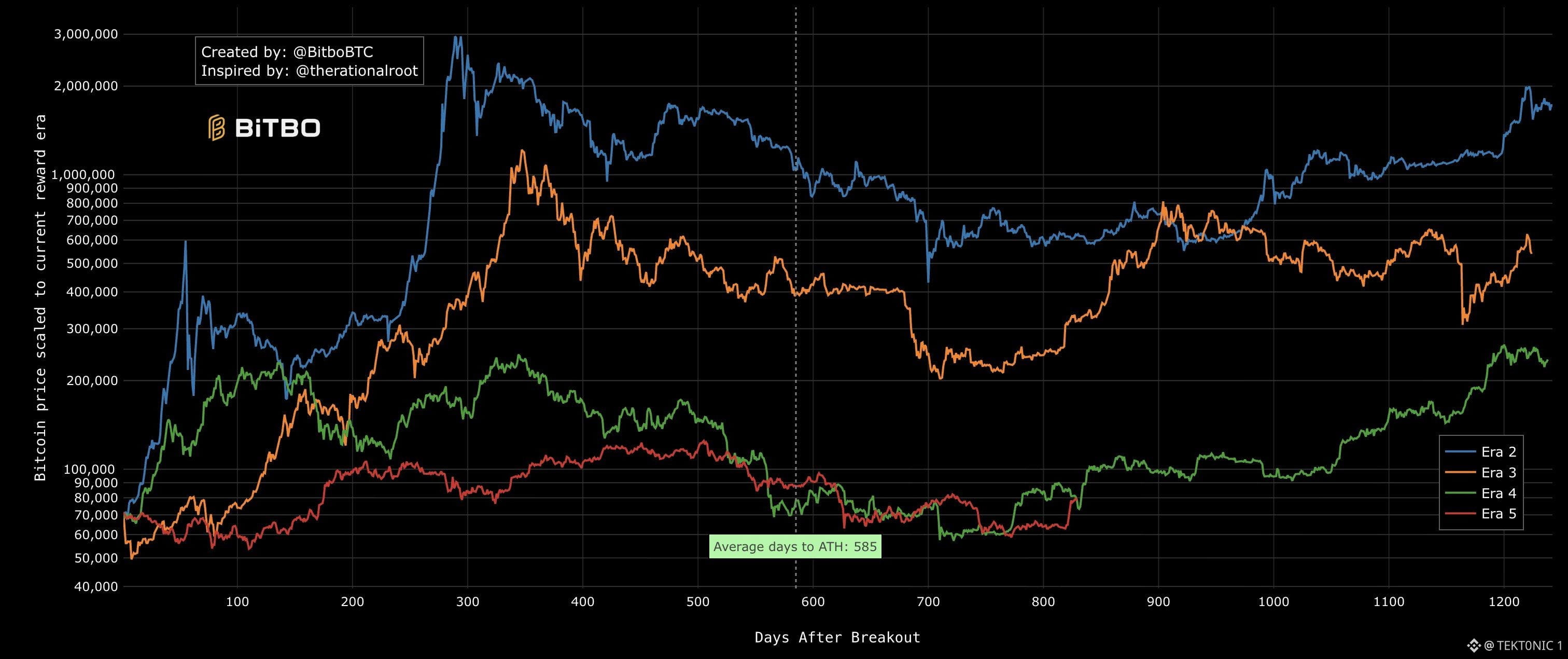
Bitcoin Bull Market Comparison Chart Points to Cycle Already Underway A widely followed cycle chart that overlays previous $BTC bull markets shows the current price action aligning with the early stages of a new uptrend. Key Details from the Chart (created by Bitbo): > Previous cycles (Eras 2–5) are scaled to the current reward era for direct comparison
> Price is plotted by “days after breakout”
> Historical average time from breakout to all-time high: 585 days
> Current cycle’s trajectory is shown against those earlier patterns
In simple terms, the chart measures how $BTC has performed after key breakout points in past cycles. When the current path begins tracking the early upward slopes of previous bull markets, many analysts interpret it as evidence that a new bull phase has already started. This view is supported by other recent signals, including strong weekly gains and on-chain indicators that have flipped more bullish. However, some analysts still look for additional confirmation, such as a sustained move above longer-term moving averages near the $83,000 area. The chart suggests the current rebound is not just a short-term bounce but the beginning of a longer cyclical advance, though markets remain data-dependent. A visual comparison that puts the recent price recovery into multi-cycle context.
#BTC Price Analysis# $ETH #Bitcoin Price Prediction: What is Bitcoins next move?#
> Price is plotted by “days after breakout”
> Historical average time from breakout to all-time high: 585 days
> Current cycle’s trajectory is shown against those earlier patterns
In simple terms, the chart measures how $BTC has performed after key breakout points in past cycles. When the current path begins tracking the early upward slopes of previous bull markets, many analysts interpret it as evidence that a new bull phase has already started. This view is supported by other recent signals, including strong weekly gains and on-chain indicators that have flipped more bullish. However, some analysts still look for additional confirmation, such as a sustained move above longer-term moving averages near the $83,000 area. The chart suggests the current rebound is not just a short-term bounce but the beginning of a longer cyclical advance, though markets remain data-dependent. A visual comparison that puts the recent price recovery into multi-cycle context.
#BTC Price Analysis# $ETH #Bitcoin Price Prediction: What is Bitcoins next move?#