
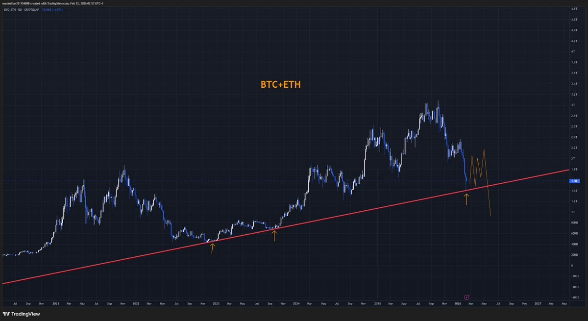
Some charts tell a clear story at a glance. For me, the combined market cap of $BTC + $ETH is one of those charts right now.
The long-term trendline drawn from the 2020 lows has acted as major support multiple times across previous cycles. Every touch led to a meaningful reaction. And now, once again, total market cap is approaching that same critical zone.
Here’s what that suggests:
1️⃣ This isn’t a level that breaks easily
This is more than just a technical line — it represents a long-term psychological area where capital has historically stepped in. Zones like this usually require time and pressure before a true break or confirmation happens.
2️⃣ Major support often slows the market down
Instead of immediate breakdowns, markets typically move into a prolonged phase of back-and-forth action — bouncing, rejecting, and building a wide range before choosing direction.
Because of that, the more likely scenario right now looks like:
• A wide sideways range over the coming months
• Not strong enough for a clean new bull trend
• But not necessarily the start of a deep collapse either
This type of environment tends to exhaust both longs and shorts.
What tends to work better in this phase:
• Range trading instead of directional all-in bets
• Selective narratives instead of broad market expectations
• Patience and flexibility over strong conviction
If this long-term support holds, it could become the base for the next major cycle. If it breaks decisively with strong selling pressure, then the broader structure changes significantly.
For now, this isn’t a moment for extreme bullishness or extreme bearishness.
Sometimes the hardest market isn’t the one that crashes —
it’s the one that moves sideways long enough to test everyone’s patience.

